Every brushstroke carries intention. Every pixel holds purpose. Yet beneath the technical mastery that artists, designers, and creatives strive to achieve lies a fundamental force that shapes human experience in ways both profound and subtle: color. The hues we choose don’t merely fill space or create visual interest—they tap into the deepest recesses of human psychology, evoking emotions, triggering memories, and influencing behavior with remarkable precision.
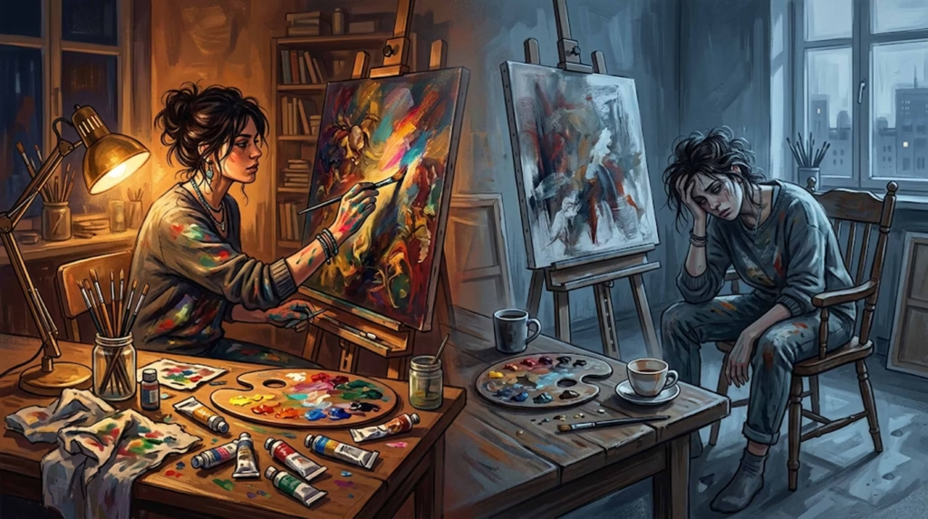
Color psychology represents the intersection where art meets science, where aesthetic choices become psychological tools. For the creative professional, understanding how colors shape our perception isn’t just academic knowledge—it’s a powerful instrument for crafting experiences that resonate on a visceral level. Whether you’re a painter seeking to convey melancholy through your palette, a graphic designer aiming to inspire action through brand colors, or an interior designer creating spaces that promote wellness, the science of color perception provides the foundation for intentional, impactful creative work.
This exploration into color psychology will equip you with evidence-based insights that transform how you approach your craft, revealing the neurological mechanisms behind color perception and offering practical applications that can elevate your artistic practice from intuitive to intentional.
Understanding Color Psychology
Color psychology is the scientific study of how colors influence human behavior, emotions, and cognitive processes. Far from being merely an aesthetic consideration, color serves as a complex communication system that operates below the threshold of conscious awareness, triggering automatic responses rooted in evolutionary biology, cultural conditioning, and personal experience.

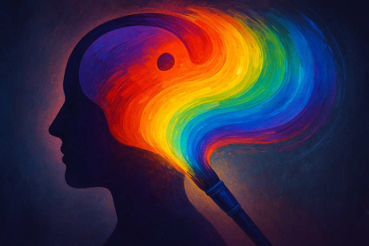
The foundation of color psychology rests on the understanding that color perception is not passive but actively constructed by the brain. When light waves of different frequencies enter our visual system, they undergo a remarkable transformation from physical phenomena to psychological experience. This process involves not just the eyes but the entire neurological network, creating associations that can influence everything from purchasing decisions to emotional states.
Historical research in color psychology traces back to Johann Wolfgang von Goethe’s “Theory of Colors” (1810), which challenged Newton’s purely physical approach to color by emphasizing its psychological dimensions. Goethe observed that colors produce specific emotional effects, laying the groundwork for modern color psychology. Later researchers like Faber Birren and Eva Heller expanded this foundation, conducting empirical studies that revealed consistent patterns in how humans respond to different hues across cultures and contexts.
Contemporary color psychology draws from multiple disciplines, including neuroscience, anthropology, and cognitive psychology, to create a comprehensive understanding of color’s impact on human experience. This interdisciplinary approach reveals that color effects are neither arbitrary nor purely cultural but stem from fundamental aspects of human neurology and evolutionary adaptation.
The Emotional Impact of Colors

Warm Colors: The Activators
Warm colors—red, orange, and yellow—occupy the long-wavelength end of the visible spectrum and consistently evoke feelings of energy, warmth, and stimulation. These hues trigger the sympathetic nervous system, creating physiological responses that include increased heart rate, elevated blood pressure, and heightened alertness.

Red stands as perhaps the most psychologically potent color in the human experience. Associated with passion, power, and urgency, red commands attention and demands action. Research demonstrates that exposure to red can enhance performance on detail-oriented tasks while simultaneously increasing feelings of excitement and arousal. For artists, red serves as an emotional amplifier, capable of conveying everything from romantic love to aggressive confrontation depending on context and saturation levels.
Orange combines the energy of red with the cheerfulness of yellow, creating a color that promotes enthusiasm, creativity, and social connection. Studies indicate that orange environments can stimulate appetite and encourage conversation, making it particularly effective in spaces designed for social interaction. In artistic applications, orange often represents transformation, adventure, and spontaneous expression.
Yellow, the most luminous color in the spectrum, triggers associations with sunlight, happiness, and intellectual stimulation. Neurological research reveals that yellow activates the left side of the brain, enhancing logical thinking and decision-making processes. However, excessive exposure to bright yellow can create feelings of anxiety and agitation, demonstrating the delicate balance required in color application.
Cool Colors: The Soothers
Cool colors—blue, green, and purple—occupy the short-wavelength spectrum and generally produce calming, contemplative effects. These hues activate the parasympathetic nervous system, promoting relaxation, reducing stress hormones, and encouraging introspective states.

Blue reigns as the most universally preferred color across cultures, evoking feelings of trust, stability, and tranquility. Physiological studies show that blue environments can lower blood pressure, reduce heart rate, and suppress appetite. For creative professionals, blue offers a palette for conveying reliability, professionalism, and spiritual depth. The varying shades of blue—from energizing sky blue to mysterious navy—provide a spectrum of emotional possibilities.
Green, positioned at the center of the visible spectrum, represents balance and harmony in color psychology. As the color most easily processed by the human eye, green reduces eye strain and promotes feelings of rest and restoration. Research indicates that exposure to green can enhance creativity and reduce mental fatigue, making it an ideal choice for environments where sustained creative work occurs.
Purple occupies a unique position in color psychology, combining the stability of blue with the energy of red to create associations with luxury, creativity, and spiritual transformation. Historically rare in nature, purple has developed cultural associations with royalty and mysticism that persist in contemporary color perception.
Neutral Colors: The Foundation
Neutral colors—black, white, and gray—serve as the foundation upon which other colors build their emotional impact. While often overlooked in discussions of color psychology, neutrals carry significant psychological weight and can dramatically influence the perception of accompanying hues.

Black represents the absorption of all visible light, creating associations with mystery, elegance, and authority. In artistic contexts, black can convey sophistication and timelessness while also evoking feelings of mourning or fear. The psychological impact of black often depends on cultural context and surrounding colors.
White reflects all visible light, symbolizing purity, cleanliness, and new beginnings across many cultures. White spaces can promote feelings of clarity and openness but may also create sensations of emptiness or sterility when used excessively.
Gray occupies the spectrum between black and white, often representing neutrality, compromise, and sophistication. Gray can serve as a stabilizing influence that allows other colors to shine while contributing its own subtle emotional undertones.
Cultural Interpretations of Color
Color symbolism varies dramatically across cultures, revealing that while some color responses may be biologically universal, many are shaped by cultural conditioning, historical events, and collective experiences. Understanding these cultural variations is essential for creative professionals working in global contexts or seeking to communicate with diverse audiences.
In Western cultures, white typically symbolizes purity and innocence, making it the traditional choice for wedding dresses. However, in many Eastern cultures, white is associated with mourning and death, used in funeral ceremonies and periods of grief. This fundamental difference demonstrates how cultural context can completely reverse a color’s emotional associations.

Red provides another striking example of cultural variation. While Western cultures often associate red with passion and love, Chinese culture views red as the ultimate symbol of good fortune, prosperity, and celebration. Red dominates Chinese New Year celebrations, wedding ceremonies, and other auspicious occasions. In contrast, some African cultures associate red with death and mourning.
Green carries vastly different meanings across cultures. Islamic cultures revere green as a sacred color representing paradise and the Prophet Muhammad. Western cultures often link green with nature, growth, and environmental consciousness. However, in some cultures, green can represent illness, jealousy, or inexperience.
These cultural variations extend beyond simple color associations to influence design preferences, purchasing behaviors, and emotional responses. For creative professionals, cultural awareness becomes crucial when developing work intended for international audiences or when seeking to honor specific cultural traditions.
The Neuroscience Behind Color Perception
Recent advances in neuroscience have revealed the remarkable complexity of color perception, demonstrating that color processing involves multiple brain regions working in sophisticated coordination. Understanding these neurological mechanisms provides creative professionals with deeper insights into why certain color combinations create specific emotional effects.
Color perception begins in the retina, where specialized cells called cones detect different wavelengths of light. However, the transformation from light waves to color experience occurs primarily in the brain’s visual cortex, where incoming signals are processed through multiple pathways that analyze hue, saturation, brightness, and spatial relationships simultaneously.

The limbic system, which governs emotions and memory formation, maintains direct connections to color processing centers, explaining why colors can trigger immediate emotional responses without conscious thought. This neurological pathway means that color choices can influence mood and behavior even when viewers are not consciously aware of the colors present in their environment.
Neuroimaging studies reveal that different colors activate distinct patterns of brain activity. Warm colors tend to stimulate areas associated with arousal and attention, while cool colors activate regions linked to relaxation and contemplation. These findings provide scientific validation for intuitive color choices made by artists throughout history.
The brain’s color constancy mechanisms also play a crucial role in perception, allowing us to perceive colors as stable even under changing lighting conditions. This neurological adaptation enables artists to predict how colors will appear across different viewing environments, informing decisions about color selection and application.
Research into synesthesia—a condition where stimulation of one sensory pathway triggers automatic experiences in another—has revealed that color-emotion associations may be more hardwired than previously understood. Some individuals experience specific colors as having inherent emotional qualities, suggesting that color psychology may reflect fundamental aspects of neural organization.
Applying Color Psychology in Art and Design
Translating color psychology research into practical creative applications requires understanding both the science behind color effects and the artistic techniques that maximize their impact. Successful implementation involves considering not just individual colors but their interactions, contexts, and cultural implications.

Strategic Color Selection
Begin any creative project by identifying the emotional goals you want to achieve. Are you seeking to energize viewers, promote calm contemplation, or create a sense of urgency? Once emotional objectives are clear, select colors that support these goals while considering your audience’s cultural background and the viewing context.
For projects requiring sustained attention, such as educational materials or detailed artwork, consider cool colors that promote focus without creating fatigue. For designs intended to motivate action, such as call-to-action buttons or promotional materials, warm colors can provide the necessary psychological stimulus.
Color Harmony and Contrast
Understanding color relationships proves as important as individual color selection. Complementary colors—those opposite each other on the color wheel—create visual tension that can energize designs but may cause visual fatigue if overused. Analogous colors—those adjacent on the color wheel—create harmony and cohesion but may lack sufficient contrast for effective communication.
The psychological impact of color combinations often differs from individual color effects. Red and blue together can create feelings of conflict or dynamic tension, while blue and green promote tranquility and natural harmony. Experimenting with different combinations while observing their emotional effects can reveal powerful tools for visual communication.
Saturation and Brightness Considerations
Color psychology extends beyond hue selection to include saturation and brightness levels. Highly saturated colors create stronger emotional responses but can become overwhelming in large quantities. Desaturated colors offer subtlety and sophistication but may lack the psychological impact needed for certain applications.
Brightness levels similarly influence psychological effects. Bright colors tend to advance visually and create feelings of energy and optimism, while darker colors recede and promote introspection or sophistication. Balancing bright and dark elements can create visual hierarchy while supporting emotional objectives.
Case Study Applications
Consider the work of Mark Rothko, whose color field paintings demonstrate masterful application of color psychology principles. Rothko’s large canvases featuring subtle color gradations create immersive experiences that evoke profound emotional responses. His use of warm colors like red and orange in works such as “Red Study” creates feelings of intensity and spiritual transcendence, while his blue paintings promote contemplative, meditative states.
In graphic design, successful brands consistently apply color psychology to reinforce their messaging. McDonald’s use of red and yellow leverages these colors’ appetite-stimulating and attention-grabbing properties, while Facebook’s blue palette promotes trust and reliability—crucial factors for a social networking platform.
Interior designers effectively apply color psychology by considering the intended function of each space. Bedrooms benefit from cool, calming colors that promote rest, while home offices may incorporate energizing warm accents to stimulate productivity without creating overstimulation.
Practical Implementation Tips
Start with small color studies before committing to large applications. Create mood boards that combine your chosen colors with relevant imagery to assess emotional impact. Consider the lighting conditions where your work will be viewed, as artificial lighting can significantly alter color perception and psychological effects.
Test your color choices with representative audience members when possible. While color psychology provides valuable guidelines, individual responses can vary based on personal history, cultural background, and current emotional state. Gathering feedback helps ensure your color choices achieve their intended effects.
Document successful color combinations for future reference. Building a personal database of effective color relationships and their emotional impacts creates a valuable resource for future projects while developing your intuitive understanding of color psychology principles.
Conclusion
The intersection of color and psychology reveals a profound truth about human experience: we are neurologically wired to respond to color in ways that transcend conscious thought, tapping into evolutionary adaptations, cultural conditioning, and individual experience. For artists, designers, and creative professionals, this understanding transforms color from a mere aesthetic choice into a powerful tool for communication, persuasion, and emotional connection.

The science behind color psychology provides a foundation for intentional creative work, but it should enhance rather than replace artistic intuition. The most effective applications of color psychology occur when scientific understanding informs creative decisions without constraining artistic expression. By understanding how colors influence perception, emotion, and behavior, creative professionals can make more informed choices while maintaining the spontaneity and personal expression that define great art.
As you continue developing your creative practice, consider color psychology as one tool among many in your artistic arsenal. Experiment with different color combinations while observing their emotional effects. Pay attention to cultural contexts and audience considerations. Most importantly, use this knowledge to amplify your artistic voice rather than constrain it.
The colors you choose carry power—the power to evoke emotion, communicate meaning, and create lasting impressions. By understanding the psychology behind color perception, you can wield this power with greater intention, creating work that not only pleases the eye but resonates with the human experience on a deeper level.
FAQs
What is color psychology? Color psychology is the scientific study of how colors influence human emotions, behaviors, and cognitive processes. It examines the physiological and psychological responses that different colors evoke, providing insights into how color choices can be used strategically in art, design, marketing, and environmental planning.
How do colors influence emotions? Colors influence emotions through multiple pathways: direct neurological responses triggered by specific wavelengths of light, learned cultural associations, and personal memories connected to particular hues. The brain’s limbic system, which governs emotions, has direct connections to color processing centers, allowing colors to trigger immediate emotional responses without conscious thought.
Can color choices impact the effectiveness of a design? Absolutely. Research demonstrates that appropriate color choices can significantly enhance design effectiveness by supporting the intended message, improving user experience, and triggering desired emotional responses. Colors can influence everything from brand perception and purchasing decisions to learning outcomes and behavioral changes.
Are color psychology effects universal across all cultures? While some color responses appear to have biological foundations that are relatively universal (such as red’s association with arousal), many color associations are culturally determined. For example, white represents purity in Western cultures but mourning in many Eastern cultures. Successful application of color psychology requires considering both universal tendencies and cultural variations.
How can I use color psychology in my creative work? Start by identifying the emotional goals of your project, then select colors that support these objectives while considering your audience’s cultural background. Study color relationships and their psychological effects, experiment with different combinations, and test your choices with representative audience members when possible. Use color psychology as a tool to inform decisions while maintaining your artistic vision and creative expression.


