Master the timeless principles that made Leonardo, Caravaggio, and Rembrandt legendary—and transform your own art in the process.
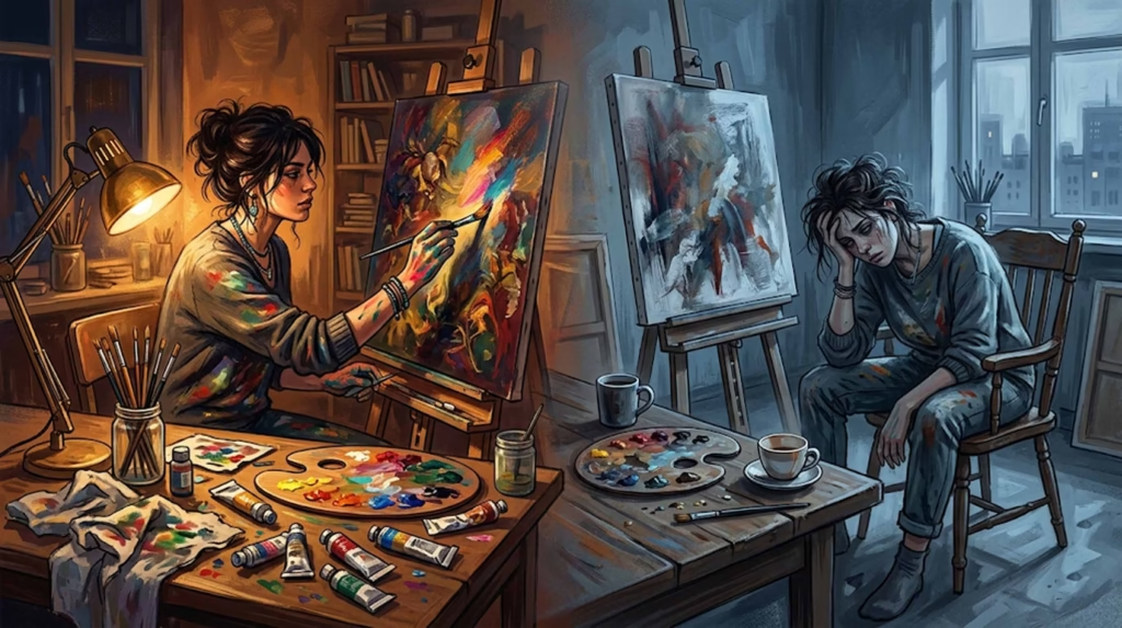
Have you ever stood before a Renaissance masterpiece and felt completely captivated, unable to look away? That magnetic pull isn’t magic—it’s masterful composition at work. The Old Masters didn’t stumble upon greatness by accident. They developed sophisticated techniques that guided viewers’ eyes, created emotional impact, and told compelling visual stories.
The best part? These same techniques work just as powerfully today, whether you’re painting with oils, creating digital art, or even taking photographs. In this comprehensive guide, we’ll decode seven essential composition techniques from history’s greatest artists and show you exactly how to apply them to your modern work.
Why Old Master Composition Techniques Still Matter
Before we dive into specific techniques, let’s address the obvious question: why should contemporary artists care about methods developed centuries ago?
The human eye hasn’t evolved. The same visual principles that captivated viewers in the 1600s still work today because our brains process visual information the same way. What made a Caravaggio painting stop people in their tracks then will stop them scrolling through Instagram now.
They solved fundamental problems. Renaissance and Baroque artists faced the same challenges we do: how to create focal points, establish hierarchy, suggest depth, and evoke emotion. Their solutions, refined over generations, remain remarkably effective.
They’re proven over time. These aren’t trendy techniques that might fall out of favor. They’ve been tested across centuries, cultures, and countless artistic styles.
1. The Dynamic Symmetry Revolution: Moving Beyond the Rule of Thirds
Most artists learn the rule of thirds as their first composition guideline. While useful, it’s actually a simplified version of something far more sophisticated: dynamic symmetry, the mathematical approach favored by Leonardo da Vinci and other Renaissance masters.
What Dynamic Symmetry Really Is
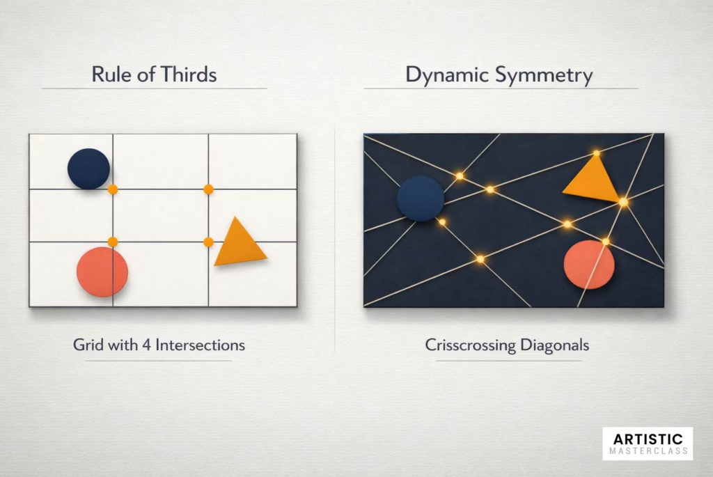
Dynamic symmetry uses diagonal lines within rectangular formats to create naturally pleasing proportions. Unlike the rule of thirds’ static grid, dynamic symmetry creates compositions that feel alive and in motion.
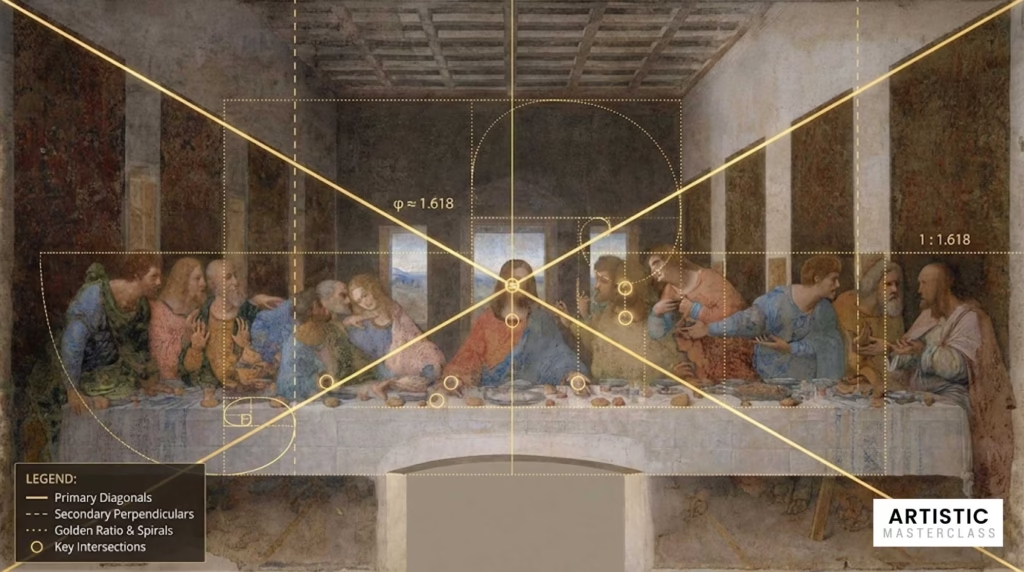
Leonardo’s “The Last Supper” demonstrates this perfectly. The painting’s power doesn’t come from thirds—it comes from carefully calculated diagonal relationships that create visual tension and guide your eye through the narrative.
The Golden Rectangle Method
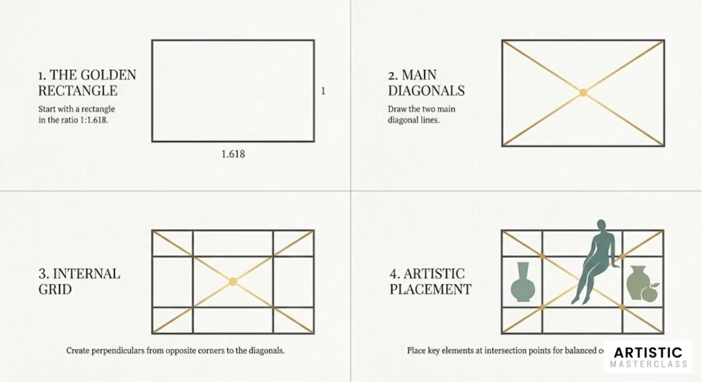
Renaissance artists often started with a “golden rectangle” (proportioned 1:1.618) and used its internal diagonals to place key elements. Here’s how to apply this:
- Draw your rectangle in golden ratio proportions
- Add diagonal lines from corner to corner
- Draw perpendicular lines from the opposite corners to these diagonals
- Place important elements where these lines intersect
Modern Application: This works brilliantly for digital art composition. In Photoshop or similar software, create guides using these proportions before you start painting or drawing.
Why It’s Better Than Rule of Thirds
While the rule of thirds creates adequate compositions, dynamic symmetry creates compelling ones. The diagonal relationships add energy and movement that simple horizontal and vertical divisions can’t match.
Pro Tip: Combine both methods. Use dynamic symmetry for your overall composition structure, then fine-tune element placement with rule of thirds if needed.
2. Triangular Compositions: The Renaissance Secret Weapon
Walk through any major art museum, and you’ll notice something fascinating: many of the most beloved Renaissance paintings organize their figures into triangular arrangements. This isn’t coincidence—it’s one of the most powerful composition techniques ever developed.
Why Triangles Work So Well
Triangles suggest stability. The wide base creates a sense of grounding, while the apex draws the eye upward, creating natural visual hierarchy.
They’re inherently dynamic. Unlike squares or circles, triangles have direction and movement built into their shape.
They mirror human psychology. We naturally organize information into hierarchies, and triangular compositions reflect this mental pattern.
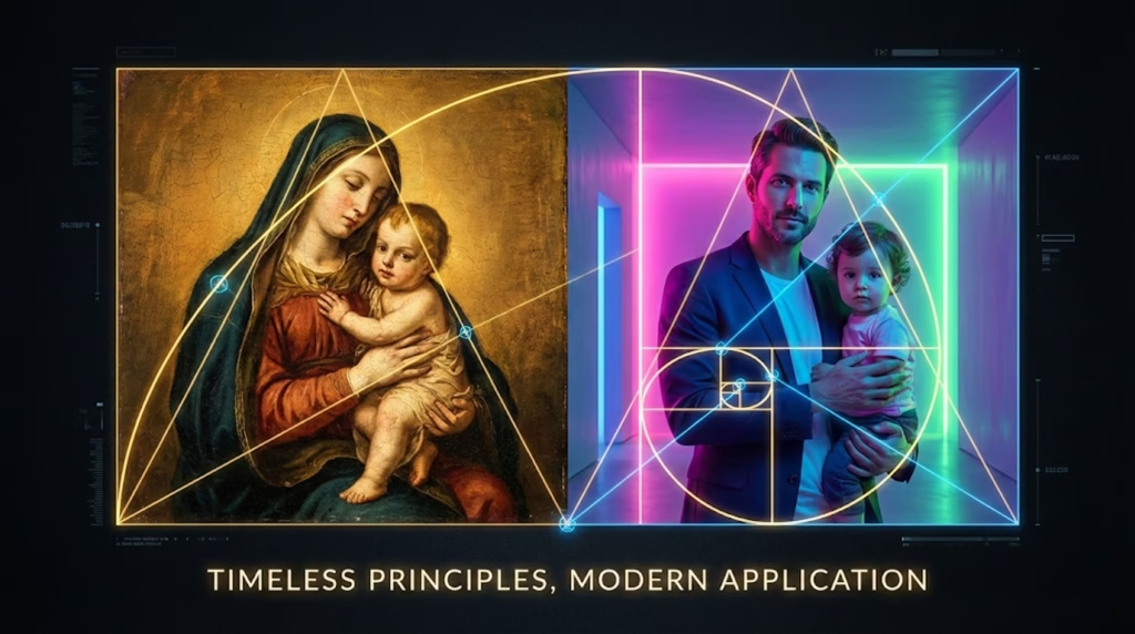
Raphael’s Madonna Mastery
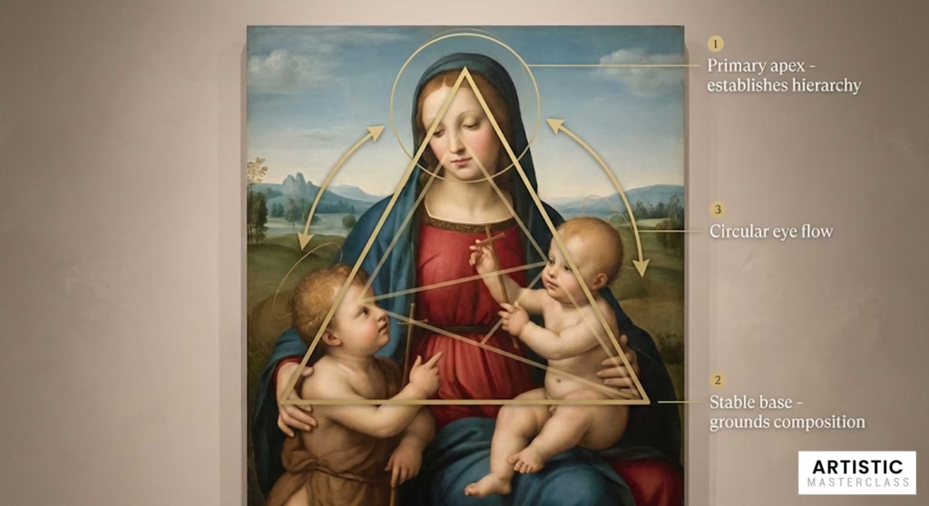
Raphael’s “Madonna of the Meadow” (1505) remains one of the finest examples of triangular composition. The Virgin Mary’s head forms the apex, while the Christ child and young John the Baptist create the base. This arrangement:
- Establishes Mary as the primary figure (highest point)
- Creates stability through the wide base
- Guides the eye in a natural circular motion around the triangle
Modern Triangular Applications
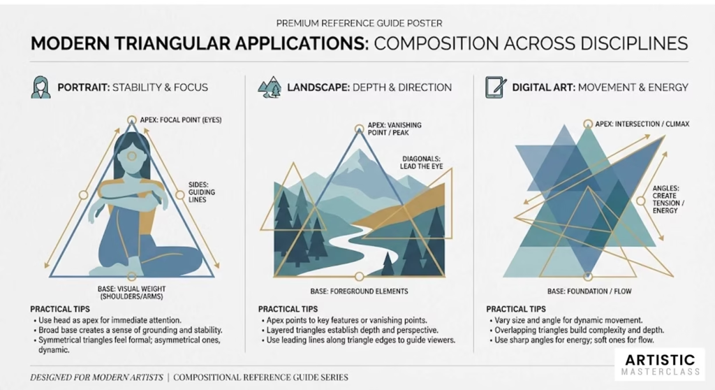
For Portrait Artists:
- Position the subject’s head at the triangle’s apex
- Use arms, shoulders, or props to create the base
- Vary triangle orientation (upward-pointing for strength, inverted for tension)
For Landscape Artists:
- Use mountains, trees, or buildings as triangle points
- Create multiple triangles for complex compositions
- Break the triangle occasionally for added interest
For Digital Artists:
- Use layers to test different triangular arrangements
- Experiment with color triangles, not just shape triangles
- Combine multiple small triangles within larger ones
Advanced Triangular Techniques
The Broken Triangle: Deliberately interrupt one side of your triangle to create tension and visual interest. Caravaggio often used this technique to add drama.
Multiple Triangle Systems: Layer several triangular compositions of different sizes. This creates visual rhythm and prevents monotony.
Color Triangles: Arrange your three dominant colors in a triangular pattern across the composition, even if the shapes themselves aren’t triangular.
3. Chiaroscuro: Caravaggio’s Revolutionary Drama Technique
No discussion of Old Master composition would be complete without exploring chiaroscuro—the dramatic use of light and shadow that Caravaggio elevated to an art form. This technique doesn’t just create visual impact; it’s a powerful compositional tool that can transform ordinary subjects into extraordinary art.
Understanding True Chiaroscuro

Chiaroscuro literally means “light-dark” in Italian, but it’s more than just contrast. It’s the strategic use of light and shadow to:
- Create focal points by illuminating what’s important
- Establish mood and atmosphere
- Suggest three-dimensional form on a flat surface
- Guide the viewer’s eye through the composition
Caravaggio’s Revolutionary Approach
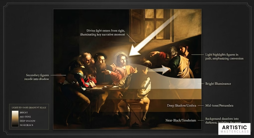
Caravaggio took chiaroscuro to extremes, often painting figures emerging from almost pure black backgrounds, lit by a single dramatic light source. Look at his “The Calling of Saint Matthew” (1599-1600):
- The background dissolves into darkness
- A single shaft of light illuminates the key figures
- The light literally points to the most important narrative moment
- Secondary figures fade into shadow, creating clear hierarchy
The Single Light Source Rule
One of Caravaggio’s most important innovations was using a single, identifiable light source—usually positioned outside the picture frame. This created:
Unified lighting logic throughout the painting Dramatic shadows that added depth and volume Clear focal hierarchy based on how much light each element received
Modern Chiaroscuro Applications
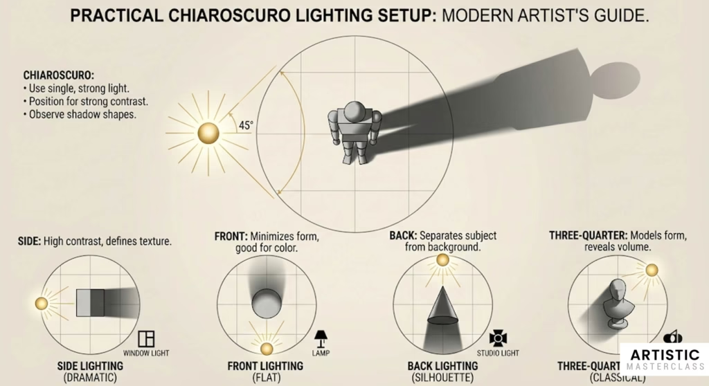
For Traditional Artists:
- Set up a single strong light source when working from life
- Use warm light against cool shadows for maximum impact
- Paint your darkest darks first, then work toward the light
- Don’t be afraid of losing details in shadow areas
For Digital Artists:
- Create a separate layer for your lighting scheme
- Use dramatic gradients from light to dark
- Employ rim lighting to separate figures from backgrounds
- Study photography lighting setups for inspiration
For Photographers:
- Master window light photography
- Use reflectors to control shadow areas
- Experiment with single speedlight setups
- Study how light falls naturally throughout the day
The Emotional Power of Chiaroscuro
Chiaroscuro isn’t just a technical technique—it’s an emotional one. Different lighting approaches create different feelings:
- High contrast lighting suggests drama, conflict, or spiritual significance
- Soft, gradual transitions create intimacy and calm
- Harsh side lighting adds tension and mystery
- Warm light sources feel welcoming and safe
Advanced Chiaroscuro Concepts
Tenebrism: Caravaggio’s most extreme approach, where large areas of the painting disappear into darkness. Use this when you want maximum drama and focus.
Sfumato: Leonardo’s softer approach to light and shadow transitions. Perfect for creating dreamy, atmospheric effects.
Cangiante: Using color shifts instead of value shifts to model form. Advanced technique that works well in stylized or fantastical artwork.
4. Leading Lines: How the Masters Guided Your Eye
One of the most sophisticated aspects of Old Master composition is how seamlessly they guide viewers through their paintings. This wasn’t accidental—they used carefully planned leading lines to create visual pathways that told stories and created emotional journeys.
The Psychology Behind Leading Lines
Human eyes naturally follow lines, especially when those lines point toward something interesting. The Old Masters understood this instinctively and used it to create compositions that felt effortless to “read.”
Vermeer’s Subtle Mastery
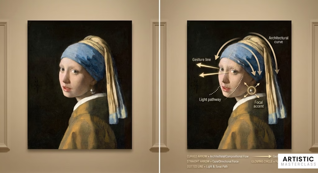
Johannes Vermeer was perhaps the most subtle master of leading lines. In “Girl with a Pearl Earring,” notice how:
- The curve of her turban leads to her face
- Her gaze direction creates an invisible line
- The lighting creates soft lines across her features
- Even her pearl creates a small circular line that draws attention
Unlike obvious leading lines (like a road receding into the distance), Vermeer’s lines feel natural and unforced.
Types of Leading Lines in Old Master Paintings
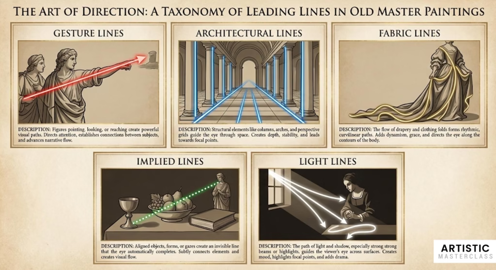
Gesture Lines: The direction figures are looking or pointing Architectural Lines: Columns, arches, floor patterns Fabric Lines: Drapery folds, clothing edges Implied Lines: Created by aligned objects or color relationships Light Lines: The path light takes across a surface
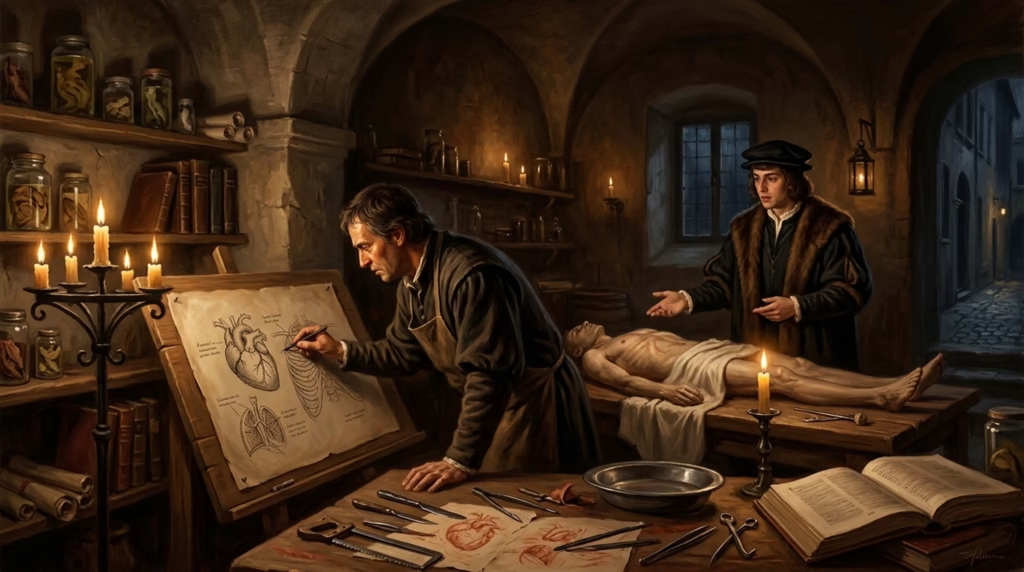
Leonardo’s Geometric Planning
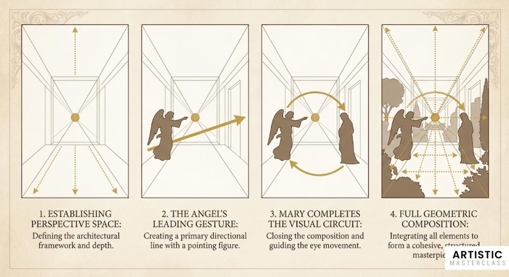
Leonardo da Vinci was obsessed with geometric relationships in his compositions. In “The Annunciation,” he uses:
- The architecture to create perspective lines
- The angel’s gesture to point toward Mary
- Mary’s body position to complete the visual circuit
- Garden elements to create subtle depth lines
Modern Leading Line Applications
For Contemporary Artists:
Plan your lines before you start. Sketch thumbnail compositions focusing only on major line directions.
Use S-curves for graceful movement. The human eye loves following gentle S-shaped paths through compositions.
Create line hierarchies. Primary lines lead to your focal point, secondary lines support the primary ones.
Break lines strategically. Interrupted lines create visual tension and can redirect attention.
For Digital Artists:
Use layer opacity to test line strength. Make leading lines more or less obvious by adjusting their visual weight.
Combine multiple line types. Mix obvious lines (like horizon lines) with subtle ones (like color gradients).
Consider screen viewing patterns. Western viewers typically scan from left to right, top to bottom.
Advanced Leading Line Techniques
The Circuit Composition: Create a complete visual path that loops back to the starting point, keeping viewers engaged longer.
Counter-Leading Lines: Use lines that oppose your main direction to create visual tension and interest.
Line Weight Variation: Make some lines stronger (thicker, higher contrast) and others weaker to create visual hierarchy.
5. The Golden Spiral: Nature’s Perfect Composition Tool
While many artists know about the rule of thirds, fewer understand the golden spiral—a composition tool based on the Fibonacci sequence that appears throughout nature and Old Master paintings. This technique creates compositions that feel inherently “right” to human eyes.
Understanding the Golden Spiral
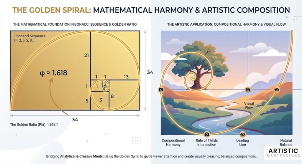
The golden spiral is based on the golden ratio (1:1.618), a mathematical relationship found everywhere in nature—from nautilus shells to galaxy formations. Renaissance artists discovered that compositions based on this ratio felt naturally harmonious to viewers.
Turner’s Landscape Mastery
J.M.W. Turner, though technically post-Renaissance, perfected the use of golden spiral composition in his landscapes. His paintings demonstrate how this technique can create:
- Natural focal points where the spiral’s curve tightens
- Flowing movement that guides the eye through the scene
- Balanced asymmetry that feels both dynamic and stable
How to Apply the Golden Spiral
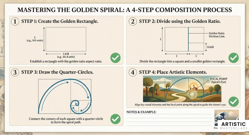
Step 1: Create your golden rectangle (1:1.618 proportions)
Step 2: Divide it using the golden ratio to create a series of smaller rectangles
Step 3: Draw quarter-circles in each rectangle, connecting them to form the spiral
Step 4: Place your main elements along the spiral’s curve, with your focal point near the spiral’s center
Modern Golden Spiral Applications
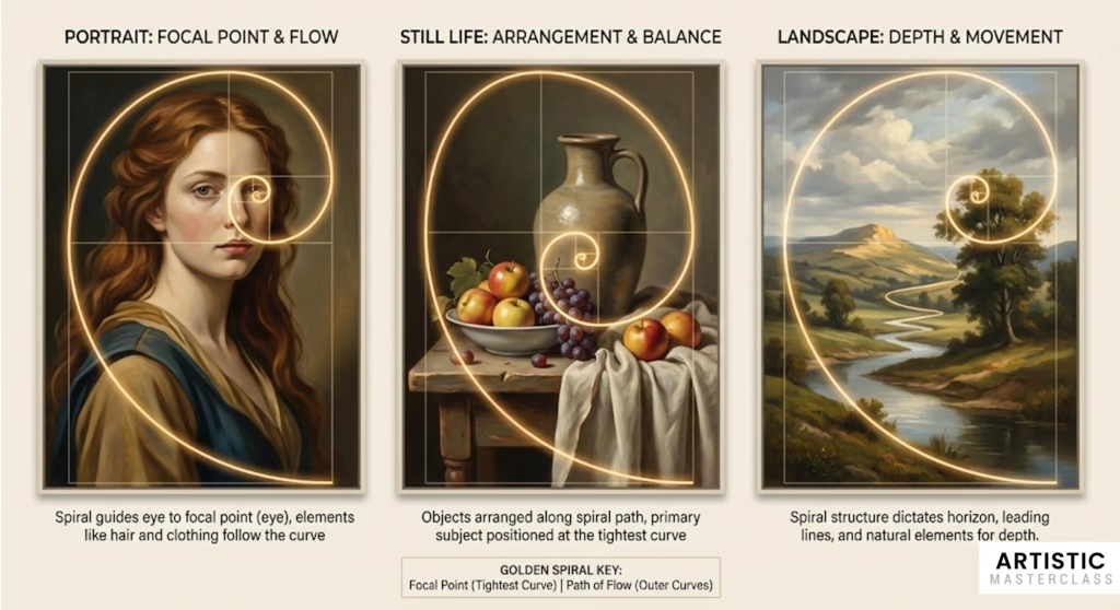
For Landscape Artists:
- Position horizon lines along the spiral’s path
- Place focal elements (trees, buildings, figures) at spiral intersections
- Use the spiral to plan cloud formations or water flow
For Still Life Artists:
- Arrange objects along the spiral’s curve
- Use the tightest spiral point for your primary focal object
- Let background elements follow the spiral’s wider curves
For Portrait Artists:
- Position eyes near the spiral’s focal point
- Use hair, clothing, or gestures to follow the spiral’s flow
- Create depth by placing elements at different points along the spiral
Why the Golden Spiral Works
It mirrors natural growth patterns. Since we see these proportions constantly in nature, they feel familiar and pleasing.
It creates dynamic balance. Unlike symmetrical compositions, the spiral provides stability while maintaining visual interest.
It guides eye movement naturally. The spiral’s curve provides a clear path for visual exploration.
Combining Spiral with Other Techniques
Golden Spiral + Triangular Composition: Use the spiral to determine where to place your triangle’s points.
Golden Spiral + Chiaroscuro: Let your light source follow the spiral’s path, creating natural-feeling dramatic lighting.
Golden Spiral + Leading Lines: Use the spiral as your primary leading line, with secondary lines supporting it.
6. Negative Space Mastery: Learning from Rembrandt’s Backgrounds
One of the most overlooked aspects of Old Master composition is their sophisticated use of negative space—the areas around and between main subjects. Rembrandt van Rijn was perhaps the greatest master of this technique, creating backgrounds that weren’t just empty space, but active participants in the composition.
What Makes Negative Space Powerful
Negative space isn’t just “empty” space—it’s compositional space that serves specific purposes:
- Creates breathing room for main subjects
- Establishes mood and atmosphere
- Provides visual rest areas for the eye
- Can become focal points themselves through careful treatment
Rembrandt’s Background Revolution
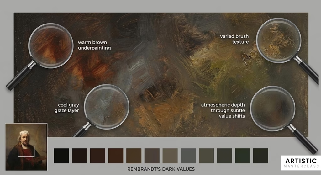
Most artists of Rembrandt’s era painted detailed backgrounds filled with objects and architectural elements. Rembrandt revolutionized this by creating backgrounds that were:
Rich but not detailed: Deep, atmospheric darks that suggested space without showing specific objects Varied in texture: Smooth areas contrasted with rough, painterly sections Responsive to lighting: Backgrounds that participated in the painting’s lighting scheme Emotionally supportive: Dark, mysterious backgrounds for introspective portraits; warmer ones for intimate scenes
The Optical Depth Trick
One of Rembrandt’s most sophisticated techniques was creating the illusion of depth in his dark backgrounds through subtle color and value variations. He achieved this by:
- Mixing warm and cool darks rather than using pure black
- Varying brush texture to suggest different distances
- Using glazing techniques to create atmospheric effects
- Adding tiny accent lights in background areas
Modern Negative Space Applications
For Digital Artists:
- Don’t fill every pixel with detail
- Use gradient tools to create atmospheric backgrounds
- Vary your brush textures in negative space areas
- Consider the emotional impact of your color choices in empty areas
For Traditional Artists:
- Mix your darks from multiple colors, not just black
- Use scumbling techniques to create textural variety
- Let some areas remain unfinished for visual breathing room
- Consider the temperature of your negative spaces
For Photographers:
- Use shallow depth of field to create soft negative spaces
- Experiment with different background lighting
- Don’t be afraid of empty areas in your compositions
- Consider how background colors affect your subject’s mood
Types of Negative Space
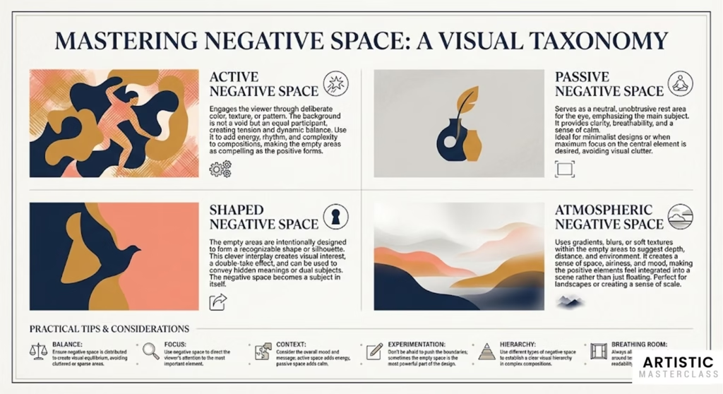
Active Negative Space: Areas that participate in the composition through color, texture, or implied meaning Passive Negative Space: Neutral areas that simply provide rest for the eye Shaped Negative Space: Empty areas that form recognizable shapes themselves Atmospheric Negative Space: Areas that suggest depth, weather, or environmental conditions
Advanced Negative Space Techniques
The Breathing Room Principle: Ensure your main subjects have adequate negative space around them. Crowded compositions feel claustrophobic.
Negative Space Transitions: Create gradual transitions between detailed positive space and simple negative space areas.
Color Temperature in Negative Space: Use warm negative spaces to make subjects feel welcome; cool ones to create distance or melancholy.
Textural Hierarchy: Keep negative space textures simpler than positive space textures to maintain visual hierarchy.
7. Color Temperature for Atmospheric Depth: Monet’s Revolutionary Approach
While earlier masters focused primarily on value and form, Claude Monet revolutionized composition through his understanding of color temperature—the warmth or coolness of colors. This technique creates powerful atmospheric effects and compositional depth that works as effectively today as it did in the 1800s.
Understanding Color Temperature in Composition
Color temperature isn’t just about making things look “realistic”—it’s a compositional tool that can:
- Create depth by using warm colors to advance and cool colors to recede
- Establish mood through temperature relationships
- Guide the eye by using temperature contrasts as focal points
- Unify compositions through consistent temperature schemes
Monet’s Atmospheric Breakthrough
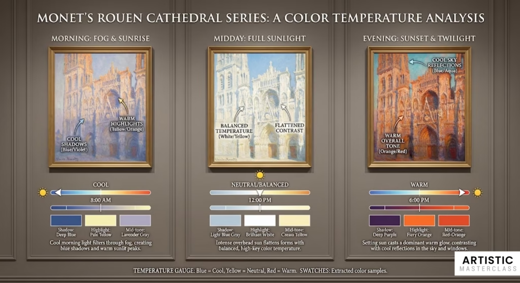
Monet’s genius lay in observing how atmospheric conditions affect color temperature throughout a scene. In his famous cathedral series, he demonstrated how:
- Morning light creates cool shadows with warm highlights
- Midday sun flattens color temperature differences
- Evening light bathes everything in warm tones with cool sky reflections
- Atmospheric haze shifts distant objects toward cooler temperatures
The Warm-Advances, Cool-Recedes Principle
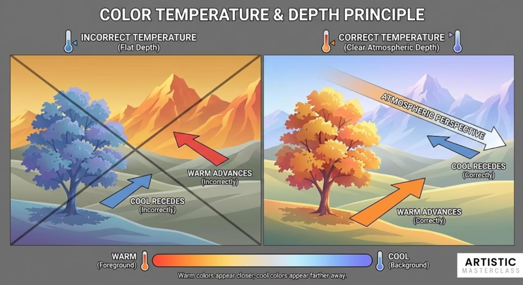
This fundamental principle works because of how human vision processes wavelengths:
Warm colors (reds, oranges, yellows) appear to come forward Cool colors (blues, purples, blue-greens) appear to recede Neutral colors can appear warm or cool depending on context
Modern Color Temperature Applications
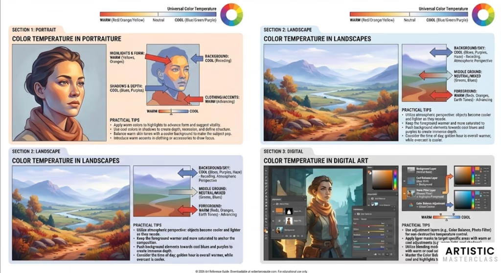
For Landscape Artists:
- Foreground: Use warmer temperatures to bring elements forward
- Middle ground: Mix warm and cool temperatures for transitional depth
- Background: Shift toward cooler temperatures for atmospheric perspective
- Sky: Often coolest area, providing contrast for warm land elements
For Portrait Artists:
- Skin tones: Generally warm, but use cool accents in shadow areas
- Background: Cool backgrounds make warm skin tones pop forward
- Clothing: Use temperature contrast to separate figure from background
- Hair: Can be neutral temperature, allowing flexibility in composition
For Digital Artists:
- Use adjustment layers to test different temperature schemes
- Create depth maps based on temperature rather than just value
- Experiment with split-complementary temperature schemes
- Use gradient maps to establish consistent temperature relationships
Advanced Color Temperature Techniques
Temperature Transitions: Create smooth transitions from warm to cool across your composition for natural-feeling depth.
Temperature Spotlighting: Use a small area of contrasting temperature as a focal point—like a warm window light in a cool evening scene.
Reflected Color Temperature: Show how different light sources affect the same objects with different color temperatures.
Emotional Temperature: Use overall warm or cool schemes to support your composition’s emotional message.
Combining Temperature with Other Techniques
Temperature + Chiaroscuro: Use warm light sources against cool shadows for maximum dramatic impact.
Temperature + Leading Lines: Create lines that transition from warm to cool to guide the eye through space.
Temperature + Negative Space: Use cooler negative spaces to make warmer positive spaces more prominent.
Putting It All Together: Creating Your Masterpiece
Now that we’ve explored these seven techniques individually, the real magic happens when you combine them strategically. The Old Masters didn’t use just one technique per painting—they layered multiple approaches to create compositions of extraordinary power and sophistication.
The Planning Process
Before you touch brush to canvas (or stylus to tablet), spend time planning your composition:
- Choose your primary technique based on your artistic goals
- Sketch thumbnail compositions exploring different arrangements
- Test your composition using the techniques covered in this guide
- Refine and adjust before committing to your final piece
Common Combination Strategies
Drama and Focus: Combine chiaroscuro with triangular composition for powerful, focused compositions Natural Flow: Use golden spiral with color temperature for organic, harmonious arrangements Dynamic Balance: Combine dynamic symmetry with leading lines for energetic but controlled compositions
Modern Tools for Old Master Techniques
Digital artists have advantages the Old Masters could only dream of:
- Layer systems for testing different approaches
- Adjustment tools for fine-tuning color temperature and contrast
- Transformation tools for experimenting with proportions
- Blend modes for creating atmospheric effects
Practice Exercises
Exercise 1: Master Study Analysis Choose three Old Master paintings and identify which techniques from this guide they use. Sketch diagrams showing the underlying composition structure.
Exercise 2: Technique Isolation Create six small compositions (digital or traditional), each focusing on one specific technique from this guide.
Exercise 3: Combination Practice Choose two techniques and create a composition that demonstrates both working together harmoniously.
Exercise 4: Modern Application Take a photo you’ve taken or find a reference image, then create a new composition applying Old Master principles to contemporary subject matter.
Conclusion: Your Journey Toward Masterful Composition

The techniques we’ve explored represent centuries of artistic evolution and refinement. They’ve been tested by countless artists across cultures and time periods, and they continue to work because they’re based on fundamental principles of human visual perception.
Remember that mastery takes time. The Old Masters didn’t develop these techniques overnight, and you won’t master them immediately either. But by understanding these principles and practicing them consistently, you’ll begin to see dramatic improvements in your compositional skills.
Start with one technique that resonates most strongly with you. Practice it until it becomes intuitive, then gradually incorporate others. Before long, you’ll find yourself automatically considering these principles as you create, just as the masters did.
Most importantly, don’t let technique overshadow creativity. These tools should enhance your artistic vision, not constrain it. Use them as a foundation for your unique creative expression.
The Old Masters gave us these gifts across the centuries. Now it’s your turn to carry them forward, adapting timeless principles for contemporary expression. Your artistic journey awaits—armed with the wisdom of history’s greatest artists, there’s no limit to what you can create.
What’s your favorite Old Master technique? Let us know in the comments below, and share examples of how you’ve applied these principles in your own work.