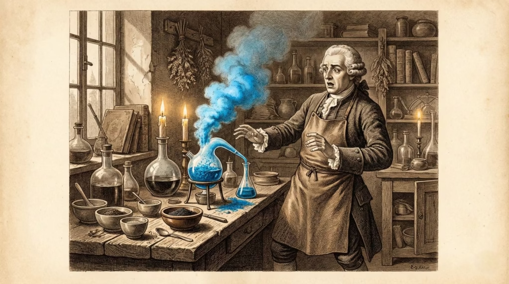
Imagine a Renaissance workshop in Florence, 1485. A master painter carefully applies a tiny amount of brilliant blue to the Virgin Mary’s robe on a massive altarpiece. His apprentice watches nervously—the pigment being applied costs more per ounce than gold. One mistake, one spilled drop, could bankrupt the workshop. The blue came from a single mountain range in Afghanistan, traveled months along the Silk Road through dozens of hands, and required weeks of grinding and washing to extract from stone. This wasn’t just paint. It was liquid wealth reserved for depicting divinity itself.
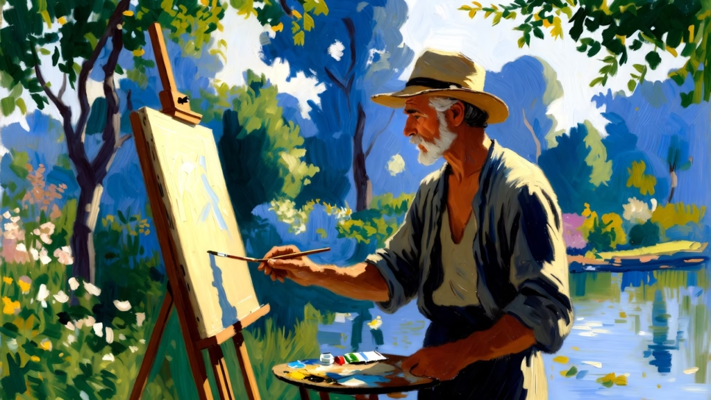
Fast forward to 1874. Claude Monet stands in his garden at Argenteuil, squeezing generous amounts of blue directly from a metal tube onto his palette. He’s painting outdoors—something nearly impossible just decades earlier—using synthetic ultramarine that costs a fraction of what his Renaissance predecessors paid. He mixes it freely, applies it boldly, uses it for shadows and skies and water reflections without a second thought about cost. The same color that once signified heaven and royalty is now available to any artist with a few francs.

This is the story of how color pigments changed art—not just aesthetically, but economically, socially, and creatively. You’ll discover how material constraints shaped artistic hierarchies for centuries, how accidental chemistry revolutionized what painters could create, and how the journey from natural scarcity to synthetic abundance democratized art-making itself. We’ll trace blue pigments specifically—from ancient Egyptian innovations through medieval ultramarine economics to modern synthetic breakthroughs—because blue’s evolution reveals the clearest patterns of how materials dictate artistic possibility.
This article examines five turning points across 5,000 years where new pigments fundamentally changed what artists could create, who could be an artist, and how visual culture developed. Along the way, you’ll see how the same forces that drove pigment innovation—economics, chemistry, global trade, and human creativity—continue shaping art today.
The Paradox of Blue – Why This Color Demanded Innovation
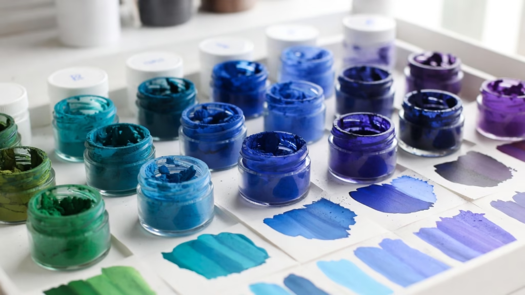
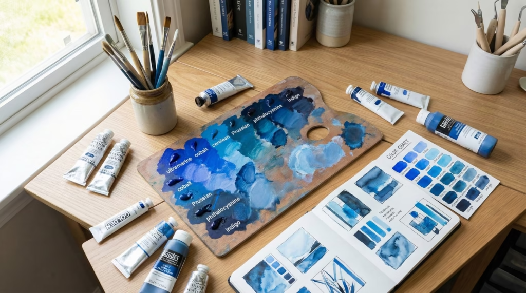
Walk into any art supply store today and you’ll find dozens of blue pigments—from cerulean to cobalt, ultramarine to phthalocyanine. This abundance makes it easy to forget that for most of human history, blue was the most problematic color in an artist’s palette. Understanding why requires looking at nature itself.
The Scarcity of Blue in Nature
Earth pigments—the ochres, umbers, and siennas that give us yellows, browns, and reds—come from iron oxide deposits found virtually everywhere. Clay containing these minerals can be dug from the ground, dried, and used directly as pigment. Ancient artists had ready access to warm colors simply by collecting the right dirt.
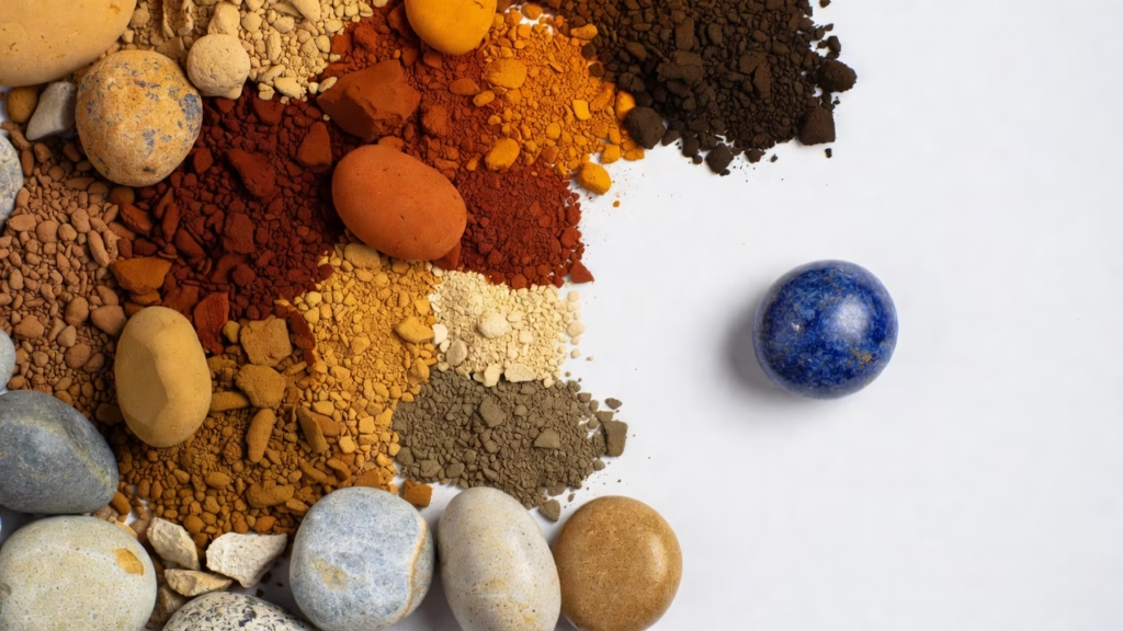
Blue is different. Stable blue compounds are exceptionally rare in minerals. While iron oxides are abundant and create warm colors, the copper and cobalt compounds that produce blues occur in far fewer locations and forms. This isn’t just historical inconvenience—it’s chemistry. The molecular structures that absorb light in ways our eyes perceive as blue are more complex and less commonly formed in nature than those creating other colors.
The few natural blue options available to ancient and medieval artists each had serious limitations. Azurite, a copper carbonate mineral, provided a decent blue but was never as vibrant as desired and had a troubling tendency to degrade into green over time. Indigo and woad, organic dyes from plants, were too transparent and fugitive for permanent painting applications—they faded quickly when exposed to light.
This scarcity created symbolic value that transcended mere aesthetics. When a color is genuinely rare in your environment, it becomes special. Across cultures, blue’s scarcity led to its association with the divine and precious.
Blue’s Cultural and Symbolic Importance
In ancient Egypt, blue represented the heavens, the gods, and the life-giving Nile River. The color was essential for religious art and funerary objects meant to ensure safe passage to the afterlife. Without blue, Egyptian sacred art couldn’t fulfill its spiritual purpose.
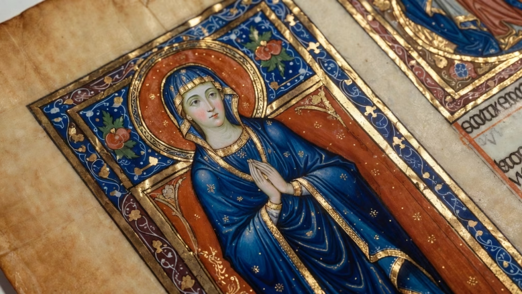
Medieval Christianity reserved blue specifically for the Virgin Mary’s robes in religious paintings. This wasn’t arbitrary—it reflected a careful theological hierarchy. Gold represented God the Father, red symbolized Christ’s sacrifice, and blue denoted Mary’s divine grace and heavenly connection. Using cheap substitutes for Mary’s robes would have been seen as spiritually inappropriate, even heretical.
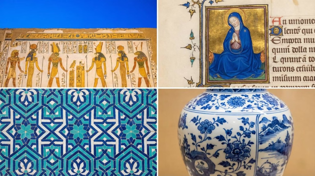
Islamic architecture and manuscript illumination elevated blue tiles and calligraphy to extraordinary levels. The famous blue tiles of Isfahan, the brilliant illuminations in Qur’an manuscripts—these required technological innovation driven by religious and cultural importance.
In East Asia, blue-and-white ceramics became symbols of refinement and status. Chinese potters developed specialized blue pigments for porcelain decoration that would eventually influence global trade patterns. Japanese culture elevated indigo dyeing to an art form, though painters still struggled to achieve intense blues.
Key insight: Religious and cultural significance created economic demand that motivated centuries of experimentation. Blue wasn’t just desirable—it was necessary for expressing the sacred, the divine, and the precious across civilizations.
The Economics of Color Hierarchy
This spiritual importance translated directly into material economics. Medieval and Renaissance painting contracts explicitly specified pigment quality and quantity, particularly for blues. These weren’t casual agreements—they were legal documents that could make or break both artist and patron financially.
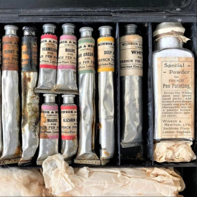
A 1485 contract for Domenico Ghirlandaio to paint the Tornabuoni Chapel frescoes in Florence specified the exact amount and quality of ultramarine to be used. The contract stated that the blue must be “ultramarine of the value of four florins the ounce.” For context, four florins represented about two months of a skilled craftsman’s wages. The contract also detailed exactly which figures would receive this expensive blue and which could use cheaper azurite.
Guild regulations in medieval Europe controlled pigment purity and usage with the same rigor applied to precious metals. The Venetian painters’ guild, which held a near-monopoly on ultramarine processing by the 15th century, maintained strict standards. Adulterating ultramarine with cheaper blues could result in fines, expulsion from the guild, or worse.
The apprenticeship system was partly built around learning to prepare and apply expensive pigments. Apprentices spent years grinding pigments and learning the complex extraction process for ultramarine before being trusted to apply it. The ability to work with costly materials signified advancement from apprentice to journeyman.
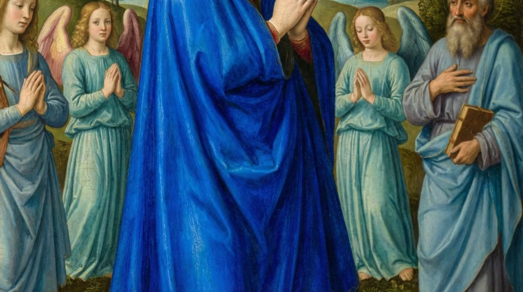
This created strategic usage patterns visible in Renaissance paintings. Expensive blues appear in foregrounds and on important figures—the Virgin Mary, Christ, saints, or wealthy patrons who commissioned the work. Cheaper alternatives fill backgrounds, minor figures’ clothing, and less significant areas. Looking at a Renaissance altarpiece, you can literally map the painting’s budget by tracking where the expensive blue appears.
Practical example: In Jan van Eyck’s “Ghent Altarpiece” (1432), the Virgin Mary’s robe gleams with the finest ultramarine, applied generously and glazed for maximum brilliance. Her position at the center of the composition justifies the expense. Meanwhile, figures in outer panels show more restrained use of cheaper azurite mixed with white to extend the blue. Van Eyck wasn’t being cheap—he was following both artistic convention and economic necessity.
This economic reality shaped not just individual paintings but entire artistic traditions. The hierarchy of subjects in Western art—religious scenes at the top, portraits next, landscapes at the bottom—partly reflected material costs. Landscapes rarely required expensive ultramarine, while religious paintings demanded it.
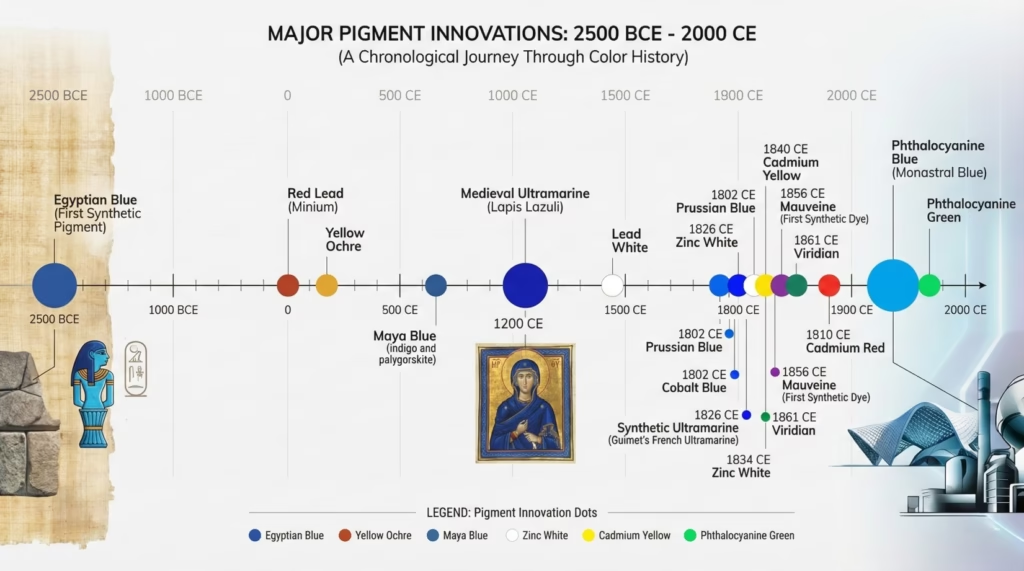
Turning Point #1 – Egyptian Blue: Humanity’s First Synthetic Color (c. 2500 BCE)
The story of synthetic pigments doesn’t begin in the Industrial Revolution. It starts 4,500 years ago along the Nile, where Egyptian artisans achieved what seems almost miraculous: they invented a completely artificial color never found in nature.
The Chemistry of Ancient Innovation
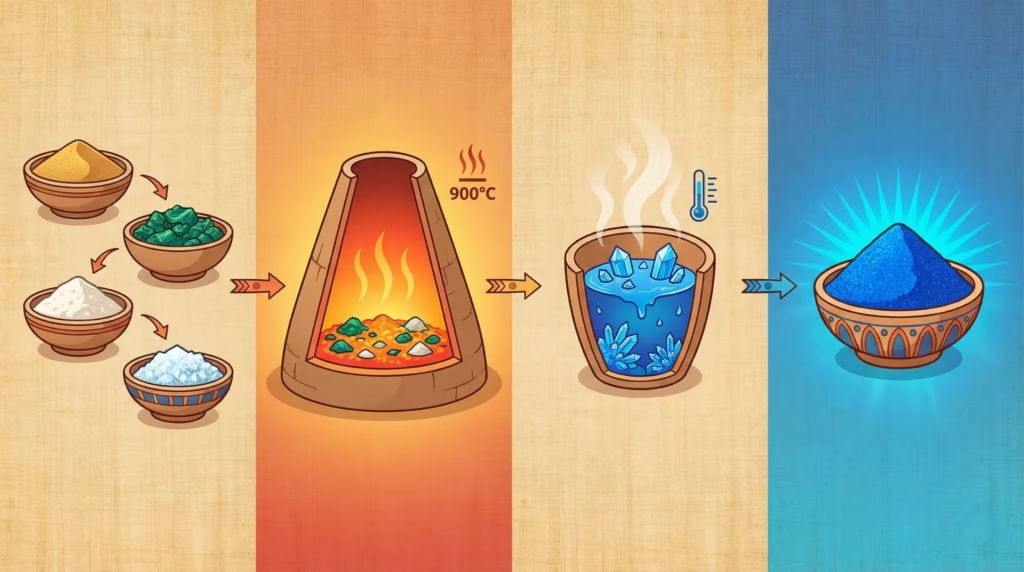
Egyptian blue, chemically known as calcium copper silicate (CaCuSi₄O₁₀), doesn’t occur naturally anywhere on Earth. Creating it required understanding principles of high-temperature chemistry that wouldn’t be formally studied for thousands of years.
The manufacturing process involved heating a precise mixture of ingredients to approximately 900°C (1,650°F) and holding that temperature for hours. The recipe: ground quartz sand or crushed quartz pebbles, a copper compound (from minerals like malachite), calcium carbonate (from limestone or shells), and an alkali flux (natron, a naturally occurring salt in Egypt).
Getting this right required remarkable technical sophistication. Too low a temperature and the materials won’t fuse into the proper crystalline structure. Too high and the mixture degrades. The proportions had to be correct—too much copper makes a darker, less vibrant blue; too little produces a pale, weak color. Ancient Egyptian workshops somehow determined the optimal ratios and firing procedures through trial and error.
Archaeological evidence shows Egyptian blue production on an industrial scale. Workshops at sites like Amarna and Memphis produced the pigment commercially, with standardized manufacturing processes passed down through generations. The consistency of Egyptian blue across centuries and regions indicates sophisticated quality control.
Why this was revolutionary: Creating Egyptian blue required controlled application of chemical principles 2,500 years before the scientific revolution. Ancient Egyptians didn’t have our understanding of molecular structures or chemical reactions, yet they successfully synthesized a compound through empirical experimentation that rivals modern material science in complexity.
Egyptian Blue in Ancient Art
The pigment appears throughout Egyptian art, from tomb paintings to sarcophagi, faience objects to architectural decoration. Its uses reveal how essential this color was to Egyptian culture.
In Tutankhamun’s funerary mask (c. 1323 BCE), Egyptian blue creates the distinctive striped pattern on the nemes headdress. The color’s permanence ensured these stripes would remain vibrant for over 3,000 years—as they have. Egyptian blue’s stability exceeded most organic colors, which faded or degraded over centuries.
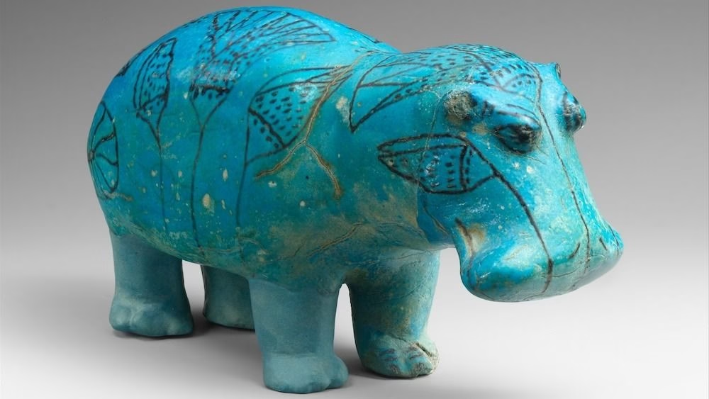
Tomb paintings used Egyptian blue extensively for sky, water, and divine figures. The tomb of Nefertari (c. 1255 BCE) shows the pigment’s full glory—brilliant blue backgrounds representing the night sky through which the deceased travels to the afterlife. Without this specific blue, the entire theological message of the painting would be compromised.
The “Book of the Dead” papyri employed Egyptian blue for hieroglyphs and divine figures. These weren’t merely decorative choices—the color carried spiritual significance. Using an inferior blue would have been like printing a Bible with pages falling apart; it would undermine the text’s sacred purpose.
Egyptian blue spread beyond Egypt through trade and cultural exchange. Greeks and Romans adopted the pigment, calling it “caeruleum.” Pompeii’s frescoes, preserved by volcanic ash in 79 CE, show extensive use of Egyptian blue more than 2,000 years after its invention. The pigment became a standard of the ancient Mediterranean world.
Modern Rediscovery and Analysis
After the fall of the Roman Empire, the knowledge of how to make Egyptian blue was lost. The recipe disappeared from European practice for over a thousand years. Medieval and Renaissance artists knew ancient artworks contained a mysterious brilliant blue they couldn’t replicate, but the manufacturing method remained unknown.
In the 19th century, chemists began analyzing ancient pigments scientifically. They identified Egyptian blue’s composition and realized it was entirely synthetic—a revelation that challenged assumptions about ancient technological capabilities. Here was proof that sophisticated material science predated modern chemistry by millennia.
The 21st century brought even more surprising discoveries. In 2015, researchers found that Egyptian blue exhibits near-infrared fluorescence—when illuminated with visible light, it emits infrared radiation invisible to the human eye but detectable by special cameras. This property is now being used to analyze ancient artworks, revealing details invisible in normal light. Wall paintings previously thought lost due to fading or damage are being read again using this fluorescence.
This discovery has practical modern applications beyond art history. Researchers are investigating Egyptian blue for use in cooling pigments (the infrared emission could help buildings stay cooler), infrared detectors, and other photonic applications. A 4,500-year-old pigment is inspiring cutting-edge material science.
Actionable takeaway: Egyptian blue demonstrates that “synthetic” doesn’t mean “modern” or “inferior.” Some of humanity’s longest-lasting, most stable pigments were artificial from the beginning. The dichotomy between “natural” and “synthetic” is far more complex than it appears—sometimes the most enduring materials are those humans engineer specifically for purpose.
Turning Point #2 – Lapis Lazuli and Ultramarine: The “Blue Gold” of Medieval and Renaissance Art (c. 1000-1800 CE)
If Egyptian blue was humanity’s first triumph over blue’s scarcity, ultramarine was the color that defined an entire economic system around pigments. For nearly eight centuries, this single color—extracted from a semi-precious stone found in one remote mountain range—shaped artistic practice, guild structures, and painting prices across Europe.
From Afghan Mountains to European Workshops – The Journey of Lapis
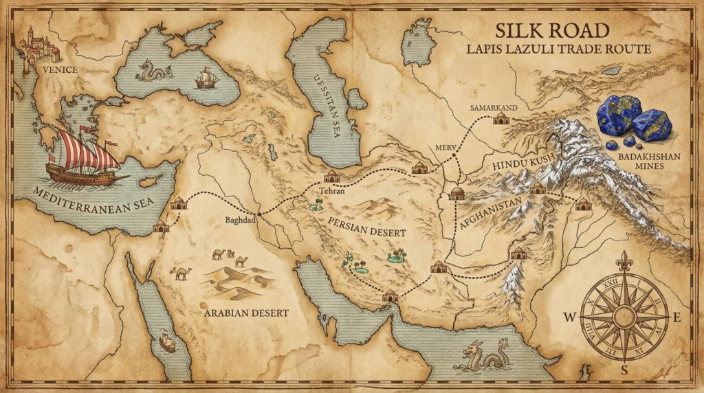
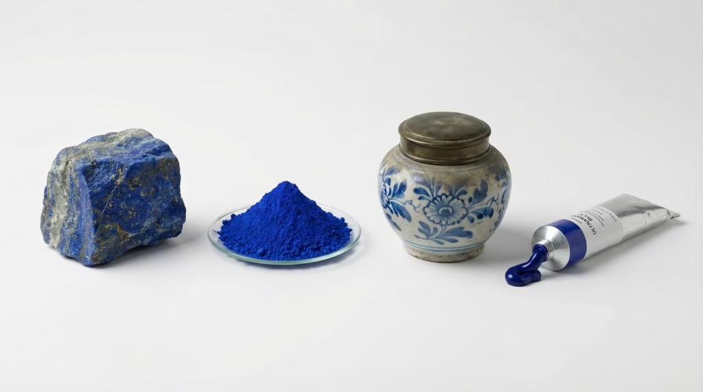
Lapis lazuli forms through metamorphic processes deep underground, requiring specific geological conditions that occur in few places. Until the 19th century, the only significant source was the Sar-e-Sang mines in Badakhshan, Afghanistan, high in the mountains of the Hindu Kush. The stone had been mined there for over 6,000 years.
The journey from mine to painter’s palette took months and passed through dozens of hands. Lapis traveled the Silk Road trade routes through Central Asia, Persia, the Middle East, and finally into Europe via Venice. Each intermediary—miners, caravan merchants, regional traders, Mediterranean shippers, Venetian importers—added their markup.
By the time lapis reached a European workshop, its price had increased astronomically. In 1508, a single ounce of the highest quality ultramarine pigment cost roughly 6-8 ducats in Venice. For comparison, the same weight in gold cost about 3 ducats. Ultramarine was literally worth more than twice its weight in gold.
But purchasing the stone was only the beginning. Extracting the pure blue pigment from lapis lazuli required a complex, labor-intensive process that could take weeks.
First, the stone had to be carefully ground to a powder without generating too much heat—friction could damage the blue. Then came the extraction process: the ground lapis was mixed with a complex paste of heated resins (pine resin, mastic), wax, and linseed oil, then kneaded underwater for days or even weeks. The blue particles slowly separated from the stone’s impurities (calcite, pyrite) and floated in the water, where they could be collected.
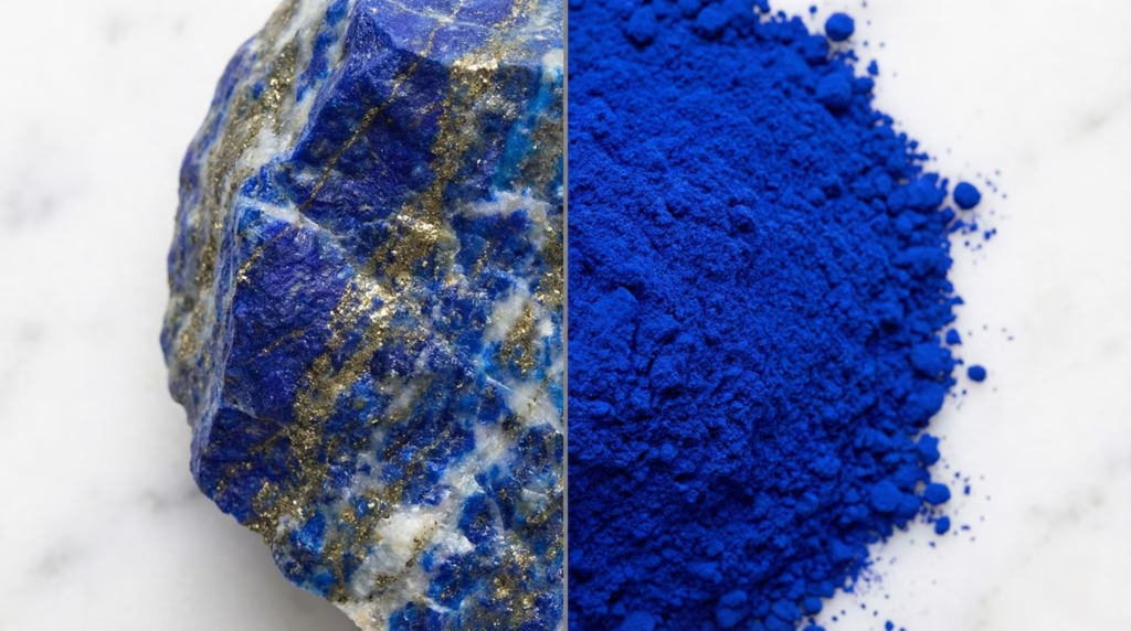
This kneading process was grueling manual labor, often assigned to apprentices. The first extraction yielded the finest, most vibrant blue. Subsequent kneading of the same mixture produced progressively lower quality grades—still blue, but paler and less pure. The lowest grades were barely usable.
Venice established itself as the European center for ultramarine processing by the 15th century, effectively monopolizing the trade. Venetian processors developed the most refined extraction techniques, and Venetian merchants controlled access to Mediterranean shipping routes. This monopoly allowed Venice to maintain premium prices and ensure quality standards.
Cost quantification: To put ultramarine’s price in perspective: In 1492 Florence, a skilled stonemason earned approximately 1 florin per week. The finest ultramarine cost 6-8 florins per ounce. That means a single ounce represented 6-8 weeks of wages—nearly two months of skilled labor. A painter using just one ounce of ultramarine in a painting was consuming economic value equivalent to hundreds of hours of human work.
Ultramarine in Medieval Illuminated Manuscripts
Before ultramarine dominated panel painting, it appeared in the most valuable manuscripts of the medieval period. These illuminated books—painstakingly hand-lettered on vellum (prepared animal skin) and decorated with precious pigments—represented the pinnacle of medieval artistic production.
The “Très Riches Heures du Duc de Berry” (1412-1416), one of history’s most famous illuminated manuscripts, uses ultramarine lavishly. The calendar pages showing monthly activities against architectural and landscape backgrounds employ ultramarine for skies, robes, and decorative borders. The intensity of these blues, still brilliant 600 years later, demonstrates ultramarine’s exceptional lightfastness.
The Lindisfarne Gospels (c. 715-720 CE), created by monks on a remote island off the English coast, contains imported lapis lazuli—evidence of trade networks extending from Afghanistan to the furthest reaches of Christian Europe even before the peak of Silk Road commerce. The monks who created this manuscript considered blue essential enough to justify its enormous cost for religious texts.
In manuscripts, ultramarine served specific symbolic purposes. Heaven, divine light, and the Virgin Mary’s robes received ultramarine. These weren’t arbitrary choices—theological meaning demanded the most precious material. Using a cheaper substitute would have diminished the spiritual significance of the image.
The technical application in manuscripts differed from later panel painting. Manuscript illuminators often applied ultramarine in thick, opaque layers over gold leaf, creating rich, deep blues that seemed to glow. They also used glazing techniques—thin, transparent layers over white grounds—to maximize the color’s luminosity while conserving the expensive pigment.
Renaissance Painting and the Ultramarine Economy
The Renaissance saw ultramarine’s economic impact reach its peak. Contracts for major commissions specify ultramarine amounts and quality with the precision of precious metal transactions.
Domenico Ghirlandaio’s 1485 contract for the Tornabuoni Chapel frescoes states: “The blue must be ultramarine of the value of about four florins the ounce.” The contract continues, specifying exactly which figures would receive this expensive blue. This wasn’t unusual—most major commissions included detailed pigment specifications.
These contracts protected both parties. Patrons ensured they received what they paid for—not cheap azurite passed off as expensive ultramarine. Artists protected themselves from accusations of cutting corners or pocketing pigment money. Ultramarine was expensive enough that financial disputes could end up in court.
This contractual precision shaped artistic choices. Painters designed compositions to concentrate expensive blues where they’d be most visible and symbolically appropriate. The Virgin Mary—the most important figure in most religious paintings—invariably wore ultramarine robes when the commission budget allowed.
Specific artwork analysis:
Titian’s “Bacchus and Ariadne” (1520-1523): Commissioned for the Duke of Ferrara, this mythological painting shows Titian’s strategic use of ultramarine. Ariadne’s dress is rendered in brilliant ultramarine, applied generously and glazed to create depth and luminosity. The sky contains ultramarine mixed with white lead, extending the expensive pigment. Lesser figures and background elements use cheaper alternatives. Titian could deploy ultramarine generously here because he had a wealthy ducal patron—but even he used it strategically rather than uniformly.
Johannes Vermeer’s paintings (1650s-1670s): Vermeer is famous (or infamous, depending on your perspective) for his generous use of ultramarine. “Girl with a Pearl Earring” features ultramarine in the famous turban. “Woman in Blue Reading a Letter” uses ultramarine extensively for the woman’s jacket. Multiple paintings show ultramarine in large areas that would have consumed enormous amounts of expensive pigment.
Art historians have speculated this lavish pigment use contributed to Vermeer’s financial difficulties. He died in 1675 leaving his family in significant debt. While many factors contributed to his financial troubles, his apparent refusal to compromise on materials—using ultramarine where cheaper blues would suffice—may have been one of them.
Substitution Strategies and Technical Properties
Not every commission could afford pure ultramarine. Artists developed substitution strategies for lower-budget works.
Azurite, a copper carbonate mineral that occurs more commonly than lapis lazuli, served as the standard ultramarine alternative. It provided a decent blue at roughly one-tenth the cost. However, azurite had significant drawbacks: it wasn’t as vibrant, it tended to turn green over time through chemical degradation, and it didn’t mix as cleanly with other pigments.
Many Renaissance paintings show strategic layering: cheaper azurite in lower layers and backgrounds, with ultramarine reserved for final glazes on important elements. This approach balanced budget constraints with aesthetic goals.
Smalt—ground blue glass colored with cobalt—appeared in the 16th century as another alternative. It was cheaper than ultramarine but had its own problems: it lost color intensity over time, becoming grayish, and its coarse particle size made it difficult to apply smoothly.
Natural ultramarine’s technical properties:
The pigment consists of sodium aluminum silicate with sulfur (Na₈[Al₆Si₆O₂₄]Sₙ), creating its distinctive hue. The particle size directly affects color intensity and saturation—finer grinding produces more saturated color but requires more careful processing.
Lightfastness: Exceptional. Ultramarine is one of the most permanent pigments known, essentially unchanging when properly protected from acids (which can destroy its blue color). This is why 500-year-old ultramarine still looks brilliant in Renaissance paintings.
Mixing behavior: Ultramarine has relatively weak tinting strength compared to some modern pigments—it takes a lot of ultramarine to significantly shift other colors toward blue. This property actually made it more expensive in practice, as painters needed more of it to achieve desired effects.
Application techniques varied by medium:
- Oil painting: Ultramarine works beautifully in oil, producing deep, rich blues with good transparency for glazing
- Tempera: (egg yolk-based medium common before oil painting dominated) Ultramarine performs well, though slightly less brilliant than in oil
- Fresco: (painting into wet plaster) Ultramarine is one of the few blues that survives the alkaline environment of fresh plaster—another reason for its importance in wall paintings
Key insight: Understanding Renaissance pigment economics helps modern viewers appreciate these paintings differently. That brilliant blue robe isn’t just beautiful—it represents months of someone’s wages, weeks of processing labor, and a stone that traveled 4,000 miles. The color itself communicates wealth, devotion, and symbolic importance in ways we’ve lost as blue became commonplace.
Turning Point #3 – Prussian Blue: The Accidental Revolution (1706)
Sometimes the most important innovations happen by accident. A Berlin color-maker trying to create red pigment instead discovered the first modern synthetic blue—a moment that would eventually democratize color and enable new forms of artistic expression across the globe.
The Accidental Discovery That Changed Art Forever
Johann Jacob Diesbach was a color-maker working in Berlin in 1706. He was attempting to create a red pigment when something went wrong—or rather, magnificently right. The alkali he was using (potassium carbonate) had been contaminated with animal oil containing blood. When he mixed his ingredients, instead of red, an intense, deep blue precipitated out.
Diesbach had accidentally created iron ferrocyanide, now known as Prussian blue. The “ferrocyanide” refers to the iron-cyanide complex at the pigment’s heart. While cyanide sounds alarming, Prussian blue is relatively stable and safe when properly handled—far less toxic than many historical pigments.
The exact recipe remained secret initially, known only to Diesbach and the scientist who helped him understand what had happened, Johann Conrad Dippel. But by the 1720s, the secret was out. Within two decades of its discovery, Prussian blue was being manufactured across Europe.
This represented a revolution in pigment technology for several reasons:
First, it was entirely synthetic. While Egyptian blue preceded it by millennia, that ancient knowledge had been lost. Prussian blue was the first modern synthetic pigment created within the emerging scientific framework of chemistry.
Second, it was reproducible at scale. Unlike ultramarine’s complex extraction from stone, Prussian blue could be manufactured reliably using readily available chemicals: iron sulfate, potassium ferrocyanide, and acid. This meant industrial-scale production and consistent quality.
Third, it was affordable. By the 1730s, Prussian blue cost a fraction of ultramarine’s price—perhaps one-twentieth or less. For the first time, painters could access an intense blue that didn’t require months of wages.
Fourth, its properties were unique. Prussian blue wasn’t just a cheap substitute for ultramarine—it was a different tool with different applications.
Prussian Blue’s Unique Properties and Applications
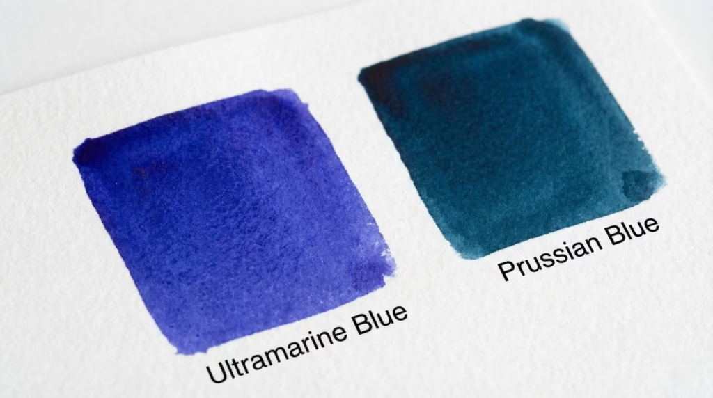
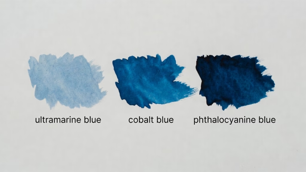
Chemically, Prussian blue is very different from ultramarine. Where ultramarine leans slightly toward purple-blue, Prussian blue tends toward green-blue. This might seem like a disadvantage, but it opened new possibilities.
Comparison to ultramarine:
- Tinting strength: Prussian blue is far stronger—a little goes a long way in mixtures. This made it economical even beyond its lower price
- Transparency: More transparent than ultramarine, making it excellent for glazing techniques
- Mixing behavior: Creates beautiful greens when mixed with yellows, intense darks when mixed with blacks or browns
- Color temperature: Cooler than ultramarine, useful for atmospheric effects and shadows
Technical characteristics:
Lightfastness varies depending on application method and medium. In oil painting with proper technique, Prussian blue is reasonably stable. In watercolor and especially in calligraphy inks, it can have issues with fading or bleeding. Some historical Prussian blue applications show a phenomenon called “bronze disease”—a greenish discoloration—though this is less common in well-executed paintings.
Application advantages:
Landscape painters embraced Prussian blue for atmospheric perspective—the effect where distant objects appear blue-gray due to atmospheric haze. Its cool, greenish-blue perfectly captured this phenomenon.
Canaletto, the famous 18th-century Venetian view painter, used Prussian blue extensively in his vedute (detailed city views). His paintings of Venice show Prussian blue creating atmospheric depth in skies and distant architecture, effects that would have been prohibitively expensive with ultramarine.
Thomas Gainsborough employed Prussian blue in his landscape backgrounds, creating the cool, misty distances characteristic of British landscape painting. The pigment’s affordability allowed him to use blue generously where earlier painters would have been forced to economize.
But the most dramatic impact of Prussian blue occurred not in Europe but across the Pacific Ocean.
Prussian Blue and the Globalization of Artistic Color
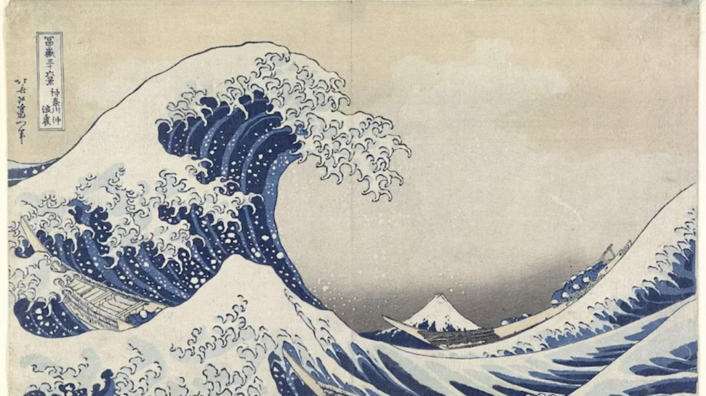
When Prussian blue arrived in Japan around 1829, it revolutionized an entire artistic tradition.
Japanese artists had long struggled with blue. Indigo provided a blue dye excellent for textiles but too transparent and fugitive for prints. The traditional “ai-zuri” (indigo-printed) images were pale, unable to achieve the intensity artists desired.
Prussian blue changed everything.
Katsushika Hokusai’s famous series “Thirty-Six Views of Mount Fuji” (1830-1832) showcases Prussian blue’s impact. The most famous print from this series, “The Great Wave off Kanagawa,” would have been impossible without Prussian blue. That intense, dramatic blue dominating the composition—the wave curling over terrified boats with Mount Fuji small in the distance—that’s Prussian blue.
The pigment enabled a new genre called “aizuri-e” (blue-printed pictures), where Prussian blue dominates the composition. Utagawa Hiroshige’s “One Hundred Famous Views of Edo” (1856-1858) includes numerous aizuri-e prints where Prussian blue creates entire worlds of color.
Compare traditional indigo to Prussian blue in Japanese prints:
- Indigo: Pale, transparent, limited tonal range, fades quickly
- Prussian blue: Intense, can achieve both dark and light tones through dilution, relatively stable
Japanese printmakers called it “bero-ai” (Berlin blue) or “bero” for short, acknowledging its European origin. They didn’t see foreign origin as a problem—it was a tool that let them create the images they’d envisioned but couldn’t previously achieve.
This cultural exchange shows how pigment innovation transcends borders. Prussian blue, accidentally discovered in Berlin, fundamentally shaped Japanese art of the Edo period, which in turn influenced French Impressionists who collected Japanese prints. Material technology creates ripples across cultures and generations.
The Dark Side – Toxicity and Chemical Instability
No historical pigment is perfect, and Prussian blue has its problems.
The name “ferrocyanide” causes understandable concern—cyanide is deadly. However, the cyanide in Prussian blue is tightly bound within the iron complex. The pigment is relatively safe to handle in normal artistic use. It won’t release cyanide gas under normal conditions. That said, heating Prussian blue to high temperatures or treating it with strong acids can decompose it, potentially releasing toxic compounds. Historical artists didn’t always understand these risks.
More problematic is Prussian blue’s incompatibility with certain other pigments and conditions:
Alkali sensitivity: Prussian blue breaks down in alkaline (basic) environments, turning brown. This makes it unsuitable for fresco painting, where the plaster is alkaline.
Lead white interactions: In certain conditions, Prussian blue can react with lead white (the standard white pigment until the 20th century), causing color shifts or discoloration over time.
Bronze disease: Some Prussian blue applications develop a greenish discoloration (copper-like patina) over decades or centuries. This degradation pattern appears in some historical paintings, presenting conservation challenges.
Despite these issues, properly applied Prussian blue in oil paintings generally survives well. Many 18th and 19th-century paintings retain their Prussian blues beautifully.
Practical lesson for modern artists: Understanding historical pigment problems informs contemporary choices. Prussian blue remains available and useful, but knowing its alkaline sensitivity prevents application errors. Incompatibility issues remind us that pigments interact chemically—choosing compatible materials matters for archival quality.
Key insight: Prussian blue proves that innovation often comes from accident rather than planning. Diesbach wasn’t trying to revolutionize art—he was trying to make red pigment and messed up. Yet his mistake gave painters a new tool that enabled centuries of artwork. Sometimes the best discoveries are the ones you didn’t know you needed.
Turning Point #4 – Synthetic Ultramarine and the Democratization of Color (1826)
If Prussian blue began the democratization of intense blues, synthetic ultramarine completed it. This achievement—creating a chemical match for the most expensive pigment in history at a fraction of the cost—fundamentally changed who could be an artist and what kinds of art were possible.
The Prize Competition That Liberated Blue
By the 1820s, ultramarine’s cost remained exorbitant despite Prussian blue’s availability. Natural ultramarine still cost what it always had—a small fortune. Artists wanted ultramarine’s particular hue, which Prussian blue couldn’t match. Prussian blue’s green-blue was perfect for some applications but couldn’t replicate ultramarine’s violet-blue essential for certain effects.
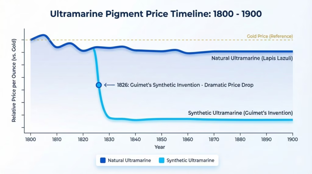
In 1824, the Société d’Encouragement pour l’Industrie Nationale (French Society for the Encouragement of National Industry) offered a prize of 6,000 francs—a substantial sum—for anyone who could create a synthetic ultramarine matching natural ultramarine’s color and properties but costing less than 300 francs per kilogram. The natural version cost over 3,000 francs per kilogram, ten times the target price.
Chemists across Europe competed. The challenge was daunting: ultramarine’s complex chemical structure (sodium aluminum silicate with sulfur in a specific crystalline arrangement) had been analyzed, but synthesizing it proved difficult.
In 1826, French chemist Jean-Baptiste Guimet succeeded. He created synthetic ultramarine by heating a mixture of kaolin (china clay), sodium carbonate, sulfur, and other ingredients to high temperatures. The product was chemically nearly identical to natural ultramarine and visually indistinguishable to most observers.
Two years later, German chemist Christian Gmelin independently developed his own process. Both processes worked. Within a decade, synthetic ultramarine factories operated across Europe.
The manufacturing process was reasonably straightforward compared to extracting natural ultramarine:
Mix readily available industrial chemicals: kaolin (abundant clay used in porcelain), sodium carbonate (soda ash, easily manufactured), sulfur, carbon, and sometimes quartz sand. Heat the mixture to 700-800°C (1,300-1,470°F) in a kiln. The components react to form the complex ultramarine structure. Grind the resulting product to the desired particle size.
No rare minerals needed. No months-long journey from Afghanistan. No weeks of grinding and kneading. Just industrial chemistry producing consistent, high-quality blue.
Price impact was immediate and dramatic:
- 1825 (before synthesis): Natural ultramarine costs ~3,500 francs per kilogram
- 1830 (after synthesis): Synthetic ultramarine costs ~250 francs per kilogram
- 1850s: Price drops further to ~100 francs per kilogram
- Today: Synthetic ultramarine costs roughly $5-15 per pound ($10-30 per kilogram)—about 0.3% of what natural ultramarine cost in 1825 when adjusted for inflation
A color that was once more precious than gold became affordable to art students and hobbyists.
How Synthetic Ultramarine Changed Who Could Be an Artist
The psychological and practical impact of affordable ultramarine is hard to overstate. For the first time in history, anyone who wanted to paint with intense blue could do so without bankrupting themselves.
Quantified democratization:
Before synthetic pigments, art production centered in urban workshops tied to wealthy patrons or the Church. Becoming a professional painter required years of apprenticeship partly because the materials themselves were so expensive that only established workshops could afford them.
After synthetic pigments became available (not just ultramarine, but cadmiums, chromes, and others developed through the 19th century), art education expanded dramatically. Art academies opened to broader classes of students. Provincial artists working far from major cities could access materials previously available only in places like Paris, Florence, or Venice.
Women’s access to art education expanded in the late 19th century, partly because affordable materials made art education less financially risky. While social barriers remained significant, economic barriers decreased.
The tube paint revolution (1841):
In 1841, American painter John Goffe Rand invented the collapsible metal paint tube. Before this, artists mixed paint fresh each day from pigment and binder (oil, usually). Mixed paint dried out within days. Painters couldn’t store pre-mixed colors long-term.
Metal tubes changed everything. Paint manufacturers could pre-mix oil paints and seal them in tubes where they’d remain fresh for months or years. Artists could purchase ready-made paint, carry it anywhere, and use it whenever inspiration struck.
The combination of affordable synthetic pigments plus portable metal tubes enabled plein air painting—working outdoors directly from nature. Previously impossible logistics became routine.
Direct connection to Impressionism:
The Impressionist movement (1860s-1880s) was materially impossible before synthetic pigments and tube paints. Let me be specific about why:
Impressionist technique required applying paint rapidly to capture changing light conditions. The painters worked outdoors, often finishing paintings in single sessions to maintain consistency of light. They used pure, bright colors in small strokes rather than subtle, blended tones.
All of this required:
- Portable, ready-made paint (tube paints)
- Affordable pigments in abundance (synthetic ultramarine, cadmiums, chromes, cobalts)
- Bright, pure colors that didn’t require expensive mixing (synthetic pigments’ intensity)
Claude Monet’s water lily paintings, done outdoors at Giverny, use generous amounts of ultramarine. The sky reflections, water depths, and shadows all employ ultramarine that would have cost more than Monet could possibly have afforded had it been natural pigment. His “Impression, Sunrise” (1872)—the painting that gave Impressionism its name—uses ultramarine extensively. This painting, which defined an entire movement, was materially enabled by synthetic pigment chemistry.
Pierre-Auguste Renoir could paint crowds of people at outdoor cafes, each figure with blue clothing, because blue was no longer a precious commodity to be used strategically. His “Dance at Le Moulin de la Galette” (1876) shows ultramarine in shadows, clothing, and atmospheric effects throughout a large canvas—impossible economics for earlier painters.
Synthetic vs. Natural Ultramarine – Can You Tell the Difference?
Given that natural ultramarine still exists and costs 10-50 times more than synthetic, the question arises: is there actually a difference?
Chemical composition comparison:
Both are sodium aluminum silicate with sulfur: Na₈[Al₆Si₆O₂₄]Sₙ
The synthetic version is not a substitute or approximation—it’s the same compound. Modern synthetic ultramarine matches natural ultramarine at the molecular level.
Optical properties:
The particle size distribution can create subtle differences. Natural ultramarine, hand-processed, often has slightly more variation in particle size, which can affect the texture and light scattering properties minimally. Some artists claim natural ultramarine has a “depth” or “warmth” synthetic lacks.
Controlled tests comparing natural and synthetic ultramarine applied identically show no statistically significant differences most people can detect. The differences, if they exist, are extremely subtle and likely related to individual batch variations rather than inherent natural-vs-synthetic differences.
Working properties:
In practical application, most artists find them functionally identical. Both have similar:
- Tinting strength
- Opacity/transparency
- Mixing behavior with other pigments
- Handling characteristics in various mediums (oil, watercolor, acrylic)
Conservation perspective:
Both exhibit excellent lightfastness (ASTM Lightfastness Rating I – Excellent). Both are chemically stable when properly protected from acids. Paintings 175+ years old using synthetic ultramarine show no more deterioration than those using natural ultramarine from the same period.
Cost today:
- Natural ultramarine: $400-2,000+ per pound depending on quality
- Synthetic ultramarine: $10-30 per pound for professional grade
When to choose natural vs. synthetic:
Honestly? For most artists, the choice is philosophical rather than practical. Natural ultramarine’s cost premium buys you:
- Connection to historical materials and methods (if you’re doing historical recreation)
- Supporting traditional lapis lazuli mining communities
- Marketing cachet if you’re selling art (“painted with natural lapis lazuli ultramarine”)
What it doesn’t necessarily buy you is better color, better permanence, or better working properties. The synthetic is essentially identical in performance.
Practical recommendation: For learning, practicing, and most professional work, synthetic ultramarine is the rational choice. It’s permanent, beautiful, and affordable. Save the expense of natural ultramarine for situations where the historical connection matters to you philosophically, or where you’re specifically recreating historical techniques.
The Expanded Blue Palette of the 19th Century
Synthetic ultramarine didn’t arrive alone. The 19th century saw an explosion of new blue pigments, each filling different needs.
Cerulean Blue (1805, commercially available 1860s):
Chemically cobalt stannate (cobalt tin oxide), cerulean blue offers a unique greenish-blue that sits between ultramarine and Prussian blue in hue. Its semi-opaque nature and gentle mixing properties made it immediately popular.
Impressionists loved cerulean for skies. That characteristic Impressionist sky blue—lighter and slightly greener than deep ultramarine—often incorporates cerulean blue. Monet used it extensively in his outdoor scenes. Renoir employed it for atmospheric effects.
Cobalt Blue (1802 discovery, 1807 commercial production):
Cobalt aluminate provides a pure, middle blue—not as violet as ultramarine, not as green as Prussian. It has excellent lightfastness, strong tinting strength, and works beautifully in all mediums.
Cobalt blue’s relatively high cost (more expensive than Prussian blue or synthetic ultramarine, but far cheaper than natural ultramarine) positioned it as a “professional” pigment—affordable for serious artists, expensive enough to signify quality.
Comparison table of 19th-century blues:
| Pigment | Chemical Composition | Hue Character | Relative Cost (1850s) | Lightfastness | Transparency | Best Uses |
|---|---|---|---|---|---|---|
| Natural Ultramarine | Na-Al silicate + S | Violet-blue | Very High (1.0x baseline) | Excellent | Semi-transparent | Historical, symbolic importance |
| Synthetic Ultramarine | Na-Al silicate + S | Violet-blue | Very Low (0.03x) | Excellent | Semi-transparent | General use, skies, shadows |
| Prussian Blue | Fe ferrocyanide | Green-blue | Very Low (0.02x) | Very Good | Transparent | Glazing, darks, greens |
| Cobalt Blue | Co aluminate | Pure blue | Medium (0.15x) | Excellent | Semi-transparent | General use, strong tint |
| Cerulean Blue | Co-Sn oxide | Greenish-blue | Medium-High (0.20x) | Excellent | Semi-opaque | Skies, atmospheric effects |
This range gave artists unprecedented choice. Instead of “expensive blue” (ultramarine), “cheap blue” (whatever substitute available), and “that new blue” (Prussian), painters now had a spectrum of blues with different properties, all reasonably affordable.
Key insight: Synthetic ultramarine represents the completion of blue’s democratization. The color that once marked artistic and social hierarchy—reserved for depicting divinity, worn by the wealthy—became universally accessible. This shift from scarcity to abundance didn’t cheapen art; it liberated it, allowing artists to focus on creative expression rather than material economics.
Turning Point #5 – Modern Synthetic Blues and the Artist’s Palette Today (20th Century-Present)
The story of blue pigments didn’t end in the 19th century. The 20th century brought one more revolutionary blue—and with it, the final chapter in the technical evolution of permanent pigments.
Phthalocyanine Blue – The 20th Century’s Color Revolution (1936)
In 1927, chemists at Scottish Dyes Ltd. accidentally discovered a new class of compounds while trying to synthesize phthalimide. A small amount of brilliant blue-green substance formed in their reactor. The color was so intense and stable it demanded investigation.
By 1935-1936, Imperial Chemical Industries (ICI) in Britain developed these compounds into commercial pigments under the name “Monastral Blue.” Chemists soon created variations providing different hues—from greenish to slightly reddish blues.
Chemical structure: Phthalocyanine blue is a copper phthalocyanine complex—a large, flat molecule with a copper atom at its center surrounded by an intensely colored organic ring structure. This molecular architecture creates the most stable, most lightfast synthetic blue ever made.
Revolutionary properties:
Lightfastness: Phthalocyanine blue achieves the highest possible ASTM Lightfastness Rating (I – Excellent) with better resistance to fading than any historical blue, including ultramarine. Paintings 85+ years old show zero color change.
Tinting strength: Extreme. Phthalocyanine blue is roughly 3-4 times stronger than ultramarine. A tiny amount can shift large quantities of other colors toward blue. This makes it economical but also challenging for beginners who can easily overpower mixtures.
Transparency: Exceptional. Phthalocyanine blue creates transparent glazes of unmatched intensity, impossible with more opaque historical blues.
Two main variants:
- Phthalocyanine Blue (Green Shade) – PB15:3 – leans toward cyan, excellent for mixing greens
- Phthalocyanine Blue (Red Shade) – PB15:0 – slightly warmer, closer to ultramarine but more intense
Artistic impact:
Abstract Expressionists working on enormous canvases in the 1940s-1960s needed affordable pigments with consistent quality across large areas. Phthalocyanine blues (and greens) enabled their scale and intensity.
Mark Rothko’s color field paintings employ phthalocyanine pigments in some works, creating luminous rectangles of color that seem to float and vibrate. The intensity and transparency of phthalocyanine enables these optical effects.
Barnett Newman’s large-scale works use phthalocyanine for both strength and economy—covering huge canvases with pure, saturated color.
Modern watercolorists embrace phthalocyanine’s transparent strength. A single brushstroke of diluted phthalocyanine blue can create intensely colored washes that would require multiple layers of ultramarine.
Digital color influence:
The CMYK color model used in printing uses cyan ink—essentially phthalocyanine blue (green shade). When you see printed blues on posters, magazines, or art reproductions, you’re seeing phthalocyanine’s influence. This pigment’s properties literally define the blue component of modern commercial printing.
The Complete Modern Blue Palette
Today’s artists have access to approximately 12-15 professionally available blue pigments, each with distinct properties. This represents the culmination of 5,000 years of innovation.
Traditional pigments still in use:
- Ultramarine (synthetic) – PB29
- Cobalt Blue – PB28
- Cerulean Blue – PB35/PB36
- Prussian Blue – PB27
Modern synthetics:
- Phthalocyanine Blue (Green Shade) – PB15:3
- Phthalocyanine Blue (Red Shade) – PB15:0
- Manganese Blue – PB33 (now discontinued due to toxicity, but worth mentioning historically)
- Indanthrone Blue – PB60 (intense, slightly reddish blue with excellent properties)
Specialty blues:
- Carbazole Dioxazine Violet (bluish-purple) – PV23
- Various proprietary mixes and convenience colors
Decision matrix for modern artists:
When selecting blues for your palette, consider:
Hue needed:
- Violet-blue → Ultramarine or Indanthrone
- Pure blue → Cobalt Blue
- Cyan/green-blue → Phthalocyanine Blue (Green Shade) or Prussian Blue
- Sky blue → Cerulean or Manganese Blue Hue
Transparency vs. opacity:
- Maximum transparency (glazing) → Phthalocyanine Blues, Prussian Blue
- Semi-transparent → Ultramarine, Cobalt Blue
- More opaque (covering) → Cerulean Blue
Tinting strength:
- Very strong (use sparingly) → Phthalocyanine Blues
- Medium strength → Ultramarine, Cobalt Blue, Prussian Blue
- Gentle (easy to control) → Cerulean Blue
Budget:
- Most affordable → Ultramarine, Phthalocyanine Blues
- Mid-range → Prussian Blue, Cerulean Blue
- Higher cost → Cobalt Blue
- Premium → Natural Ultramarine (if desired)
Mixing needs:
- Best for mixing greens → Phthalocyanine Blue (Green Shade), Prussian Blue
- Best for mixing purples → Ultramarine, Phthalocyanine Blue (Red Shade)
- Best for mixing neutrals → Ultramarine, Cobalt Blue
Complete blue palette comparison:
| Pigment Name | Code | Hue | Transparency | Tinting Strength | Lightfastness | Approx. Cost | Best For |
|---|---|---|---|---|---|---|---|
| Ultramarine (Synthetic) | PB29 | Violet-blue | Semi-trans | Medium | Excellent | $ | General use, versatile |
| Cobalt Blue | PB28 | Pure blue | Semi-trans | Medium-strong | Excellent | $$$ | Clean hue, reliable |
| Cerulean Blue | PB35 | Green-blue | Semi-opaque | Medium | Excellent | $$$ | Skies, gentle mixing |
| Prussian Blue | PB27 | Green-blue | Transparent | Strong | Very Good | $$ | Darks, glazing, greens |
| Phthalo Blue (GS) | PB15:3 | Cyan | Transparent | Very Strong | Excellent | $ | Intense color, greens |
| Phthalo Blue (RS) | PB15:0 | Blue | Transparent | Very Strong | Excellent | $ | Intense color, purples |
| Indanthrone Blue | PB60 | Red-blue | Semi-trans | Strong | Excellent | $$ | Alternative to ultramarine |
Cost key: $ = $5-15/tube, $$ = $15-30/tube, $$$ = $30-50/tube (professional quality, 37ml tubes)
What Modern Artists Can Learn from Pigment History
Studying pigment evolution isn’t just historical interest—it provides practical lessons for contemporary practice.
Lesson 1: Lightfastness matters, and we know which pigments last
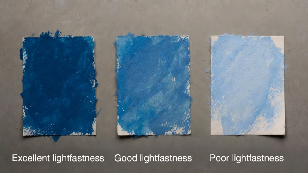
Centuries of evidence show which pigments endure and which fade. The ASTM (American Society for Testing and Materials) lightfastness ratings build on this historical evidence, combined with accelerated aging tests.
ASTM Lightfastness Ratings:
- I (Excellent): No fading under museum conditions, minimal change in harsh conditions – Choose these for archival work
- II (Very Good): Minimal fading, acceptable for most applications
- III (Fair): Moderate fading over time – Avoid for permanent work
- IV-V (Poor): Significant fading – Use only for studies or temporary work
All blues discussed in this article rate I or II. Historical evidence proves ultramarine lasts 500+ years, phthalocyanine shows zero change after 85+ years, Prussian blue endures for 300+ years in proper applications.
Practical application: Always check pigment codes (PB29, PB15, etc.) and lightfastness ratings on paint tubes. Student-grade paints often substitute fugitive (temporary) pigments for cheaper production. Professional-grade paints use permanent pigments exclusively.
Lesson 2: Pigment chemistry determines mixing behavior
Understanding why certain color combinations work (or don’t) prevents frustrating results.
From historical practice:
- Prussian blue + lead white can cause chemical reactions → Modern solution: use titanium white instead
- Ultramarine + acids destroys blue color → Keep acidic mediums away from ultramarine
- Phthalocyanine’s extreme strength requires careful measurement → Start with tiny amounts in mixtures
Lesson 3: “Student grade” vs. “Professional grade” echoes historical quality hierarchies
Medieval guilds regulated pigment purity. Renaissance contracts specified pigment quality. Today’s market still segments by quality.
Student grade paints:
- Lower pigment concentration (more filler)
- Sometimes use cheaper pigment substitutes (“hues”)
- Acceptable for learning, less suitable for finished work
Professional grade paints:
- Higher pigment concentration
- Use actual pigments (not substitutes)
- More expensive but go further due to strength
- Required for archival-quality work
This isn’t snobbery—it’s chemistry. Student ultramarine might contain 30% pigment by weight, professional 50-60%. The difference is real and measurable.
Lesson 4: Historical degradation teaches archival selection
Why do some Renaissance paintings look perfect while others show color shifts?
Known degradation patterns:
- Azurite → turns green (copper carbonate degradation)
- Chrome yellows → fade (Van Gogh’s sunflowers are literally losing color)
- Some lakes (organic dyes) → fade rapidly
- Poor-quality Prussian blue → bronze disease
Modern artists can avoid these problems by choosing pigments with proven stability. The blues discussed here—ultramarine, cobalt, cerulean, phthalocyanine—all have excellent permanence records.
Lesson 5: Cost doesn’t always equal quality for modern pigments
In the past, expensive pigments were expensive because they were rare or difficult to produce, and that rarity often correlated with desirable properties.
Today, some expensive pigments cost more due to rarity (genuine cadmiums, cobalts contain expensive metals) while others are expensive simply because formulations remain complex. But affordable pigments like phthalocyanine blue match or exceed expensive options in permanence and intensity.
Smart modern choices:
- Core palette: Ultramarine + Phthalocyanine Blue (GS) = $10-20 total for two permanent blues covering most needs
- Add Cobalt Blue for pure hue if budget allows
- Natural ultramarine is a luxury, not a necessity for performance
Practical decision framework for choosing blues:
Step 1: Determine your needs
- What medium? (Oil, acrylic, watercolor, gouache)
- What techniques? (Glazing, direct application, heavy impasto)
- What subjects? (Landscapes, portraits, abstracts)
- Budget constraints?
Step 2: Choose 2-3 blues maximum for starting palette
- Recommended starter set: Ultramarine + Phthalocyanine Blue (Green Shade)
- Covers warm blue and cool blue, enabling most mixing needs
- Both are affordable and excellent performers
Step 3: Expand as needs become clear
- Need gentle mixing for skies? Add Cerulean
- Want pure, bright hue? Add Cobalt
- Need stronger darks? Prussian Blue
- Prefer reddish-blue alternative to Ultramarine? Try Indanthrone
Step 4: Always prioritize lightfastness
- Check pigment codes on tubes
- Verify ASTM ratings (look for I or II)
- Avoid “hues” unless you understand they’re substitutes
Current Research and Future Innovations
Pigment development continues. While we’re unlikely to see revolutionary changes comparable to ultramarine or phthalocyanine, research proceeds in several directions.
Sustainable pigment development:
Environmental concerns drive research into pigments that:
- Replace toxic heavy metals (cadmiums, cobalts contain heavy metals)
- Use renewable feedstocks
- Minimize manufacturing waste
- Reduce energy requirements for production
Bio-derived pigments from bacteria and algae show promise. Some microorganisms produce intensely colored compounds that could become artist pigments. Research is early-stage but potentially revolutionary.
Conservation science advances:
Modern analytical techniques reveal historical pigment usage with unprecedented precision:
- X-ray fluorescence (XRF) identifies elements present, indicating which pigments were used
- Raman spectroscopy identifies specific chemical compounds
- Infrared reflectography reveals underdrawings and changes hidden beneath paint layers
- Multispectral imaging creates detailed maps of pigment distribution
These techniques help conservators understand and restore historical paintings. They also inform modern artists about how historical materials perform over centuries.
Special-effect pigments:
Contemporary developments include:
- Interference and iridescent pigments that change color depending on viewing angle
- Thermochromic pigments that change color with temperature
- Photochromic pigments that change color with light exposure
- Fluorescent and luminescent pigments that glow under UV light
These expand creative possibilities beyond what historical artists imagined.
What comes next?
Likely developments over the next decades:
- Safer alternatives to remaining toxic pigments
- More sustainable manufacturing processes
- Enhanced durability through nanotechnology
- New colors filling gaps in the spectrum (researchers recently discovered “YInMn Blue,” the first new blue pigment in 200 years)
- Better integration with digital workflows (pigments optimized for scanning/reproduction)
Beyond Blue – The Broader Pigment Revolution
Blue’s story is dramatic because blue was particularly scarce, but similar patterns played out across the color spectrum. Understanding these parallel developments shows that blue’s evolution reflects broader historical forces.
Parallel Stories in Other Colors
Reds – From Precious to Accessible:
Vermillion (mercury sulfide) served as red’s ultramarine—beautiful, costly, toxic. Natural vermillion from cinnabar ore required careful processing. Its brilliant red-orange made it essential for important details despite its cost.
Chrome reds and cadmium reds (19th-20th centuries) provided synthetic alternatives. Cadmium reds offered exceptional brilliance and permanence, though cadmium’s toxicity raises environmental concerns. Naphthol reds and quinacridones (20th century) provide modern alternatives with excellent properties.
The pattern mirrors blues: scarce natural pigment → toxic but effective synthetics → safer modern alternatives.
Yellows – Beauty and Danger:
Indian Yellow derived from the urine of cows fed only mango leaves—a practice banned in the early 20th century for animal cruelty. This created a yellow gap.
Chrome yellows (lead chromate) filled the need brilliantly but carried problems. Vincent van Gogh’s “Sunflowers” series famously used chrome yellows extensively. Conservation scientists have tracked these yellows fading and darkening over the past 130 years. Paintings that were once vibrant yellow-orange are becoming brown-olive. We’re watching Van Gogh’s most famous works slowly change color despite museum conservation efforts.
Modern azo yellows and nickel complex yellows provide permanence chrome yellows lacked. Cadmium yellows remain available but face environmental pressure.
Van Gogh case study: Van Gogh’s degrading yellows illustrate why pigment stability matters. He chose chrome yellows partly because they were affordable and readily available as art materials democratized. Ironically, we now know these yellows weren’t permanent. His paintings would look significantly different if he’d had access to modern stable yellows. The “Sunflowers” we see today aren’t the “Sunflowers” Van Gogh painted—they’re darker, browner, less brilliant versions.
Greens – Stability Challenges:
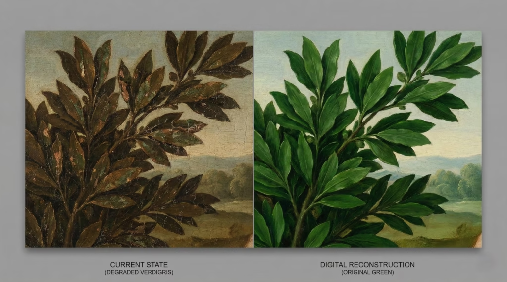
Verdigris (copper acetate) created beautiful blue-greens but degraded unpredictably. Renaissance paintings often show areas that were once green now turned brown as verdigris oxidized.
Emerald green (copper acetoarsenite) was brilliantly vibrant and intensely poisonous. The arsenic content made it dangerous to manufacture and use. Stories (possibly apocryphal) suggest Napoleon died from arsenic poisoning from green wallpaper pigments. Whether true or not, emerald green’s toxicity was real.
Viridian (hydrated chromium oxide, 1838) finally provided a stable, reasonably safe green. Phthalocyanine green (1938) offered even better properties—intense, transparent, permanent.
Degradation example: Many Renaissance paintings show formerly green landscapes now brown. The verdigris used for foliage degraded over 400-500 years. Looking at these paintings, modern viewers see brown trees and think Renaissance artists painted autumn scenes—but often these were meant to be spring or summer landscapes. The green is simply gone.
Whites – The Toxic Standard and Its Replacement:
Lead white (basic lead carbonate) dominated for 2,000+ years as the standard white pigment. Its excellent covering power, fine texture, and desirable working properties made it irreplaceable—despite being toxic.
Artists regularly suffered lead poisoning. The symptoms—abdominal pain, cognitive impairment, peripheral neuropathy—affected generations of painters who ground their own pigments or carelessly handled lead white.
Titanium white (titanium dioxide, commercialized 1920s) finally provided a safe alternative. It’s actually superior to lead white in many ways: better lightfastness, higher opacity, no toxicity. Modern artists have no reason to use lead white except for historical accuracy in conservation or replication work.
Yet lead white’s dominance for millennia shows how long toxic materials persisted when no adequate alternatives existed.
Common Patterns in Pigment Evolution
Looking across all colors, several recurring themes emerge:
1. Natural scarcity → Synthetic abundance
Every major pigment color follows this arc. Natural sources are geographically limited, difficult to process, and expensive. Synthetic chemistry breaks these constraints, making colors universally accessible.
2. Toxicity concerns → Safer alternatives
Historical pigments often contained toxic metals (lead, mercury, arsenic, cadmium) or other dangerous substances. Modern chemistry increasingly replaces these with safer alternatives without sacrificing performance. This trend continues as environmental and health awareness grows.
3. Regional availability → Global standardization
Ancient and medieval pigments varied by region based on local resources. European blue wasn’t Japanese blue wasn’t Egyptian blue. Today, an artist in Tokyo, London, or São Paulo buys essentially identical pigments from globally distributed production.
4. Artisanal production → Industrial manufacturing
Pigment-making shifted from individual craftspeople grinding minerals to chemical factories producing tons of consistent material. This industrialization enabled the democratization of art-making.
5. Guild secrets → Published knowledge
Pigment recipes were once closely guarded trade secrets, passed master to apprentice, protected by guilds. Today, pigment chemistry is published in scientific journals, taught in universities, and essentially universal knowledge. You can look up the exact chemical formula and manufacturing process for any pigment.
What the Blue Story Teaches About Other Colors
Blue’s evolution is particularly well-documented and dramatic, but it’s not unique. The same forces that drove blue pigment innovation affected all colors:
Economic factors driving innovation:
When a color is valuable enough, chemistry finds a way. The 6,000-franc prize for synthetic ultramarine had equivalents for other colors. Market demand motivates research.
Artistic impact of material availability:
Just as Impressionism required affordable blues, other movements depended on specific pigments. Fauvism’s bold, non-naturalistic colors relied on intense synthetic pigments. Abstract Expressionism’s scale needed industrial quantities of consistent, affordable paint.
Trade-offs between traditional and modern:
Every pigment replacement involved trade-offs. Modern pigments might be safer and more affordable, but sometimes handled differently or mixed with different characteristics than traditional pigments. Artists had to adapt techniques to new materials.
The conversation between “traditional” and “modern” materials continues. Some artists prefer historical materials for aesthetic or philosophical reasons. Others embrace modern chemistry’s possibilities. Both approaches are valid—the key is understanding the materials you choose.
Frequently Asked Questions
What is the rarest pigment in art history?
Natural ultramarine from lapis lazuli holds this distinction. Sourced exclusively from Afghanistan’s Badakhshan mines until the 19th century, it was literally worth more than gold ounce-for-ounce during the Renaissance. A single ounce could cost 6-8 ducats when gold cost about 3 ducats per ounce. The combination of single-source geography, months-long Silk Road trade route, and labor-intensive extraction made it incomparably rare and valuable. Learn more about ultramarine’s journey in the section on Renaissance painting and the ultramarine economy.
Why was ultramarine so expensive in the Renaissance?
Three factors created ultramarine’s extreme cost: First, it came from a single source—Afghanistan’s Badakhshan mines, with no alternative deposits known. Second, it required months-long transport via the Silk Road through dozens of intermediaries, each adding markup. Third, extracting pure pigment from crushed lapis lazuli demanded weeks of labor-intensive processing—grinding the stone without generating heat, then kneading the powder in complex resin pastes underwater for days to separate blue particles from impurities. By the time ultramarine reached a European workshop, it had traveled 4,000+ miles and passed through scores of hands. See the complete economic analysis of Renaissance pigment costs.
When was synthetic ultramarine invented and by whom?
French chemist Jean-Baptiste Guimet won a 6,000-franc prize in 1826 for creating the first synthetic ultramarine that matched natural ultramarine’s color and properties. German chemist Christian Gmelin independently achieved this in 1828. Both processes involved heating mixtures of readily available industrial chemicals (kaolin clay, sodium carbonate, sulfur) to produce chemically identical ultramarine at a fraction of natural ultramarine’s cost. The invention democratized art-making by making previously elite colors accessible to all artists.
What colors were available to Renaissance artists?
Renaissance artists had access to approximately 20-25 pigments: earth colors (ochres, umbers, siennas in various shades), ultramarine (extremely expensive), azurite (cheaper blue alternative), vermillion (red from cinnabar), lead white, lead-tin yellow, verdigris (green), carbon blacks, and various organic colors like madder (red) and indigo (blue, but fugitive). This limited palette required masterful technique and strategic pigment deployment based on cost hierarchies. The most expensive pigments were reserved for central figures and important details, while cheaper alternatives filled backgrounds and minor elements. Learn more about Renaissance color economics.
How did the invention of synthetic pigments change art?
Synthetic pigments fundamentally democratized art-making through several mechanisms: First, they reduced costs 100-1000x for previously expensive colors, making full palettes affordable for students and provincial artists, not just wealthy urban workshops. Second, combined with metal tube paints (invented 1841), they enabled plein air painting—working outdoors directly from nature became logistically possible when paint was portable and colors were affordable. Third, they expanded the artist population beyond those with wealthy patrons, allowing more people to pursue art professionally or as serious amateurs. Fourth, they allowed movements like Impressionism that required abundant, affordable color for their techniques—rapid outdoor painting with pure, bright colors. See complete analysis of this transformation.
What is Egyptian blue made of?
Egyptian blue is calcium copper silicate (CaCuSi₄O₁₀), created by heating sand, lime, copper compounds, and alkali flux to approximately 900°C. This makes it humanity’s first synthetic pigment, predating modern chemistry by 4,500 years. Ancient Egyptians developed this complex manufacturing process through empirical experimentation around 2500 BCE. The pigment required precise ingredient ratios and controlled high temperatures—remarkable technical sophistication for the ancient world. Full manufacturing details explain the process and modern discoveries about Egyptian blue’s unique properties, including infrared fluorescence discovered in 2015.
Why did ancient artists value blue pigments so highly?
Blue’s extreme scarcity in nature created both practical and symbolic value. Unlike earth colors readily available from clay deposits, stable blue compounds are rare in minerals. The few natural options (azurite, lapis lazuli) occurred in limited geographic locations or had problematic properties. This scarcity led to blue’s association with divinity, heaven, and royalty across cultures—from Egyptian gods to the Virgin Mary to Chinese imperial ceramics. When a color is genuinely rare, it becomes special. Religious and cultural importance created economic demand that motivated centuries of innovation and experimentation. Complete explanation of blue’s unique status in art history.
What replaced lapis lazuli in paintings?
Several pigments served as lapis lazuli/ultramarine substitutes over time. Azurite (copper carbonate) was the most common medieval and Renaissance alternative—cheaper but less vibrant and prone to turning green over centuries. Smalt (ground cobalt glass) saw use in 16th-17th centuries but lost intensity over time. Prussian blue (discovered 1706) provided the first affordable, intense synthetic blue, though its green-blue hue differed from ultramarine’s violet-blue. Finally, synthetic ultramarine (1826) chemically matched natural ultramarine at a fraction of cost, truly replacing rather than substituting for the original. See comparisons of these various blues’ properties and uses.
How is natural ultramarine different from synthetic?
Chemically, they’re nearly identical—both are sodium aluminum silicate with sulfur (Na₈[Al₆Si₆O₂₄]Sₙ). Modern synthetic ultramarine matches natural ultramarine at the molecular level. Subtle differences exist in particle size distribution, which can create minor variations in texture and light scattering, but controlled tests show most people cannot detect differences when they’re applied identically. Both offer excellent lightfastness (ASTM Rating I), similar tinting strength, and nearly identical working properties in all mediums. Natural costs 10-50 times more mainly due to scarcity rather than performance advantages. For most applications, synthetic is the rational choice—it’s permanent, beautiful, and affordable. Detailed comparison discusses when natural might be preferred.
What is Prussian blue and how was it discovered?
Prussian blue is iron ferrocyanide, accidentally discovered by German color-maker Johann Jacob Diesbach in 1706 while attempting to create red pigment. A contaminated ingredient (alkali tainted with blood) produced intense blue instead of the expected red—a fortunate mistake that created the first modern synthetic pigment. Prussian blue offered affordable, intense blue with strong tinting strength and unique green-blue hue. It revolutionized art by providing intense blue at a fraction of ultramarine’s cost, enabling new techniques and eventually reaching Japan where it transformed ukiyo-e printmaking. Complete discovery story and analysis of Prussian blue’s global impact.
Why do some historical paintings change color over time?
Pigment degradation has multiple causes. Chemical instability causes some pigments to break down—azurite turning green (copper carbonate degradation), verdigris greens becoming brown (oxidation). Light exposure breaks down organic colors like certain lakes and some early synthetic pigments (Van Gogh’s chrome yellows are demonstrably fading). Reactions between incompatible pigments can cause color shifts (Prussian blue + lead white in certain conditions). Changes in binding medium contribute as oil darkens with age. Environmental factors like humidity and pollutants accelerate degradation. Renaissance paintings with formerly green landscapes now brown (degraded verdigris) and Van Gogh’s fading yellows are classic examples. Understanding historical pigment degradation informs modern pigment selection for archival work.
How were pigments made in medieval times?
Medieval pigment preparation was labor-intensive craft work. Mineral pigments required grinding stones (lapis lazuli, azurite, malachite) with mortar and pestle—carefully to avoid heat buildup. Extracting ultramarine from lapis demanded weeks of kneading ground stone in heated resin-wax-oil paste underwater to separate blue particles. Synthetic compounds like verdigris were created by exposing copper to vinegar fumes for weeks. Organic colors came from plants (madder root for red, woad for blue) or insects (cochineal for crimson), requiring complex extraction processes. Apprentices spent years mastering these techniques before being trusted with expensive materials. Workshop practices shaped the entire apprenticeship system.
What are the most lightfast blue pigments?
Modern blues with highest lightfastness ratings (ASTM I – Excellent): phthalocyanine blue in both variants (PB15:3 and PB15:0), ultramarine both natural and synthetic (PB29), cobalt blue (PB28), cerulean blue (PB35/PB36), and indanthrone blue (PB60). Prussian blue (PB27) rates ASTM I-II (very good to excellent) depending on medium and application. These all dramatically outlast historical organic blues like indigo, which fades rapidly with light exposure. All blues discussed in this article have proven permanence records—ultramarine survives 500+ years in Renaissance paintings, phthalocyanine shows zero fading after 85+ years. Complete properties comparison with specific recommendations for different uses.
How did artists obtain and prepare pigments before modern manufacturing?
Pre-industrial artists (or more commonly, their apprentices) sourced raw materials through specialized pigment merchants or imported them via long-distance trade networks (lapis lazuli via Silk Road, cochineal from Americas). Mineral pigments required hours of hand-grinding to achieve proper particle size—fine enough for smooth application but not so fine as to lose intensity. Complex pigments like ultramarine demanded weeks of extraction processes. Artists mixed pigments with binding mediums (linseed oil for oil painting, egg yolk for tempera, gum arabic for watercolor) fresh each day as needed—pre-mixed paint dried quickly. Guild regulations strictly controlled quality standards and methods. The entire apprenticeship system centered on learning material preparation before being allowed to actually paint. Detailed description of workshop hierarchies and pigment handling.
What impact did tube paints have on art history?
Metal tube paints (invented 1841 by John Goffe Rand) revolutionized artistic practice by enabling portability and outdoor painting. Previously, artists mixed fresh paint daily from pigment and oil—mixed paint dried within days and couldn’t be stored long-term. Tubes provided ready-made paint staying fresh for months or years. This portability, combined with affordable synthetic pigments, made plein air painting practical—artists could carry complete palettes outdoors and work directly from nature. This directly enabled Impressionism and subsequent movements that required outdoor work or rapid execution with abundant color. The combination of synthetic pigments (affordable color) and tube paints (portability) represents a technological revolution comparable to photography’s impact. Connection to Impressionism explains this transformation in detail.
Key Takeaways – How Materials Shaped Art History
Scarcity drove innovation across 5,000 years. From Egyptian blue (2500 BCE) through ultramarine’s medieval dominance to phthalocyanine (1936), artists and chemists continuously sought to overcome natural color limitations. Blue presented the most persistent challenge due to its extreme rarity in nature, but innovation eventually solved what seemed like insurmountable material constraints.
Economic accessibility fundamentally changed artistic movements. Impressionism, Fauvism, and Abstract Expressionism required abundant, affordable color—these movements were materially impossible in the Renaissance economy where ultramarine cost more than gold. The democratization of pigments didn’t just make existing art cheaper; it enabled entirely new forms of artistic expression.
“Synthetic” and “natural” are historical categories, not quality indicators. Egyptian blue was synthetic 4,500 years ago yet outlasted most natural pigments. Modern synthetic ultramarine is chemically identical to natural. Phthalocyanine blue surpasses all historical blues in lightfastness. The meaningful distinction isn’t natural-versus-synthetic but rather permanent-versus-fugitive, safe-versus-toxic, and appropriate-for-purpose.
Material constraints shaped artistic hierarchies and symbolism for centuries. Blue reserved for Virgin Mary’s robes wasn’t aesthetic preference—it was economic necessity. Composition strategies placing expensive pigments in foregrounds and on important figures reflected material costs, not just artistic vision. Understanding this economic context transforms how we read historical paintings.
Historical degradation teaches modern preservation. Knowing why certain blues failed (azurite turning green, fugitive organic blues fading, chrome yellows darkening) informs contemporary pigment selection. The ASTM lightfastness rating system builds on centuries of evidence about which materials endure. Artists today can make informed archival choices based on historical lessons.
Accidental discoveries changed art history as much as planned research. Prussian blue (trying to make red), phthalocyanine (industrial byproduct), and numerous other innovations emerged from experiments gone “wrong.” Chemistry advances often preceded artistic applications—pigments were invented, then artists discovered what they made possible.
Complete color democratization is recent. Artists working before 1830 faced material constraints modern painters cannot imagine. Truly comprehensive, affordable palettes are only 150-200 years old. The abundance we take for granted—dozens of intense, permanent colors at reasonable prices—represents the culmination of millennia of innovation.
Next Steps for Artists
Review the modern blue palette comparison to optimize your pigment selection based on actual properties rather than marketing or habit. Understanding hue, transparency, tinting strength, and lightfastness lets you choose strategically.
Understand lightfastness ratings in historical context. The ASTM system (I through V, excellent through poor) distills centuries of evidence. Always choose I or II rated pigments for finished work. Your paintings should outlast you.
Explore pigment mixing principles developed over centuries. Understanding which combinations work beautifully and which cause problems prevents frustration and material waste. Historical knowledge about compatible pigments remains relevant.
Consider sustainability implications of material choices. Heavy metal pigments (cadmiums, cobalts) face environmental pressure. Research safer alternatives providing comparable performance. Your choices affect manufacturing practices and environmental impact.
Further Exploration
Visit museum conservation departments to see pigment analysis in practice. Many museums offer behind-the-scenes tours showing how conservators identify pigments using scientific techniques and plan restoration approaches.
Examine historical paintings closely noting strategic blue deployment. Stand close to Renaissance altarpieces in museums—you can often see where expensive ultramarine concentrates versus where cheaper alternatives fill backgrounds. This transforms abstract economic discussions into visible reality.
Experiment with different modern blues to understand their unique properties through direct experience. Buy small tubes of ultramarine, Prussian blue, cerulean, and phthalocyanine blue. Mix them with whites, with yellows, with reds. See how they behave differently. Hands-on experience teaches what no article can.
Study specific artists’ palettes to see how material choices shaped style. Research what pigments your favorite historical artists used. Understanding their material constraints illuminates their artistic choices—why they painted certain subjects certain ways often traces directly to what pigments they could access.
The story of pigments is ultimately the story of human ingenuity overcoming limitation. From ancient Egyptians synthesizing brilliant blue in desert workshops to medieval traders moving lapis lazuli across continents to modern chemists creating molecules never seen in nature, the drive to create color has pushed boundaries of chemistry, economics, and global trade. Understanding this history enriches both our appreciation of historical art and our practice of contemporary art. Every brushstroke connects to centuries of innovation.
This article provides historical and educational information about art materials. While every effort has been made to ensure accuracy, pigment chemistry and art historical research continue to evolve. For specific artwork conservation or restoration questions, consult qualified conservation professionals. Artist material choices involve personal preference alongside objective material properties.
For questions, corrections, or additional information, please contact the author.
The story of pigment connects to how colors shape our perception and the symbolism of still life through the ages — part of the evolution of art.