Artist 萌物绘馆 (22114887525): The Case for Taking the Color Out
黑白灰极致高级感 — black, white and gray, taken to the limit of sophistication. It is the title of her most-watched drawing and it is also a claim: that removing the color is not a limitation but a taste.
野生 — Wild, and Saying So
There is a word Chinese artists use for people like her: 野生 — wild, meaning self-taught, grown up outside the academy. Most who wear it wear it apologetically. 萌物绘馆, under a name that translates roughly as Cute Things Painting Hall, states it as her entire position: style undefined, a wild art blogger.
It is a strange banner to fly over work this controlled. What she does is the most classically demanding thing in drawing — a convincing human face built out of nothing but graded tone — and she does it with no institution behind her, no lineage to invoke, and nothing to sell at the end of it. Forty-six pieces.
The Case for Taking the Color Out
Removing color sounds like a reduction of the problem. It is the opposite, and the reason is worth stating precisely.
In a color drawing, hue does an enormous amount of work for free. A red apple sitting on a green cloth separates instantly, even if the two happen to be exactly the same brightness, because the eye reads the difference in color and the shapes come apart on their own. The artist never has to think about it.
Convert that same scene to gray and the apple and the cloth merge into one indistinguishable blob. There is no hue left to do the separating, so the only tool remaining is value — and if the reference does not supply a value difference, the artist has to invent one that is not there and then keep it consistent across the whole picture.
Monochrome is therefore not a filter applied to a drawing. It is a complete re-composition of the tonal structure, decided by the person holding the pencil. That is why 黑白灰 is a discipline rather than a preset, and why so few people do it well.
Light Without Line
Her method inside that constraint is disarmingly pure. She does not build a face from networks of contour. She models it almost entirely through light and shadow — smudging and layering charcoal until a cheekbone catches and a strand of hair turns glossy.
That is harder than it looks and it is the second reason so few attempt it. Line is forgiving: it can be corrected, redrawn, buried under detail. Tone cannot. A face built purely from value either reads as a solid head sitting in real light, or it collapses into smudge, and there is no decorative flourish available to rescue it halfway. Her high-contrast portraits hold up because the observation underneath was correct before the first gray went down.
高级感
The aesthetic she has settled on is deliberate and a little severe: cool, retro, high-glamour faces that prize bone structure and atmosphere over prettiness. Seamless tonal transitions, convincing skin, unapologetic drama. Her own words for it are 极致高级感 and 极致丝滑质感 — peak sophistication, peak silken texture.
高级感 is a specific idea in contemporary Chinese visual culture. It means the restrained, expensive-looking quality that comes from removing saturation rather than adding it — the aesthetic of an unbranded gray coat. Claiming it for charcoal portraiture is a small act of positioning, and it is accurate: the pictures do look like fashion photography rather than like drawings of people.
There is also an argument buried in it. Color is what most viewers assume makes a portrait lifelike, and she takes it away entirely. A greyscale face that somehow feels more alive than a colored one makes the case better than any explanation could — that likeness lives in value, not in hue.
The Portrait Wrapped in Cling Film
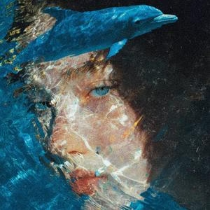
One graphite piece explains her better than the rest. A portrait rendered as though the face were wrapped in cling film: every crease in the plastic, every transparent reflection, every place where the sheet pulls tight across a feature and where it slackens away.
Nobody attempts that for the subject’s sake. It is a problem set on purpose, because a transparent surface over a solid form means rendering two competing sets of highlights simultaneously — the ones belonging to the plastic and the ones belonging to the face beneath — while keeping the head believable through both. Lose the separation and it stops being a wrapped face and becomes a shiny one.
That she chose it, unprompted, with no tutor to impress and no course to sell, says more about her seriousness than any credential would.
Why the Smudge Is the Technique
Charcoal is the only common drawing material designed to be pushed around after it lands, and her handling depends entirely on that.
A pencil mark stays where you put it. Charcoal is loose carbon dust sitting on the surface, so a finger, a stump or a cloth can move it — spreading a passage into a seamless gradient, pulling it thin at an edge, or lifting it back out with a kneaded eraser. That is what makes a cheekbone turn smoothly and skin read as skin rather than as hatching.
The cost is that it moves whether or not you meant it to. A sleeve dragged across a finished passage takes an hour with it, the paper only accepts so much reworking before it stops holding anything, and nothing can be sharpened back once it has been softened. Working almost entirely in blended tone means committing to the least recoverable handling of the least stable material in the studio.
Thirty Seconds, Three Minutes, Thirty Minutes
The most useful thing on the page is a recurring format that draws the same subject three times against a clock: thirty seconds, then three minutes, then thirty minutes. Woody and Buzz get that treatment.
Almost nobody films this, because it makes the artist look worse rather than better. It isolates exactly what each additional order of magnitude of time actually buys, and the answer is not flattering to anyone.
The thirty-second version establishes the shapes and where they sit relative to each other. It is crude and it is unmistakably the right character.
The three-minute version fixes the relationships — proportions tightened, the head sitting correctly, the features at the right heights. This is where a drawing either becomes right or becomes permanently wrong.
And the thirty-minute version adds almost nothing structural at all. It adds surface: modeling, texture, edges, the finish that makes a drawing look finished. If the shapes were wrong at thirty seconds, they are still wrong at thirty minutes, only now beautifully rendered.
Which is the lesson, and it is an uncomfortable one. A beginner whose drawings feel unfinished almost always believes the problem is patience. The three-panel comparison shows them that the drawing was decided in the first half-minute, and that twenty-nine of those thirty minutes went into decorating a decision made before they had properly looked.
There is a gentler half to it too. The thirty-second version is not a failed attempt at the thirty-minute one. It is a different decision about how much information to include, and it is complete on its own terms — which is worth knowing before you throw away another sketch for the crime of being a sketch.
One Fineliner, and a Red-Blue Split Screen
Away from the charcoal she ranges restlessly, and the restlessness is part of who she is.
In colored pencil there are recognizable public faces — Michael Jackson framed as the eternal King of Pop, a curly-haired Timothée Chalamet, the crown and soft light of Nintendo’s Rosalina. In fineliner she strips a face to a few tender manga contours, twice, under captions insisting a single technical pen is enough. There is a red-and-blue split-screen experiment, a clean manga inking piece, an eagle, a Naruto tribute, and a watercolor.
The mix looks eclectic and is actually systematic. Each subject is a different problem in light, chosen because it will not solve the same way the last one did.
Everything Here Belongs to Somebody Else
Run down the subjects. Stitch, teeth bared. Woody and Buzz. LEGO Batman, glowing blue. A boy band in candy colors. A crying woman from a film. An anime girl. A group shot with dozens of characters crammed into it. An eagle.
Almost nothing on the page is invented, and almost nothing is observed from life. It is a wall of other people’s characters.
The reflex is to call that derivative. For a self-taught artist without a school behind them, it is closer to the opposite.
An invented character cannot be wrong. Whatever appears on the paper is by definition what was intended, so the drawing carries no information about whether the person can actually draw — including for the person themselves. It is the most comfortable place in the world to hide, and plenty of people who describe themselves as artists never leave it.
A borrowed character is a test with a published answer. Everyone knows what Stitch looks like. Everyone knows the proportions of Woody’s head well enough to feel it the instant a drawing is off, even without being able to say which part is wrong. Draw him and you have submitted to a jury of several hundred million people who have all seen the reference.
With no teacher, no studio and no assessment, that is the only marking scheme available. The borrowing is not of an audience. It is of a standard.
Sweat, and the Things Kept at the Bottom
Two captions sit oddly against the glamour and are probably the most personal things here. One describes a pencil study replicating a face covered in beads of sweat. Another is about the collapse a person keeps hidden at the bottom of their heart, painted out in a single stroke of watercolor.
Sweat is a good subject for somebody working in this way — it is dozens of separate transparent domes, each with its own highlight and its own tiny shadow, sitting on skin that must stay readable underneath. It is the cling-film problem again in miniature, and it is also, plainly, about effort.
No Course, No Pitch
Her captions speak the language of the earnest learner rather than the authority — art-student daily, zero foundation, just light and shadow. There is no course, no funnel, no invitation to sign up for anything.
It makes for an unusual page: low on self-promotion, high on craft, growing one drawing at a time on the strength of the images alone. People pass the work along because of what is in it rather than because they were asked to.
A Style Refused
The first thing the profile says is that the style is not defined.
The work backs it up almost aggressively. A softly airbrushed black-and-white portrait, glamorous and cold, sits beside flat anime lineart, which sits beside a neon LEGO Batman, which sits beside a boy band in candy pinks, which sits beside a charcoal eagle.
Nothing here looks like it was made by one person, and that is the stated intention.
It costs something. A recognizable signature is the mechanism by which anything accumulates — people follow a maker rather than a picture because they can predict what they will get, and a page where every post looks like a different artist gives a viewer little reason to return. Every piece of advice ever given to a maker says the opposite of this.
There is a real argument on the other side, and it belongs specifically to the self-taught. A trained artist choosing a style is choosing between things they have already been made to do. Somebody working alone has not been made to do anything, and the only way to find out what their hand is actually good at is to keep trying registers that do not suit them, in public, until one does.
Forty-odd pieces is early in that process. The airbrushed portraits are plainly the strongest thing here, and the refusal to admit it yet is a defensible position for someone still finding out whether they have a style at all.
What the Wild Artist Has
Charcoal and graphite portraiture are as old as drawing and she has invented nothing in them. What she brings is a position — that the hardest, least decorated version of the craft is worth doing for its own sake, by somebody with no permission to do it.
Forty-six pieces, no institution, no lineage, no product. Just black, white and gray, taken as far as they go.