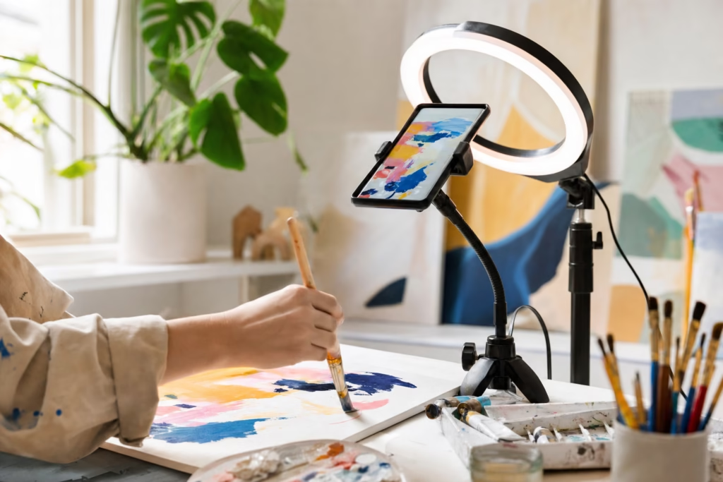
I posted the same artwork twice on Instagram. Once as a single image (84 likes), once as a 7-slide carousel (340 likes, 67 saves, 12 DMs from collectors). The only difference? How I told the story.
If you’re an artist struggling to get engagement on Instagram despite posting quality work, the problem isn’t your art—it’s how you’re presenting it. Single images get scrolled past in 0.3 seconds. Carousels? They stop the scroll, invite interaction, and give Instagram’s algorithm exactly what it wants: dwell time.
In 2025, carousel posts are getting 2-3x more engagement than single images for artists. They’re being pushed harder in feeds, saved more often, and converted into actual sales at higher rates. Yet most artists either aren’t using them or are making critical mistakes that kill their reach.
Over the next few minutes, you’ll learn the exact strategies that successful artists use to turn their work into scroll-stopping carousel content. These aren’t generic social media tips—they’re battle-tested tactics specifically for showcasing art series, process work, and collections on Instagram.
By the end, you’ll have a repeatable system for every art series you create. Let’s dive in.

Why Instagram Carousels Work for Artists (The Psychology + Algorithm)
Before we get tactical, you need to understand why carousels outperform single posts. It’s not magic—it’s psychology and platform mechanics working in your favor.
The Algorithm Advantage
Instagram’s algorithm has one job: keep people on the app as long as possible. Carousel posts accomplish this better than any other format.

Here’s why Instagram loves carousels:
Longer dwell time. When someone swipes through your carousel, they’re spending 15-45 seconds with your content instead of 0.5 seconds. Instagram interprets this as “highly engaging content” and shows it to more people.
Multiple engagement opportunities. Every swipe is tracked as an interaction. The more swipes, the more Instagram thinks your content is valuable. A single post gets one chance to engage someone. A carousel gets 5-10 chances.
Save rates. According to Instagram’s internal data from 2024, carousel posts have save rates 2.4x higher than single images. Saves are one of the strongest signals to the algorithm that your content is worth showing to more people.
Think about it from Instagram’s perspective: if someone saves your carousel to come back to later, that’s proof your content has lasting value. Instagram rewards this by pushing your post to more feeds.
The Viewer Psychology
Beyond the algorithm, carousels tap into fundamental human psychology that makes people want to keep swiping.
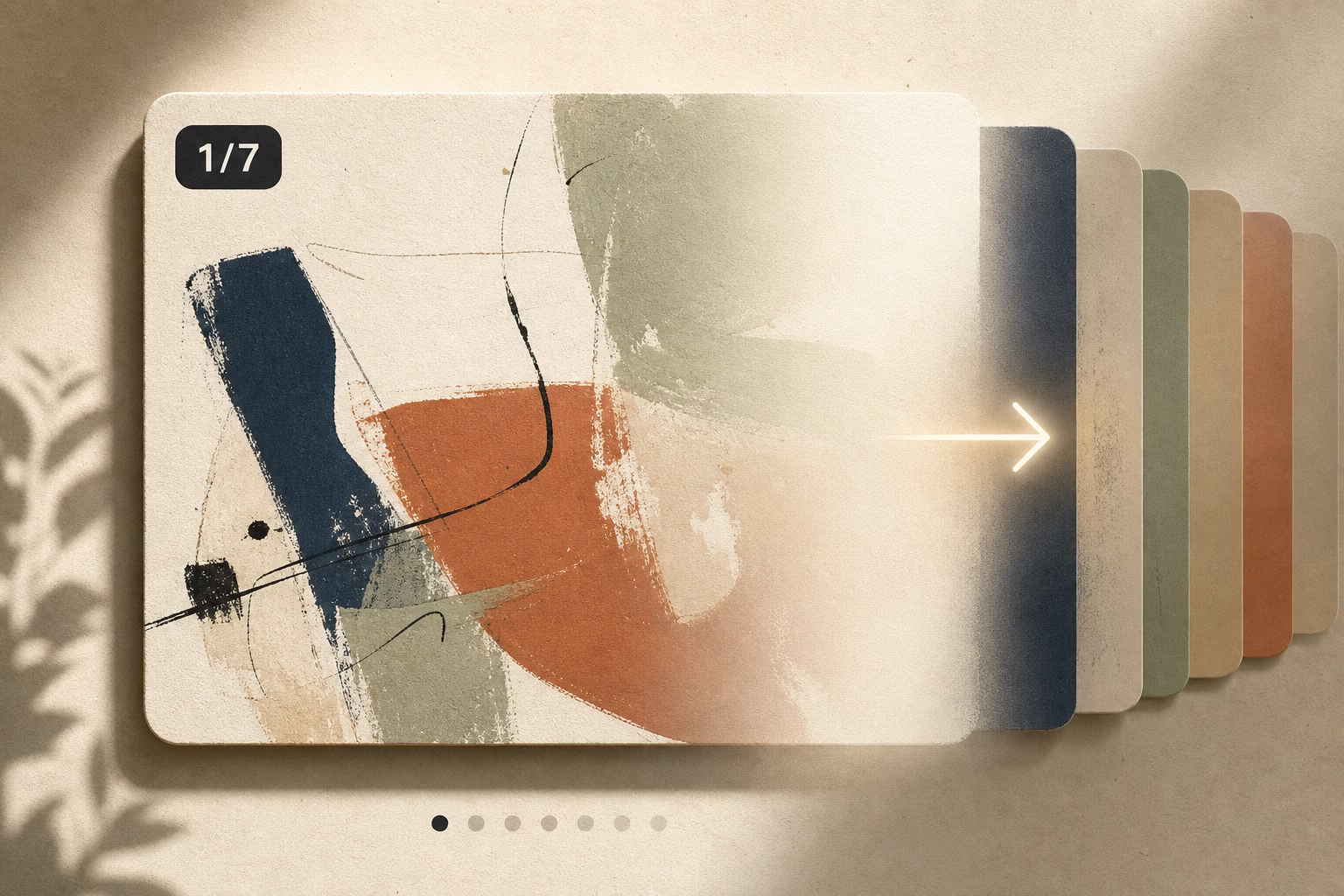
The Zeigarnik Effect is a psychological phenomenon where people remember unfinished tasks better than completed ones. When someone sees “1/7” on your first slide, their brain craves completion. They want to see what comes next. This is the same reason cliffhangers work in TV shows.
Pattern recognition is hardwired into human brains. We love sequences, progressions, and transformations. A painting process that goes from sketch to finished piece satisfies our deep desire to see “how it’s made.” We can’t help but swipe.
Storytelling creates emotional investment. A single image shows a moment. A carousel tells a story. Stories create context, build anticipation, and make viewers care about the outcome. When you show your art as a narrative journey, people become invested in your process—and in you as an artist.
The combination of algorithm preference and human psychology makes carousels the most powerful format for artists on Instagram right now. Now let’s talk about how to create them.
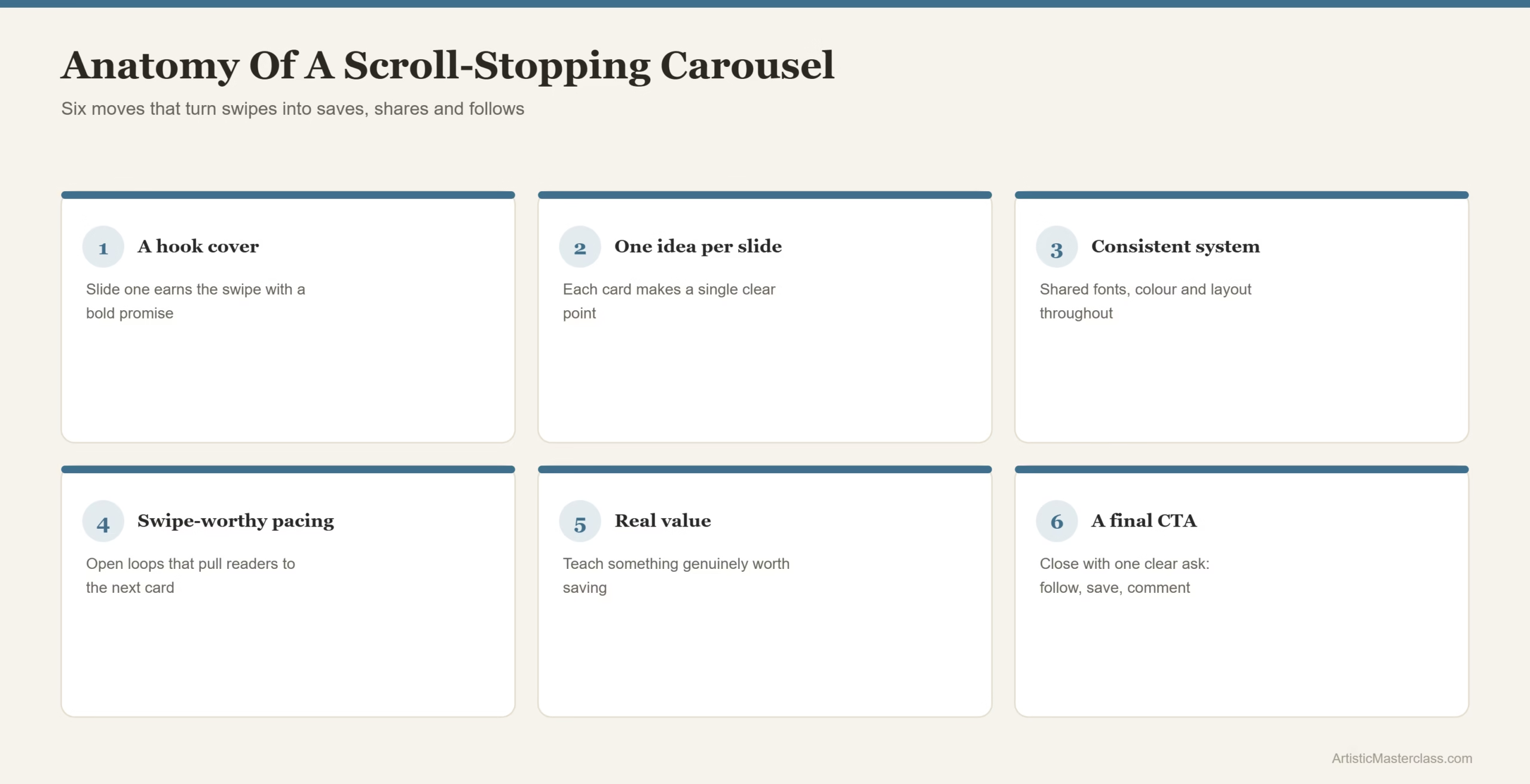
The 7 Essential Carousel Strategies for Artists
Strategy #1: The Hero Slide Formula (Slide 1 = Make or Break)
Your first slide has one job: make someone stop scrolling. If slide 1 fails, slides 2-10 don’t matter because no one will see them.
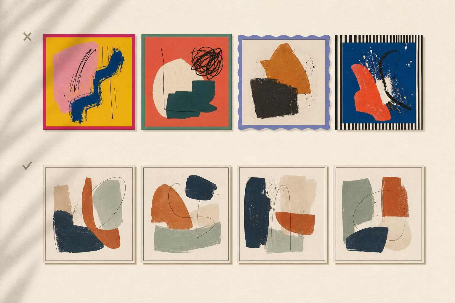
Most artists waste slide 1 on a plain text title card: “My painting process” in centered white text on a beige background. This is a death sentence for your carousel. Nobody stops scrolling for generic text.
What Makes a Powerful Opening Slide
Your opening slide needs to accomplish three things in under one second:
Lead with your strongest visual. This could be your finished piece, the most dramatic moment in your process, or a striking close-up detail. Whatever makes someone say “wait, what is that?” wins.
Create curiosity. The viewer should immediately wonder what comes next. Use minimal text overlay to hint at the journey: “5 stages of this painting ➡️” or “This started as a mistake ➡️”
Use contrast to stand out. Instagram feeds are crowded. Your first slide needs visual punch—bold colors, strong composition, or dramatic lighting that pops against the white background of the app.
Here’s what doesn’t work: starting with a “behind the scenes” photo of your messy studio floor. Save that for slide 3. Lead with impact.
5 Proven Slide 1 Templates for Artists
1. Transformation Tease
Show your final piece with text overlay: “How I got here ➡️” or “It started like this ➡️” with an arrow. The viewer knows there’s a payoff and wants to see the journey.
2. Provocative Statement
Open with a controversial or surprising claim about art: “I ruined this painting on purpose” or “Most artists skip this crucial step.” Follow with “Here’s why ➡️” Now curiosity is hooked.
3. Close-Up Detail
Zoom way into the texture, brushstrokes, or most intricate part of your work. Add text: “Pull back to see the full piece ➡️” The zoom-out reveal is deeply satisfying.
4. Behind-the-Scenes Chaos
Show your studio in complete disarray—paint everywhere, sketches scattered, creative mess. Text: “This became… ➡️” The contrast between chaos and final beauty is compelling.
5. Emotion Capture
Lead with the most emotionally evocative moment from your series. If you paint portraits, show the most intense expression. If you paint landscapes, show the most dramatic lighting. Text: “The story behind this ➡️”
The key principle: never start with information. Start with emotion or intrigue.
Strategy #2: The Narrative Arc System
Once you’ve hooked viewers with slide 1, you need a clear structure that keeps them swiping. Random images don’t work. You need a narrative arc.
Story Structures That Work for Art Series
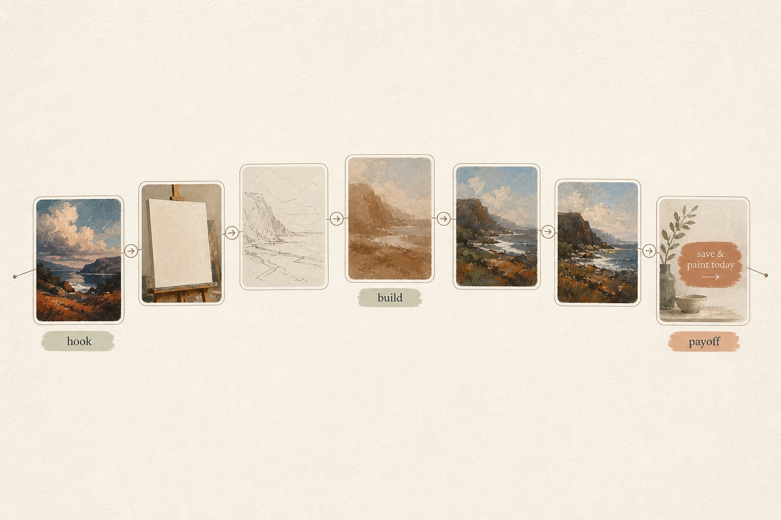
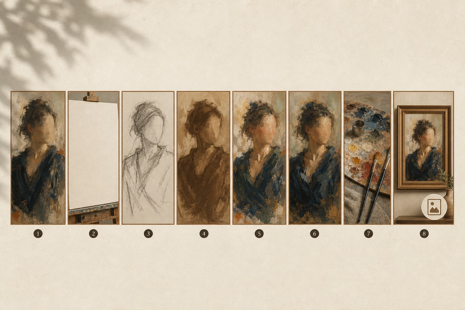
Option A: Process Journey (5-10 slides)
This is the most popular carousel format for artists—and for good reason. People love watching something go from nothing to finished.
- Slide 1: Final artwork (the tease—show them where we’re going)
- Slide 2: Blank canvas or initial sketch (the beginning)
- Slides 3-7: Key transformation moments (the journey—not every step, just the interesting ones)
- Slide 8: Detail shots showing texture, technique, or elements they might have missed
- Slide 9: Artist reflection—what you learned, what was challenging, what inspired this piece
- Slide 10: Call to action (prints available, commission info, “follow for more”)
The magic is in what you leave out. Don’t document every single stage. Show the moments where something significant changed—when you added color, when you realized it wasn’t working and had to pivot, when it finally clicked.
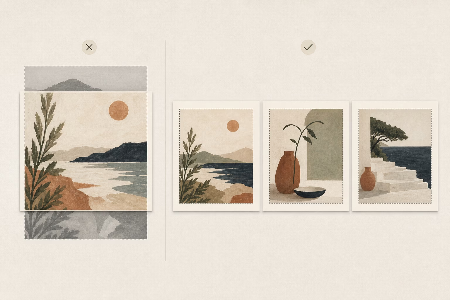
Option B: Thematic Collection (7-8 slides)
Use this when you’re showcasing a series of finished works that share a common theme, style, or concept.
- Slide 1: Collection hero image—your strongest piece or a composite showing all works
- Slides 2-7: Individual pieces from the collection (one per slide)
- Slide 8: Concept explanation—what ties these together, what you were exploring, and where people can see or buy them
Pro tip: arrange slides 2-7 to create visual flow. If your pieces use similar colors, arrange them in a gradient. If they tell a story, show them in narrative order.
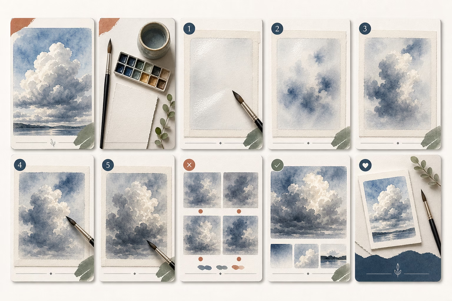
Option C: Educational Deep-Dive (6-9 slides)
This format positions you as an expert while showcasing your work. It’s excellent for building authority and getting saves.
- Slide 1: Technique showcase—show the result of the technique you’re teaching
- Slides 2-5: Step-by-step tutorial breaking down the technique
- Slides 6-8: Common mistakes to avoid, tips for success, or variations to try
- Slide 9: Resources and call to follow for more educational content
Educational carousels get saved obsessively because people want to reference them later. High saves = high reach.
The 7-10 Slide Sweet Spot
Instagram data shows that completion rates drop 40% after slide 10. Most viewers won’t swipe through 15 slides, no matter how good your content is. Keep it tight. If you can tell the story in 5 slides instead of 8, do that.
Every slide needs to earn its place. Ask yourself: “Does this move the story forward, or am I just filling space?”
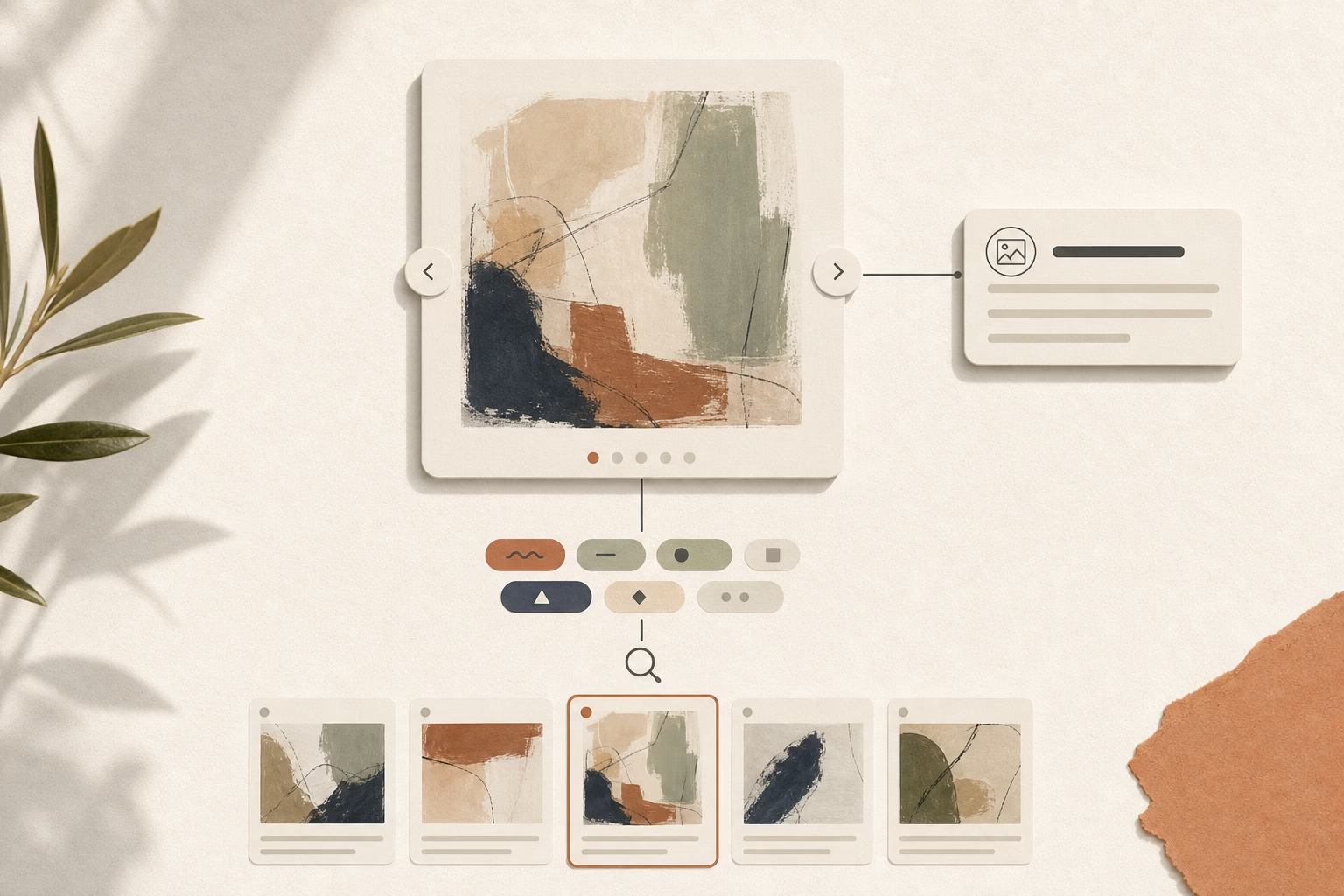
Strategy #3: Visual Cohesion Across Slides
Nothing kills a carousel faster than slides that feel disjointed. When your visuals clash, viewers get confused and stop swiping.
Design Principles for Seamless Flow
Color consistency is your first priority. Your carousel should feel like one continuous experience, not a random collection of images.
Options for color cohesion:
- Use the same color palette across all slides
- Create gradual color transitions (warm to cool, light to dark)
- Keep backgrounds consistent (all white, all black, all your brand color)
- If showing process, let natural progression create the flow
Typography rules keep things professional:
- Use maximum 2 fonts across all slides (one for headlines, one for body text)
- Keep sizing consistent (don’t jump from tiny to huge text)
- Make sure text is readable at small scale—remember, most people view on mobile
- Use the same text placement pattern (always top-left, always centered, etc.)
White space matters. Don’t overcrowd your slides with information. Follow the 70/30 rule: 70% of each slide should be your visual content, 30% should be breathing room. Cramped designs make people scroll past.
Grid systems create professional polish. Align elements across slides—if your text starts 100 pixels from the top on slide 1, start it there on every slide. This invisible structure makes the whole carousel feel intentional.
Technical Specifications (2025 Standards)
Get these wrong and Instagram will crop your work awkwardly.
Aspect ratio: Use either 1:1 (square, 1080x1080px) or 4:5 (portrait, 1080x1350px). The 4:5 format takes up more screen real estate on mobile and tends to perform better, but square is easier if you’re showing existing artwork that’s already square format.
File format: JPG for photographs and paintings. PNG for graphics with text overlays (crisper text rendering). Avoid GIFs—they don’t work in carousels.
File size: Keep each slide under 30MB (Instagram’s maximum), but aim for 8MB or less for fast loading. Large files take longer to load, and viewers won’t wait.
Slide count: Minimum 2, maximum 10. The sweet spot is 5-7 slides for most art content.
One technical note that trips up artists: make sure all slides use the same aspect ratio. If you mix square and portrait slides, Instagram will crop them to match, potentially cutting off important parts of your work.
Strategy #4: The Swipe-Worthy Text Strategy
Text overlays can make or break your carousel. Too much text and people feel like they’re reading a presentation. Too little and they miss the narrative thread.
When and How to Add Text Overlays
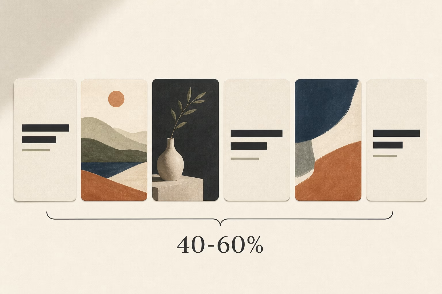
The rule: use text on 40-60% of your slides, not every single one.
Let some slides breathe with pure visuals—especially your most stunning work. Text should guide the story, not dominate it.
When you do add text, keep it scannable: 5-8 words maximum per slide. People are swiping quickly. Long paragraphs don’t get read.
Directional cues dramatically increase swipe-through rates. Add arrows (➡️), numbers (1/7, 2/7), or explicit instructions (“swipe to see the transformation”). These tiny elements remind viewers there’s more to see.
Contrast is critical for readability. If your artwork is light, use dark text. If it’s dark, use light text. Better yet, add a semi-transparent background overlay behind your text or use drop shadows to ensure readability on any background.
Text Overlay Formulas That Work
1. Numbered Sequence
“Step 1: Initial sketch” → “Step 2: Underpainting” → “Step 3: Adding details”
This creates clear progression and sets expectations for how long the carousel will be.
2. Question Progression
“What if I told you…” → “This painting started as a complete mistake” → “But then I tried something different” → “And it became this”
Questions create curiosity gaps. The viewer needs to keep swiping to get answers.
3. Emotional Labels
“The chaos stage” → “The doubt moment” → “The breakthrough” → “The final reveal”
This makes your process relatable and adds narrative drama beyond just visual transformation.
Tool Recommendations
You don’t need expensive software to add text to your slides:
- Canva offers free carousel templates with pre-designed text layouts
- Over app (mobile) is perfect for quick text overlays with stylish fonts
- Adobe Express if you want more control and have existing Adobe assets
Strategy #5: The Save-Worthy Slide (Slide 5-7)
Here’s something most artists don’t know: Instagram tracks which slide in your carousel gets viewed most. Slides that keep people’s attention signal high value to the algorithm.
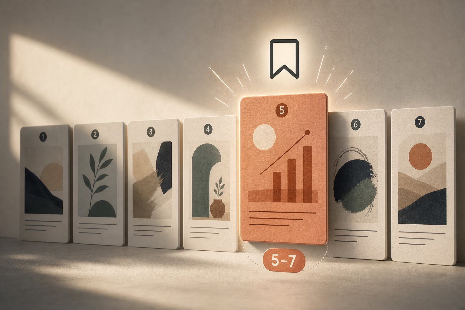
Why the Middle Matters
People often drop off after slide 3-4. To combat this, place your most valuable slide in position 5-7. This is what I call the “save-worthy slide”—content so useful that people bookmark your entire carousel to reference later.
High saves = Instagram shows your post to significantly more people.
What to Include
Your save-worthy slide should have standalone value beyond your specific artwork. Think: something people will want to come back to or share with other artists.
Tutorial summary slide: “5 watercolor techniques I used in this painting” with quick visual examples of each
Resource list: “Tools I used: [specific brushes, paints, paper]” Artists love knowing what materials create certain effects.
Inspirational quote over your art: Choose something genuinely meaningful about creativity or persistence, overlaid on your most beautiful piece.
Technique breakdown: Show a close-up with labels pointing to specific techniques: “glazing here, dry brush here, wet-on-wet here”
Print or product offering: “Available as a print” with size and price information. This isn’t pushy—it’s helpful information for people who love your work.
Real-world example: Artists who include one resource or technique slide in positions 5-7 see 3x more saves on average. Those saves compound into reach over the following days and weeks.
Strategy #6: The Closing CTA That Converts
Your final slide is prime real estate. Don’t waste it with “The End” or just your signature.
Final Slide Best Practices
Complete the narrative. If you showed a process, the final slide should show the finished piece in its full glory—maybe hanging on a wall or in proper lighting. Give viewers closure.
Include one clear call to action. Not five things they could do—one specific next step:
- “Follow @yourhandle for weekly process posts”
- “Prints available in bio”
- “Comment your favorite stage below”
Add urgency when relevant. If you’re offering prints, mention scarcity: “Limited edition of 25” or “Available this week only.” Scarcity drives action.
Reinforce your brand. Include your logo, artist name, or signature so if your carousel gets shared, people know who created it.
3 CTA Templates
1. Engagement Ask
“Which version speaks to you? Comment 1, 2, or 3 “
Comments boost your engagement rate, signaling to Instagram that your content sparks conversation.
2. Discovery Invitation
“See the full series at [link in bio]” or “Watch the process video on my profile”
This drives traffic to other parts of your Instagram presence.
3. Conversion Offer
“Want this on your wall? DM me ‘PRINT’ for sizing and pricing details”
This moves interested viewers from passive observers to active leads. DM-based sales work surprisingly well for artists.
One crucial note: don’t end your carousel abruptly. I see artists create beautiful 7-slide processes, then just… stop. No conclusion, no CTA, no closure. This leaves viewers unsatisfied. Stick the landing.
Strategy #7: Accessibility + Discoverability Hacks
The final strategy isn’t about what’s in your carousel—it’s about how you optimize it for Instagram’s search and recommendation systems.
Alt Text for Artists
Most artists skip alt text. This is a mistake for two reasons: accessibility and SEO.
Instagram’s algorithm reads alt text to understand what your image contains. Better alt text = better chance of appearing in searches and Explore page.
How to write alt text for artwork:
Describe your artwork objectively—what someone would see:
- “Abstract oil painting with bold red and orange brushstrokes on canvas”
- “Watercolor portrait of a woman with flowing blue hair”
- “Digital illustration of a cyberpunk cityscape at night”
Include process keywords when relevant:
- “Oil painting process showing sketch to finished portrait”
- “Time-lapse of acrylic pouring technique creating fluid art”
Don’t keyword stuff. Instagram penalizes this. Alt text should sound natural and helpful, not like a string of search terms.
To add alt text: Before posting, tap “Advanced Settings” → “Write Alt Text” and add a brief description for each slide.
Caption Optimization
Your caption is just as important as your carousel. Here’s how to write captions that boost reach:
Front-load your main keyword in the first 125 characters. This is what shows before “more.” Make it count.
Example: “Instagram carousel posts are changing how I share my art process. Here’s the 7-slide structure I use for every painting series…”
Tell the story behind the work. 150-250 words is the sweet spot—long enough to be meaningful, short enough that people actually read it. Share:
- What inspired this piece
- Challenges you faced
- What you learned
- Why it matters to you
Use 5-10 strategic hashtags. More than 10 can look spammy. Mix specific niche tags with medium-competition tags:
Niche: #WatercolorProcess, #PortraitArtistProcess
Medium: #ArtistProcess, #StudioWork, #ContemporaryArt
Broad: #ArtOfTheDay, #ArtistOnInstagram
Ask a question at the end of your caption to boost comments: “What stage of the process is your favorite?” or “Have you tried this technique?”
Comments increase engagement rate, which signals quality content to Instagram.
Carousel-Specific Hashtags (2025)
These tags specifically help carousel content get discovered:
- #ArtistCarousel
- #ProcessPost
- #ArtSeries
- #[YourMedium]Process (e.g., #WatercolorProcess, #OilPaintingProcess)
- #StudioSeries
- #WIPCarousel
Mix these with your standard art hashtags for maximum discoverability.
Real Artist Carousel Examples (Case Studies)
Theory is helpful, but seeing these strategies in action makes everything click. Let’s look at three artists who are crushing it with carousels.
Case Study 1: The Process Post Master
Account: Mid-size artist with 45K followers, focuses on oil painting portraits
Carousel type: 8-slide painting process
Structure: Final portrait → blank canvas → rough sketch → underpainting → building color layers → detail work → artist reflection → prints available
Results:
- 8% engagement rate (compared to 2.3% average for their single-image posts)
- 2,100 likes, 450 saves, 89 comments
- 12 direct inquiries about commissions
What worked: The artist included emotional narration on each slide, not just process steps. Slide 4 said “The stage where I almost gave up” with a photo of the messy mid-point. Slide 6, a close-up of texture, became their most-saved slide because it showed specific brush technique.
Key takeaway: Vulnerability in your process creates connection. People don’t just want to see the transformation—they want to feel like they’re in the studio with you.
Case Study 2: The Collection Showcase
Account: Emerging artist with 12K followers, creates abstract mixed-media pieces

Carousel type: 6-slide collection showcase for a new series called “Urban Decay”
Structure: Hero composite image → 5 individual pieces from the series → concept explanation + availability
Results:
- 340 saves (incredibly high for their account size)
- 5 commission inquiries within 48 hours
- 18% increase in profile visits that week
What worked: Consistent color grading across all slides (muted greens and rusted oranges). Each piece had a small text overlay with its title. The final slide explained the inspiration (abandoned industrial buildings) and mentioned that 2 pieces were still available. The scarcity created urgency.
Key takeaway: When showcasing a collection, visual cohesion is everything. The series felt intentional, not random, which elevated perceived value.
Case Study 3: The Educational Deep-Dive
Account: Established artist with 89K followers, teaches watercolor techniques
Carousel type: 10-slide tutorial on “wet-on-wet watercolor clouds”
Structure: Stunning cloud example → materials needed → steps 1-6 with photos → common mistakes → final tips → follow for more tutorials
Results:
- 15,000 reach (4x their account average)
- 1,200 saves
- Gained 340 new followers in 3 days
- Multiple artists shared the carousel to their Stories
What worked: Slide 7, titled “3 mistakes that ruin watercolor clouds,” got viewed more than any other slide. It was save-worthy content that people wanted to reference later. The artist also responded to every comment, which boosted engagement signals.
Key takeaway: Educational content with specific, actionable value spreads further than pure art showcases. When you teach, you build authority and trust.
Common Carousel Mistakes Artists Make (And How to Fix Them)
Let’s talk about what doesn’t work. These mistakes kill carousel performance.

Mistake #1: Starting with a Title Slide
I see this constantly: Slide 1 is just text on a plain background. “My Painting Process” or “New Collection Drop.”
Why it fails: There’s no visual hook. People scroll Instagram to see beautiful images, not read titles. A text-only slide looks like work, not art.
The fix: Lead with your strongest visual. Put any necessary context in slide 2 or in your caption.
Mistake #2: Inconsistent Aspect Ratios
Mixing square and portrait slides in one carousel creates awkward cropping.
Why it fails: Instagram will crop all slides to match the aspect ratio of the first slide. If slide 1 is square and slide 3 is portrait, Instagram will chop the top and bottom off slide 3. Important parts of your artwork get cut off.
The fix: Batch-resize all slides to the same dimensions before uploading. Use 1080x1080px (square) or 1080x1350px (portrait) for everything.
Mistake #3: Too Many Slides
Artists sometimes create 15-slide carousels documenting every tiny step of their process.
Why it fails: Completion rates plummet after slide 10. Most viewers won’t make it to your final slide, which hurts your overall engagement rate and reach.
The fix: Be ruthless. Aim for 5-7 slides maximum. Show only the most interesting transformations, not every incremental change. Think: What would a director include in the movie version versus what would end up on the cutting room floor?
Mistake #4: No Clear Throughline
Random images thrown together without narrative structure confuse viewers.
Why it fails: If each slide feels disconnected from the last, viewers lose the thread and stop swiping. They need to understand where the story is going.
The fix: Every slide should answer the question “and then what?” or “what happened next?” Create anticipation for the next slide. Use transitional phrases like “But here’s where it got interesting ➡️”
Mistake #5: Forgetting Mobile View
You design your carousel on your computer with a 27-inch monitor. It looks perfect. Then it’s unreadable on a phone.
Why it fails: 98% of Instagram users are on mobile. If your text is too small or your details are too fine to see on a 6-inch screen, your carousel fails.
The fix: Always preview on your phone before posting. Send the images to yourself, view them at actual size, and ask: “Can I read this? Can I see the important details?” Adjust text size and image clarity accordingly.
Tools + Resources for Creating Instagram Carousels
You don’t need expensive software to create professional carousels. Here are the best tools artists actually use.
Design Tools
Canva (Free + Pro versions)
The easiest starting point. Canva has carousel-specific templates with pre-set dimensions. You can create an entire carousel in one project, design all slides together, then download them as individual images. The free version works great; Pro adds brand kit features and more fonts.
Adobe Express (Free + Premium)
If you’re already in the Adobe ecosystem, Express integrates with your Creative Cloud assets. Good for maintaining consistent branding across carousels. The mobile app is excellent for quick edits.
Over (Mobile app, $3.99/month)
My favorite for adding text overlays to artwork photos. Clean fonts, easy alignment tools, transparent backgrounds. Perfect for artists who photograph their work and want to add minimal text.
Procreate (One-time $12.99 purchase for iPad)
If you’re a digital artist, you’re probably already using Procreate. You can design entire carousels here, create text overlays with your Apple Pencil, and export at exact dimensions.
Scheduling + Analytics
Later (Free for up to 30 posts/month)
Visual planner that shows how your carousel will look in your grid. The free version includes basic carousel analytics. You can see which slides got the most views.
Planoly (Free for basic features)
Similar to Later, with a focus on grid aesthetics. Good if you care about your overall profile visual flow.
Meta Business Suite (Free)
Instagram’s native tool. The carousel analytics here are the most detailed—you can see swipe-through rates, most-viewed slides, and how your carousel performs compared to other post types.
Advanced Tactics: Carousels + Cross-Promotion
Once you’ve mastered basic carousels, these advanced strategies will amplify your reach.
The Carousel-Story-Reel Triangle
Don’t just post your carousel and move on. Repurpose it across Instagram’s other formats to drive traffic.
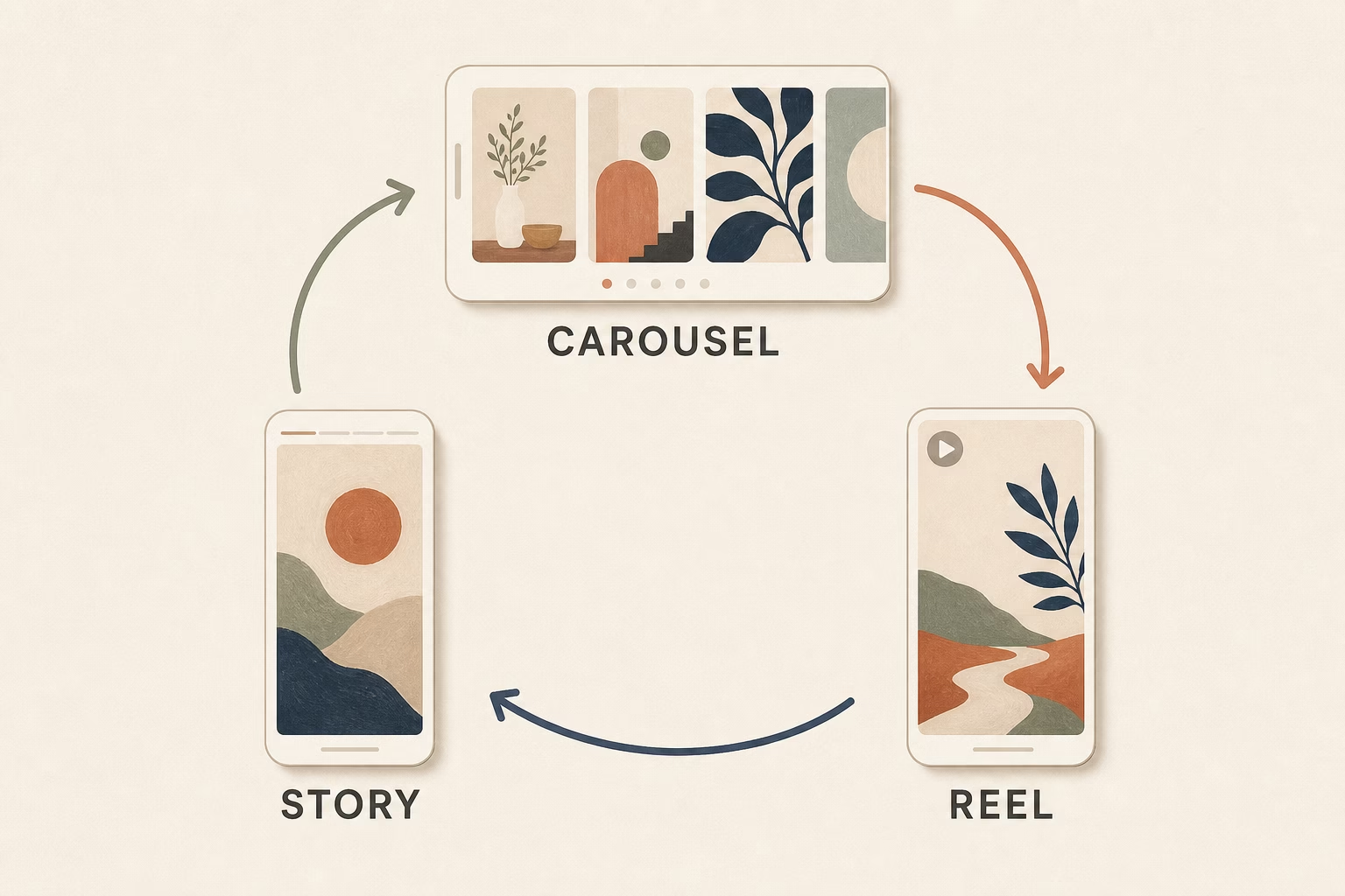
Here’s the sequence:
- Post the carousel (Tuesday morning, optimal time for artist engagement)
- 24 hours later: Share slide 1 to your Story with a poll: “Should I share more process posts like this?” with Yes/No options. Add a “See Full Post” sticker linking to your carousel.
- 48 hours later: Create a 15-second Reel showing a fast time-lapse of your transformation (pull from the same images in your carousel). In the Reel caption, say “See the full process breakdown in my recent carousel post” and link to it.
This strategy drives traffic to your carousel from multiple entry points, increasing its views and engagement over several days instead of just the first few hours.
Pin Your Best Carousel
Instagram lets you pin up to three posts to the top of your profile.
Pinned carousels get 30% more profile visits according to data from Later. When someone discovers you and visits your profile, your pinned carousel is the first thing they see.
Which carousel should you pin?
Your highest-performing process post—the one that best represents your style and gets people to hit “follow.” This is your portfolio highlight reel.
How to pin: Go to your carousel post → tap the three dots → select “Pin to your profile”
Carousel Series Strategy
Create a regular carousel series that your audience comes to expect.
Examples:
- “Transformation Tuesdays” – Every Tuesday, post a process carousel
- “Behind the Canvas” – Weekly behind-the-scenes series
- “Technique Thursdays” – Educational carousel every Thursday
Consistency builds anticipation. Your audience will start checking your profile on specific days, which boosts your engagement reliability—a signal Instagram loves.
One artist I follow does “Five-Slide Fridays” where every Friday is a 5-slide mini-tutorial. Their Friday posts consistently outperform their other content by 2-3x because their audience actively looks for them.
Tracking Success: Metrics That Matter
Creating great carousels means nothing if you’re not tracking what works. Here’s how to read your analytics.
Carousel-Specific Metrics
Open Instagram Insights for any carousel post. Here’s what to look for:
Reach: How many unique accounts saw your carousel. Compare this to your follower count. If you’re reaching 30-40% of your followers, that’s solid performance. If you’re reaching 2x or 3x your follower count, Instagram is pushing your content to non-followers via Explore.
Saves: The golden metric. Saves indicate lasting value. If 5-10% of people who see your carousel save it, you’re creating content worth coming back to. High saves dramatically increase your reach over time.
Shares: When people share your carousel to their DMs or Stories, Instagram sees it as highly valuable. Even 20-30 shares can significantly boost your reach.
Swipe-through rate: This is buried in the metrics, but critical. Tap on your carousel in Insights → “Content Interactions” → Look for “Swipes.” If 40-60% of viewers are swiping through your entire carousel, you’ve nailed the narrative flow. If only 10-20% are swiping, revisit your storytelling—people are losing interest.
Most viewed slide: Instagram shows you which slide kept people’s attention longest. If slide 6 has way more views than the others, that’s your “save-worthy slide”—the content people found most valuable. Create more like it.
What Good Looks Like (Benchmarks)
These are healthy benchmarks for artists using carousel posts:
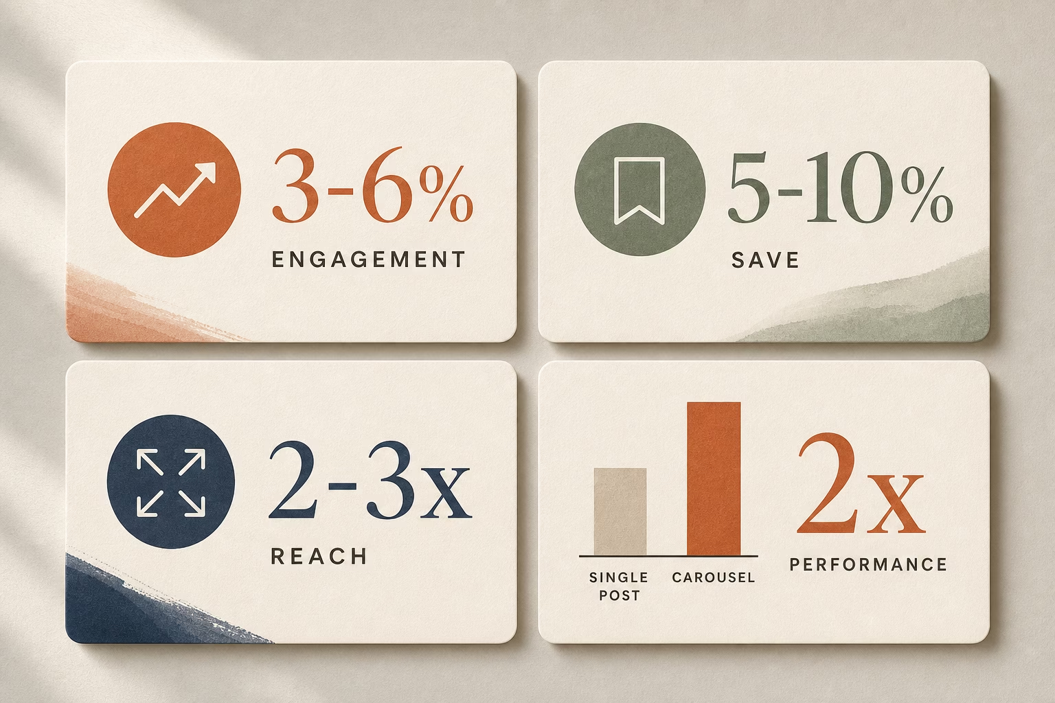
- Engagement rate: 3-6% (likes + comments + saves ÷ reach). Single posts typically get 1.5-3% for artists, so carousels should double this.
- Save rate: 5-10% of your reach. If 1,000 people see your carousel, 50-100 saves is excellent.
- Swipe-through rate: 40-60% completion. If 100 people view slide 1, 40-60 should make it to your final slide.
Don’t compare yourself to massive accounts with millions of followers. They have different dynamics. Compare your carousels to your own single-image posts to see the lift.
How to Find Your Data
Mobile:
Open Instagram → Go to your profile → Tap the carousel post → Tap “View Insights” (below the image) → Scroll to see all metrics
Desktop (more detailed):
Go to Facebook Business Suite → Instagram → Content → Select your carousel → View detailed analytics including per-slide performance
Check your analytics 7 days after posting for accurate data. Day-1 metrics don’t tell the full story—Instagram continues pushing high-quality content for days or even weeks.
Your Next Steps
You now have everything you need to create carousel posts that stop the scroll and grow your audience. But information without action changes nothing.

Here’s your simple action plan:
This week:
Audit your last 5 Instagram posts. Ask yourself: “Would any of these have been stronger as carousels?” Probably yes. Most artwork has an interesting process behind it.
Next week:
Choose one art series or process to reframe using the narrative arc structure. Use the Hero Slide Formula for slide 1. Add 5-7 slides showing transformation or showcasing your collection. Include one save-worthy slide with technique tips or tools.
Post it. Track the results. Compare the engagement to your typical single-image posts.
Ongoing:
Create at least 2 carousels per month. Process posts, collection showcases, or educational content—whatever fits your style. The more you practice, the better you’ll get at storytelling through sequential images.
The reality:
Most artists will read this and do nothing. They’ll think “this is great information” and then post another single image tomorrow because it’s easier and familiar.
Don’t be most artists.
The artists building audiences, getting DMs from collectors, and selling work consistently on Instagram aren’t more talented than you. They’re just better at presenting their work in ways the platform rewards.
Carousels aren’t a trick or a hack. They’re simply good storytelling. And every artist has stories worth telling.
Your turn. Go create something swipe-worthy.
Artists using these strategies report 2-3x more engagement within 30 days. The work you’re already creating deserves to be seen. Make your next post a carousel.