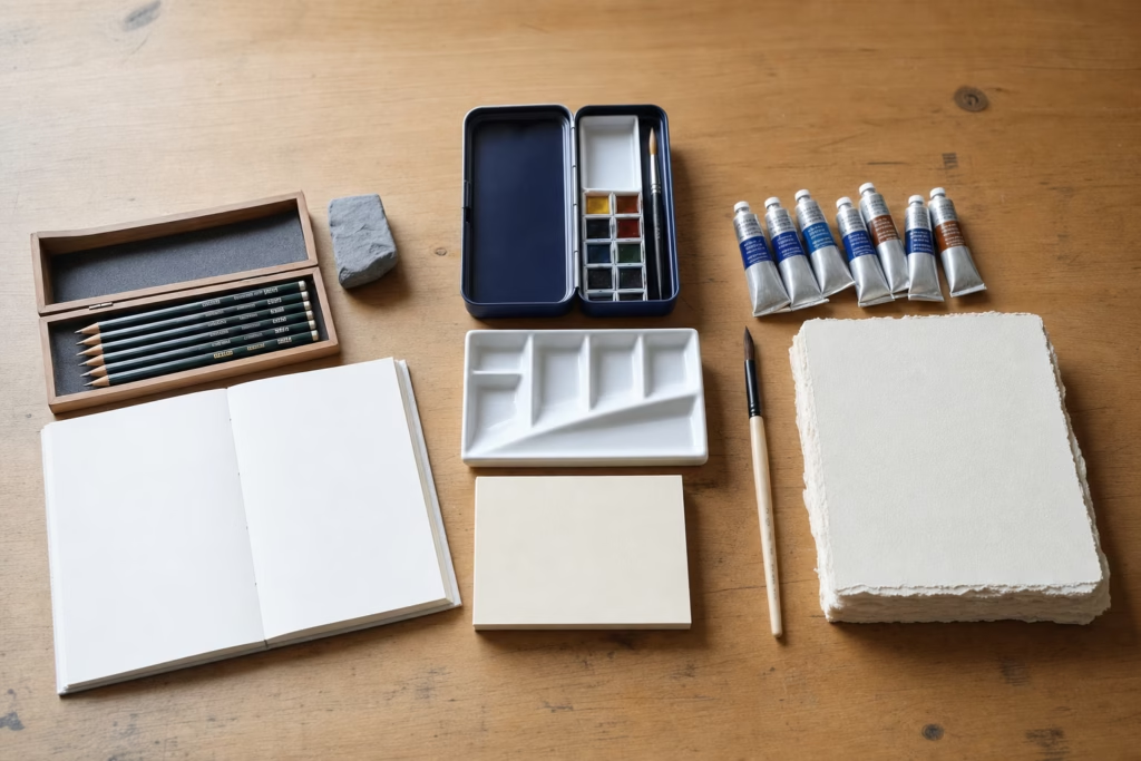
Art supply brands are best compared by medium and grade — not by logo recognition. The most consequential difference between any two brands in the same tier comes down to three measurable criteria: how much pigment is in the tube, whether that pigment is a single-source colour or a mix of several, and how long it will resist fading under light. Every marketing claim on a label — “professional,” “high-quality,” “artist grade” — can be cross-checked against those three criteria before you spend a penny.
| Comparison axis | Student / craft grade | Artist / professional grade |
|---|---|---|
| Pigment load | Low — fillers and extenders make up the balance | High — pigment is the bulk of the formula |
| Pigment source | Usually multi-pigment mixes, listed as “hue” | Mostly single-pigment; colour index code on label |
| Lightfastness | Often unrated or ASTM III–V (fades in 1–5 years) | Rated ASTM I–II (permanent for 50–100+ years) |
| Price per ml | Low — intended for practice and learning | High — but coverage per volume is 2–4× better |
| Archival quality | Not guaranteed; not suitable for work to be sold | Designed to last the lifetime of the support |
What the Two Quality Grades Actually Mean for Art
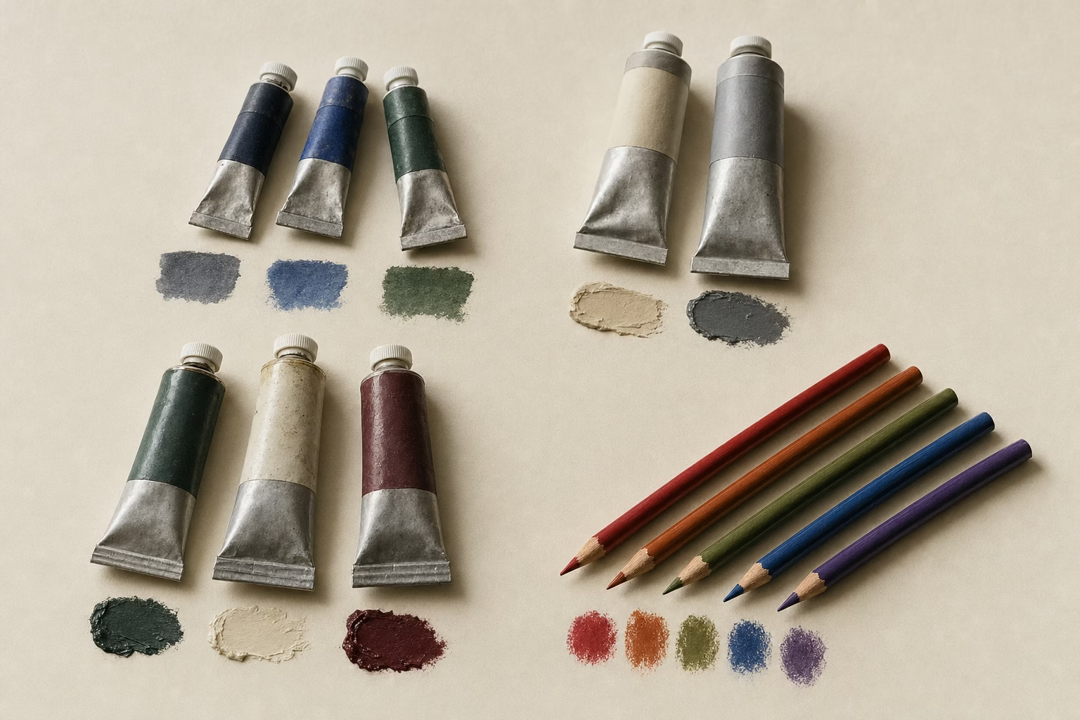
Artist-grade and student-grade art supplies differ in one fundamental way: the amount of pure pigment in the formula. Student-grade paints, pencils, and papers replace a portion of the expensive pigment with cheaper fillers — extenders in paint, low-cotton or wood-pulp fibre in paper — to bring the retail price down. The result is a product that looks similar in the tube but behaves differently the moment it touches a surface: weaker tinting strength, less vibrancy, faster fading, and less predictable mixing. As noted by researchers at ASTM International, which publishes the D4303 lightfastness testing standard used by most paint manufacturers, a colour rated ASTM I has demonstrated excellent lightfastness under 50 years of equivalent indoor museum conditions; ASTM III ratings mean the colour may noticeably fade within 15 to 50 years — a meaningful distinction for any work intended to be kept or sold.
The gap between grades is largest in watercolour and smallest in oil paint. Watercolour demands more pigment per layer because it is so transparent — a low-pigment wash simply does not carry colour onto the paper. Oil paint has some tolerance for lower pigment load because linseed oil itself contributes body and gloss. Coloured pencils sit in the middle: a low-pigment pencil requires many more layers and still cannot match the saturation of an artist-grade core. For working artists who intend to sell finished pieces, upgrading medium by medium — starting with the surface you use most — is the single most effective material decision you can make.
Reading a Tube Label Before You Buy
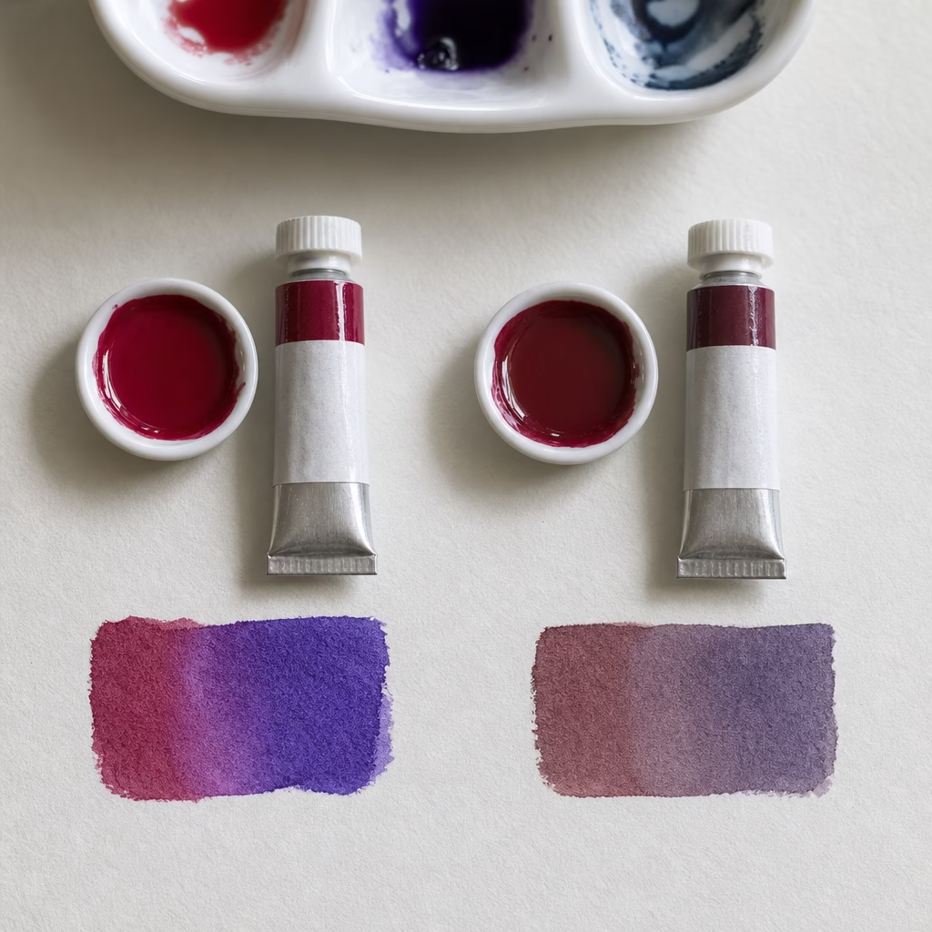
Reading a tube label tells you more about a paint than any review. The colour index name — a code like PB29 (Prussian Blue), PY150 (Nickel Azo Yellow), or PR122 (Quinacridone Magenta) — appears on every artist-grade tube from any reputable manufacturer. A tube listing a single colour index code means the colour is made from one pure pigment; its mixing behaviour is clean and predictable. A tube listing two or more codes — or labelled simply as a “hue” — contains blended pigments, which are harder to predict in mixes and frequently include lower-permanence dyes to approximate a more expensive colour. Knowing this, two simple checks at the shelf are: look for a single colour index code, and check that the lightfastness symbol shows ASTM I or II (or Blue Wool Scale 7–8 on European brands). Any brand that omits lightfastness information entirely is giving you a signal about its priorities.
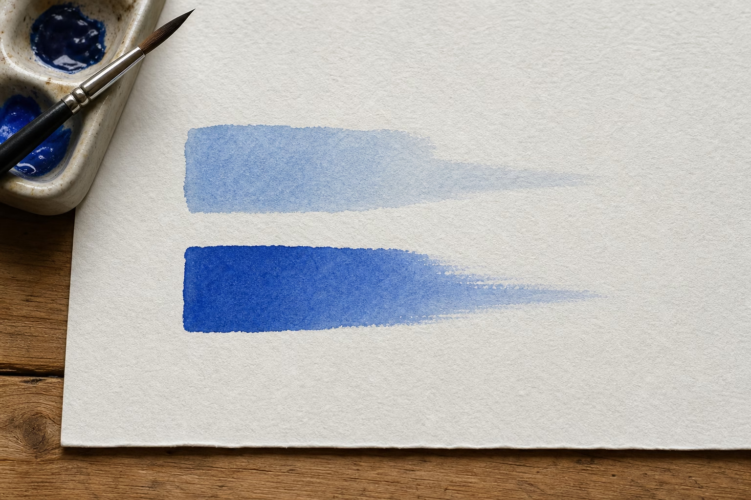
Watercolour Brands Compared
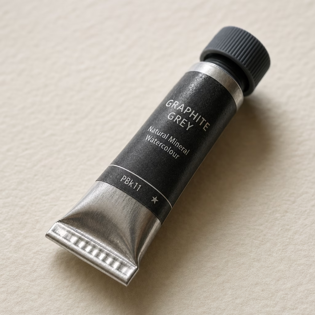
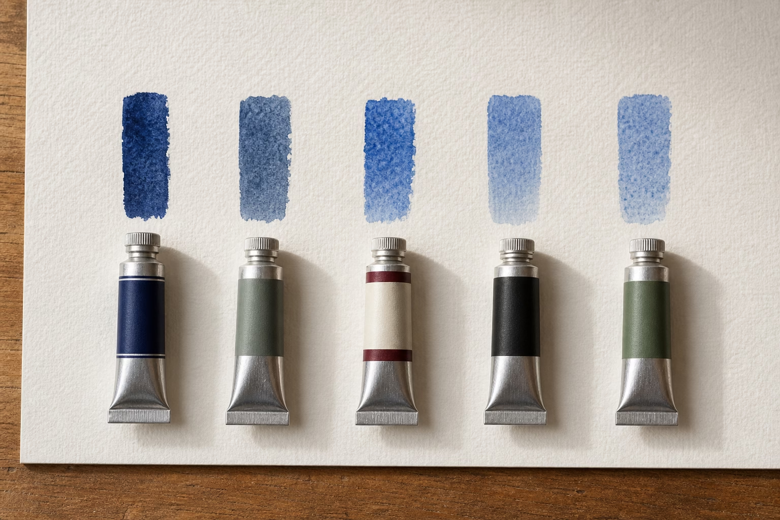
Watercolour brands differ more from one another than those in any other medium, because each manufacturer uses its own binder formulation and gum arabic ratio, which affects how the paint flows, granulates, and lifts. At the professional tier, Winsor & Newton Professional Watercolour — the direct descendant of the original tube watercolour introduced by the company’s founder William Winsor in 1832 — uses mostly single pigments with excellent permanence ratings and a range of over 100 colours, many with unique individual formulations rather than a one-size-fits-all base. Schmincke Horadam, made in Germany, is known for exceptional transparency and smooth rewetting from a dry pan, making it a reliable choice for artists who work with layering and glazing. Daniel Smith Extra Fine Watercolors stand out for an unusually wide pigment library including their PrimaTek mineral-based colours, which produce distinctive granulation effects especially valued in landscape work. For artists who prioritise bold, intensely granulating washes, Daniel Smith’s range of texturing colours — including Lunar Black (PBk11) and Piemontite Genuine — have no exact equivalent from other major brands.
| Brand | Grade | Known for | Best suited to |
|---|---|---|---|
| Winsor & Newton Professional | Artist | Consistent permanence, wide range, reliable rewetting | Versatile studio use, teaching, illustration |
| Schmincke Horadam | Artist | High transparency, smooth texture, excellent pan rewetting | Delicate layering, portrait, botanical art |
| Daniel Smith Extra Fine | Artist | PrimaTek minerals, wide pigment range, strong granulation | Landscape, expressive loose work |
| Sennelier l’Aquarelle | Artist | Honey-binder formulation for intense luminosity | Vivid colour work, collectors |
| Holbein Artists’ | Artist | Consistent colour density from tube and pan | Illustration, flat graphic work |
| Winsor & Newton Cotman | Student | Reliable entry-level performance, widely available | Learning, practice, workshops |
At the student tier, Winsor & Newton Cotman watercolours remain the most widely recommended starting point. Several colours in the Cotman range substitute less-expensive synthetic pigments for the cadmiums and cobalts in the Professional line, but the lightfastness of the substitutes has been maintained at a reasonable level. For a beginner’s art supplies checklist, Cotman paired with a sheet of 100% cotton cold-press paper will teach you more than artist-grade paint on wood-pulp paper — surface matters as much as pigment at the learning stage.
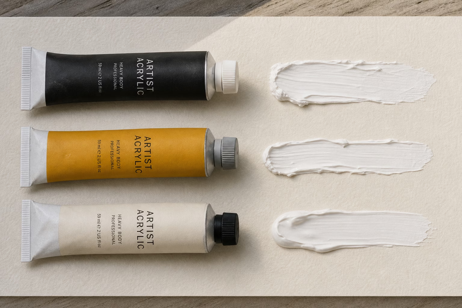
Acrylic Paint Brands Compared
Acrylic paint brands divide most clearly on body — the physical consistency of the paint out of the tube — rather than on pigment alone. Golden Artist Colors Heavy Body is the reference standard against which most other professional acrylics are measured: high pigment load, consistent handling across the full colour range, and a binder that maintains transparency when wet and dry so that the mixed colour on the palette matches what you get on the canvas. Liquitex Heavy Body competes directly with Golden in most professional evaluations, with a similarly strong pigment load and a broader range of product forms — heavy body, soft body, fluid, gouache-effect, and ink — all in a compatible binder system. Winsor & Newton Artists’ Acrylic uses a unique binder that remains transparent from wet to dry, meaning colours do not shift darker as they dry — a quality particularly useful for colour-matching work. The brand also uses pure single pigments extensively, keeping mixes clean.
| Brand | Grade | Body type | Standout property |
|---|---|---|---|
| Golden Heavy Body | Artist | Heavy | Benchmark pigment density, wide range |
| Liquitex Heavy Body | Artist | Heavy | Product range depth, compatible mediums |
| Winsor & Newton Artists’ | Artist | Creamy / medium | No colour shift wet-to-dry; pure single pigments |
| Golden Open | Artist | Fluid / extended open time | Extended drying time for wet-on-wet blending |
| Winsor & Newton Galeria | Student | Medium | Accessible price; reliable student performance |
| Liquitex Basics | Student | Medium | Widest availability; good value entry set |
For artists mixing acrylics across brands, note that Golden Open’s extended-drying formulation does not behave predictably when mixed with standard fast-drying acrylics from other brands — mixing systems is generally safe within a brand’s own line but carries some risk across lines. For more detail on the materials involved in each medium, see the guide to art supplies by type.
Oil Paint Brands Compared
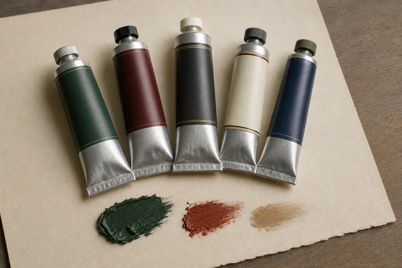
Oil paint brands are the most stratified of any medium: the gap between a household student-grade oil and an ultra-premium artist oil is larger than in any other category. At the professional mid-range, Gamblin Artist Colors are consistently recommended as the best entry point into quality oils. Gamblin uses alkali-refined linseed oil — which yellows significantly less than cold-pressed linseed oil — and does not require solvent for painting or brush-cleaning, making it a safe and practical choice for studio and classroom alike. Winsor & Newton Artists’ Oil occupies the same tier and offers over 120 colours, including options with longer open time and a well-understood permanence record. At the ultra-premium tier, Old Holland Classic Oil Colours — produced since 1664 during the Dutch Golden Age — carry the highest pigment loads of any commercially produced oil paint and are ground to a texture that produces an unmistakeable richness of colour; they are correspondingly expensive. Michael Harding oil paints, made in England, are also in this class, with several distinctive colours — particularly earth tones and transparent oranges — that artists cite as uniquely difficult to replicate from other brands.
| Brand | Tier | Pigment density | Known for |
|---|---|---|---|
| Old Holland Classic | Ultra-premium | Highest available | Dutch Golden Age tradition, 1664; highest tinting strength |
| Michael Harding | Ultra-premium | Very high | Distinctive earth pigments, transparent oranges |
| Williamsburg Handmade Oils | Ultra-premium | Very high | Hand-ground pigments, unique earths, rich body |
| Gamblin Artist Colors | Professional | High | Solvent-free, safe studio; best value at professional tier |
| Winsor & Newton Artists’ | Professional | High | 120+ colour range; well-documented permanence |
| Rembrandt (Royal Talens) | Professional | High | Strong cadmiums and cobalts; good mid-premium value |
| Winsor & Newton Winton | Student | Low–medium | Affordable practice; wide availability |
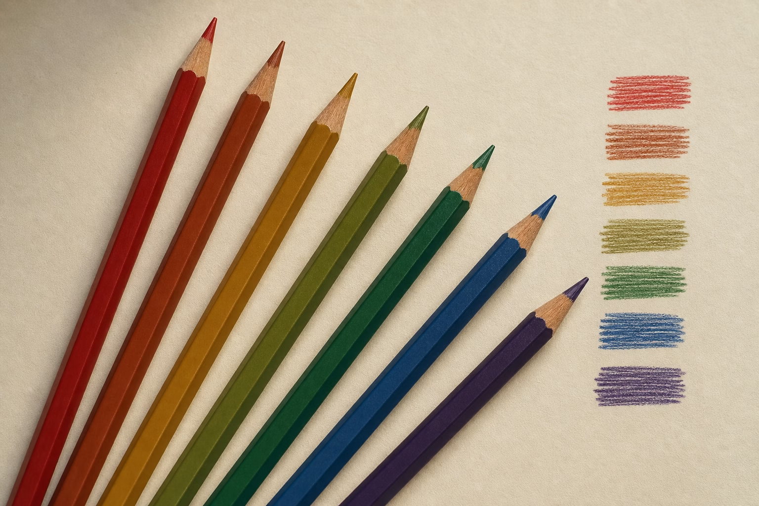
Coloured Pencil Brands Compared
Coloured pencil brands divide on one fundamental technical difference: oil-based versus wax-based binders. Faber-Castell Polychromos are oil-based, which gives them a firm, stable lead that holds a sharp point, accepts many more layers before the paper tooth fills, and can be partially erased cleanly. Prismacolor Premier are wax-based with a much softer core — the colours are vibrant and creamy to apply, but the leads break more frequently, the wax deposits on the surface limit layering (typically to four or five colours before bloom occurs), and the pigments have variable lightfastness ratings. The choice between them is genuinely a question of working style: if you build up many colour layers for realism or botanical work, Polychromos’ oil base is a significant practical advantage. If you want fast, vivid initial coverage and fewer layers, Prismacolor’s softness delivers saturation more quickly.
| Brand | Binder | Core firmness | Layers possible | Lightfastness |
|---|---|---|---|---|
| Faber-Castell Polychromos | Oil-based | Hard / firm | Many (10+) | Excellent — mostly ASTM I |
| Prismacolor Premier | Wax-based | Soft / creamy | Limited (4–5) | Variable — check individual colours |
| Caran d’Ache Luminance | Wax / oil hybrid | Medium-firm | Many | Excellent — designed for archival work |
| Derwent Lightfast | Oil-based | Medium | Many | Excellent — ASTM tested in Arizona sun |
| Holbein Artists’ CP | Wax-based | Medium-soft | Moderate | Good — consistent across range |
For a deeper comparison of pencil types and what each medium demands from its tools, the guide to drawing pencils covers the full spectrum from graphite through coloured cores.
Art Paper Brands Compared
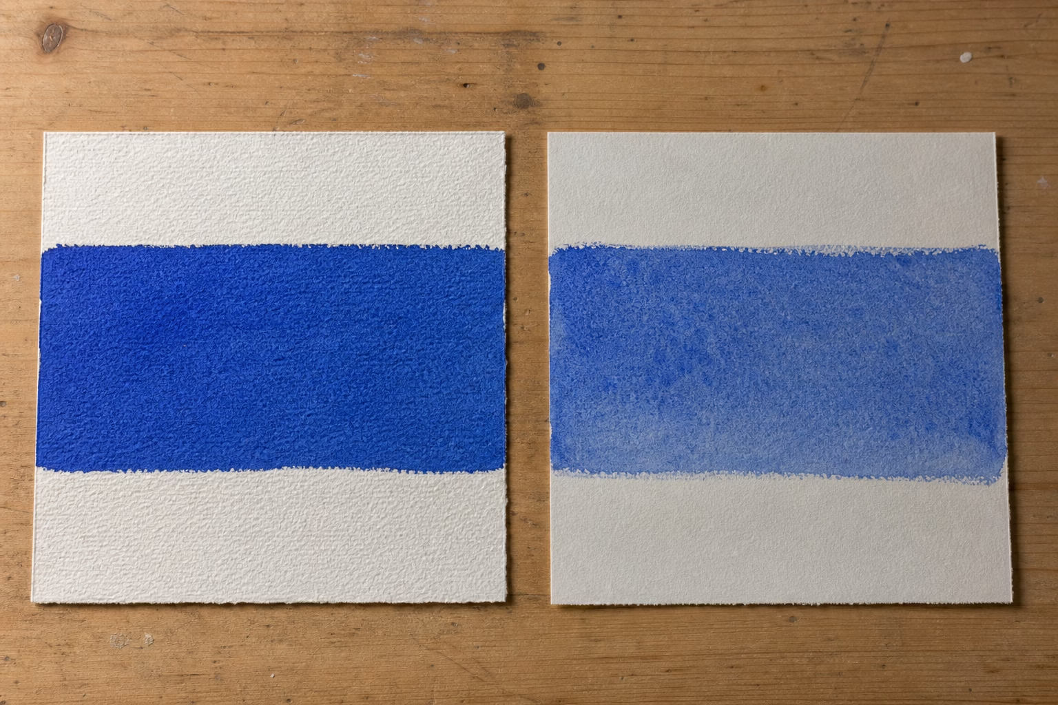
Art paper brand matters more than most artists realise, because even artist-grade paint cannot perform well on a low-quality surface. The single most important material variable in paper is cotton content: 100% cotton paper is pH-neutral, acid-free, and dimensionally stable when wet, meaning it buckles minimally and accepts multiple wet passes without tearing. Wood-pulp paper becomes acidic over time and yellows. Arches watercolour paper, made in France since 1492 using a mould-made process, is 100% cotton and is considered the reference standard against which most other papers are measured by watercolour artists globally. Fabriano Artistico, made in Italy since 1264, offers similar qualities with a slightly different surface texture that many artists prefer for portrait and botanical work. Strathmore has built a three-tier system — the 300 series is wood-pulp for practice, the 400 series is archival-quality but still partially wood-pulp, and the 500 series is 100% cotton — making it easy to move through grades without changing brands.
| Brand / paper | Cotton content | Best for | Available surfaces |
|---|---|---|---|
| Arches Watercolour | 100% | Watercolour, gouache, ink | Hot press, cold press, rough |
| Fabriano Artistico | 100% | Watercolour, mixed media | Hot press, cold press, rough |
| Strathmore 500 Series | 100% | Watercolour, drawing, pastel | Various by media type |
| Canson Heritage | 100% | Watercolour | Cold press, rough |
| Strathmore 400 Series | Mixed (partial cotton) | Study, learning, practice | Various by media type |
| Strathmore 300 Series | Wood pulp | Sketching, practice, studies | Various by media type |
For artists building a professional-grade setup from scratch, upgrading to 100% cotton paper is often the improvement that makes the most immediate visible difference — more than switching paint brands — because the surface is where the paint actually performs. If you are comparing complete starter setups by budget, the art supplies by budget guide maps which tier of each material gives the most return at different spend levels.
How to Choose Between Brands at the Same Grade Tier
Art supply brands at the same professional tier are genuinely comparable — the differences between Gamblin and Winsor & Newton Artists’ Oils, or between Schmincke Horadam and Daniel Smith, are real but narrow. Once you are working within the professional tier, brand choice becomes a matter of working properties: how the paint handles on the brush, how it mixes in your specific palette, and which individual colours within a range you find irreplaceable. Several professional artists note that no single brand covers every colour with equal strength — Schmincke is preferred by some for cobalt granulating colours, Daniel Smith for its PrimaTek mineral pigments, and Winsor & Newton for its Prussian Blue and Alizarin Crimson historical colours. Running a few of your most-used colours as dot cards across two brands is the most reliable way to compare before committing to a full palette. Many manufacturers supply these sample cards, and retailers including Blick Art Materials and Jackson’s Art Supplies sell individual tubes to allow direct comparison.
The one consistent guidance across all media is this: buy the best student-grade supplies if your budget is constrained, rather than the worst professional grade. A strong student-grade brand — Cotman for watercolour, Galeria for acrylic, Polychromos (which is already at the artist tier) for coloured pencil — will teach you more than a marginal professional product. The jump to full professional quality is most worth making when you are producing work intended to sell or last beyond your own lifetime. For a full cost analysis of which professional upgrades pay off first, see professional art supplies worth the investment.
Key Takeaways on Art Supply Brand Selection
The following principles summarise what the comparison above shows across every medium:
- Grade matters more than brand name. A student-grade product from a prestigious label will underperform an artist-grade product from a less well-known manufacturer in the same medium.
- Read the colour index code on the tube. A single code means a single pigment; multiple codes or the label “hue” means a blend, which will mix less cleanly and often fade faster.
- Check the ASTM lightfastness rating before buying any colour you intend to use in finished, sellable work. ASTM I is permanent; ASTM III and below will fade visibly within a human lifespan.
- Paper is the first upgrade to make in watercolour. Artist-grade paint on 100% cotton performs dramatically better than it does on wood-pulp paper — more so than the difference between student and artist-grade paint on the same cotton sheet.
- Within the professional tier, no single brand dominates every colour. Buying dot cards or single tubes before committing to a palette is how professional artists test across brands.
Frequently Asked Questions About Art Supply Brands
Which art supply brand is best for beginners?
No single brand is best across all media for beginners. The most reliable starting brands by medium are Winsor & Newton Cotman for watercolour, Liquitex Basics or Galeria for acrylic, Gamblin 1980 for oil, and Faber-Castell Polychromos for coloured pencil. In each case, pair the paint or pencil with artist-grade paper — Strathmore 400 series at minimum — to get results that show you what the medium can actually do.
Is Winsor & Newton better than Golden?
Winsor & Newton and Golden Artist Colors are both professional-quality acrylics with different strengths. Golden Heavy Body sets the benchmark for pigment density and consistency across the widest range of colours. Winsor & Newton Artists’ Acrylic has a binder formulation that prevents the wet-to-dry colour shift found in most other acrylics, which makes it easier to predict final results. For most artists, neither is categorically better — the choice depends on which specific colours you use and whether the no-colour-shift property matters to your process.
Are expensive art supplies worth it?
Expensive art supplies are worth it for finished work you intend to sell or preserve, because they produce more pigment per millilitre, last longer on the support, and mix more predictably. They are not worth it for practice, sketching, or learning new techniques — student-grade materials are the correct choice for those uses. The most cost-effective upgrade for most artists is moving to 100% cotton paper first, then artist-grade paint in the colours you use most frequently.
What is the difference between artist grade and student grade art supplies?
Artist-grade art supplies contain more pure pigment and less filler than student-grade equivalents. In paint, higher pigment load means better tinting strength, more vibrant mixes, and superior lightfastness. In pencils, it means more layers and better coverage. In paper, the distinction is cotton versus wood-pulp fibre — cotton is acid-free, dimensionally stable, and archival; wood-pulp paper yellows and degrades over time.
Is Faber-Castell better than Prismacolor?
Faber-Castell Polychromos and Prismacolor Premier are both artist-grade coloured pencils with different binder systems. Polychromos are oil-based with a firm lead that takes more layers, holds a sharper point, and has consistently excellent lightfastness ratings. Prismacolor Premier are wax-based with a creamy, soft core that delivers vibrant colour quickly but limits layering. Polychromos are generally preferred for finished fine-art work; Prismacolor for fast sketches and bright initial colour applications.
Can you mix art supply brands?
Art supply brands can be mixed within the same medium category with few exceptions. Watercolours from different brands are fully compatible. Acrylics from different brands are compatible provided you do not mix standard fast-drying acrylics with Golden Open. Oil paints from any brands are compatible. Coloured pencils from different brands can be layered freely on the same paper. The risk with mixing brands is inconsistency of handling, not chemical incompatibility — testing a small area first is always worthwhile.
Sources: ASTM D4303 Standard Test Methods for Lightfastness of Colorants Used in Artists’ Materials. Gamblin Artists Colors — Studio Safety documentation. Winsor & Newton — Artists’ Oil Colour product information. Fine Art Tutorials — Acrylic Paint Brands comprehensive review. Daniel Smith Artists’ Materials — Extra Fine Watercolors range.